Wednesday, May 31, 2006
Creepy Crawlers
I am starting a new series of digital bug paintings. This is a personal project and I am having fun playing with these colorful creepy crawlers. I hope to create a strong group of around 6 - 9 bug art images that I will be offering on-line in our Cafe Press gift shop. I have started today with a fellow I call Bernie the Beetle. You can buy a print of Bernie by clicking here. I'm not sure this will be everyone's cup of tea, but that's ok. I find that the work I do to please myself always helps me grow in my commercial work. I have always loved insects and I especially love dusty old books with hand tinted engravings of insects and flowers. I will be using both old engravings and photographs in these new pieces.
Tuesday, May 30, 2006
New Portraits
Jumping flowers
A few pretty things:
- Recommended by a reader: horizon magazine, the last issue being focused on retro digital art.
- Found via Infosthetics: State of the Union by Brad Borevitz, a visual analysis of all the State of the Union speeches, from George Washington to George W. Bush. You can see the vocabulary analysis, the relative importance of each word, and even see each of the speaches with the selected word hilighted. This is very instructive, scary, impressive. You see the history of a true power through the lens of a precise moment. These speeches are incredibly political, they are propaganda, and they show in a surprizingly clear way the evolution of the social mind, the social consciousness. These words, some of them highly charged concepts ("peace", "struggle", "leadership"), others apparently simple and trivial ("American", "must", "but"), often tell the stories better than the sentences they are part of. One of them surprized me the most, and I'm not sure it should be included in the analysis. In the G.W.Bush speeches, the most frequent word is "applause". Which, of course, is the applause of the public, transcribed. Was there no applause when the other presidents spoke? Then why suddenly do we need to be reminded of it, time and again?
- Finally, via Happy Famous Artists, someone I haven't heard from in a while: Pipilotti Rist. This punkish, trashy video artist (see here and here, with a fragment of the famous I'm Not the Girl Who Misses Much) has a punkish, trashy web page with some really nice images (great sense of space!), and a few projects... Obviously, it's hard to understand or follow, but you get it, don't you? Rist was really the precursor of the Vanessa Beecrofts and other "post-feminists". Interesting to see how she still uses the punk esthetics to her favor.
Technorati: digital art, net art, internet art, art, contemporary art, new art, vvoi, vvoitek, modern art, cool
Saturday, May 27, 2006
Fala Day Pics
Thursday, May 25, 2006
Trading Sheep
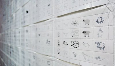
The Sheep Market, by Aaron Koblin, seems like the cutest thing in the world: a collection of 10 000 sheep drawn by people from all over the world.
#1. Don't ignore it as I nearly did.
#2. This is not about lots and lots of different drawings that create one cute whole.
#3. It has more to do with economics.
#4. And dreaming.
#5. Maybe it has to do with the economics of dreaming?
Here are some hints: Each drawing was paid 2 cents. The name is Sheep Market. The short description says "10,000 sheep created by online workers". One of the 8 pieces of data we get in the long description is the "Average wage". It's $0.69/hour.Is this a political statement? Oh, let us not reduce everything to simplistic, social terms.(Although I must mention that in an interesting e-mail he sent me, the author, Aaron Koblin, mentions Marx and Engels).Notice that if you put the cursor over any given sheep, above you get an exact reproduction (animation) of how it was made. "Within the inspiration for The Sheep Market is the urge to caste a light on the human role of creativity being expressed by workers in the system, while illustrating the massive and insignificant role each plays as part of a whole.", writes Aaron.
The ambiguity of using paid workers to do an artistic job reminds me of the earlier works of Santiago Sierra (paying people to do various, sometimes humiliating, things). Only here, several factors seem new: contrary to the classical taylorist ideas, there is no specialization. And contrary to Sierra's workers, these here are plainly, positively anonymous, faceless, nameless. I've tried to find a signature. I think I found one. Also, the work itself has another dimension: where is it? How can it be used? The author decided to make stamps out of the drawings. He could have used it in any other way. The people behind it simply vanish. It might seem ridiculous, given the amount of effort they were asked for. After all, Sierra tattoos his workers, Vanessa Beecroft makes her "models" undress... while here, all they do is draw a tiny, funny little thing. Probably not for money, but mainly for fun, or just to do something, or for whatever reason. But the work of art seems to have a quality, a certain opacity about it, that allows it to showcase some hidden traits of the (social, economic) systems that we commonly ignore. And thanks to the symbolic work we always do when reading a work, we easily go the distance that separates the sheep from any other task. After all - it's the system we see, not its elements. In this case, the system happens to be a work of art. And a pretty one, too. Full of lightness, humor. Very user-friendly. Aaron Koblin quotes The Little Prince: ’If you please--draw me a sheep . . .’ Looking at the rows and rows of sheep (notice the plural is the same as the singular), I associate it more with the ones we try to count when fighting to fall asleep. Only this time - 2 cents a piece. Or, if you're on the consumer end, $20 for a block of 20 certified stamps.
Oh, and actually, forget #2. I changed my mind. It is also about lots and lots of different drawings that create one cute whole.
Tilly and Veronica Lake
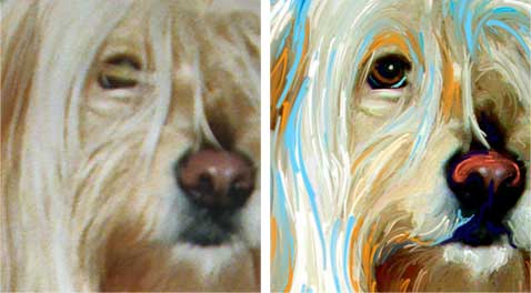
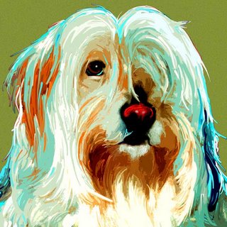
Today I worked on Tilly. Miss Tilly has a Veronica Lake look going for her with only one eye showing beneath her long flowing locks.
Tilly's original snapshot was pretty good in that we could get a real sense of personality and character. It lacked a tad bit in detail and so I just painted in an abundance of texture and line. Tilly's human also was able to show us a variety of snaps taken inside and so we were able to get a real sense of her modern style and aesthetic sensibilities ( Tilly lounges on very cool furniture).
My next step is to play around with color and come up with some different color background options to show Tilly's human. Her proof should be on-line in just a couple of days.
The Painted Photograph
David Bierk, Petrified Tree, California (1989) Oil on photographs on canvas
At the Canadian Museum of Contemporary Photography.
ps. David Bierk was the father of Sebastian Bach, leader of the band Skid Row. So strange...
At the Canadian Museum of Contemporary Photography.
ps. David Bierk was the father of Sebastian Bach, leader of the band Skid Row. So strange...
Technorati: fine art, visual art, painting, photography, art, contemporary art, new art, vvoi, vvoitek, modern art, cool
Wednesday, May 24, 2006
The Autonomous Body: the pictures of Michal Macku
Gellage No. 49
Gellage No. 5
Michal Macku makes me think of Abakanowicz and some of Beksinski's later works. Both of them are Polish - and Macku, Czech. He is quite Central-European, I suppose. There is this heaviness about the body, the despair, but a despair that becomes poetic, beautiful, that frees us from itself. He also reminds me of the Portuguese Helena Almeida in his plays with the form, the frame, the "content". But Almeida is much more conceptual, she likes lines, pure forms. Macku goes for the distortion, he seems attracted to the surrealist dream of an un-body, a body that outdoes itself, that lives an autonomous life. I suppose this could be a proof of the existence of the soul, through the negative: if we can imagine a living, functioning body without a soul, and it is different from who we are now, than we need something to describe what we are now. The technique Macku developed, which he called "gellage"(a collage using gelatin), leaves no doubt: this is not digital. This is all too real, we almost hear the fabric tear, we sense the bodies come together and seperate. Of course, one could do it digitally. But this once, let me stay with my old-fashioned analogical rhetoric.
You also need to see his newest type of work, "glass gellage", 3-dimensional glass installations. See the flash animation here.
(via the excellent Art of Love blog)
Technorati: photography, visual art, fine art, art, contemporary art, new art, vvoi, vvoitek, modern art, cool
Tuesday, May 23, 2006
Grinding through body: two works by Phillip Toledano
Baby Suit: The Possibilites of Thinking Out Loud
C-print (2006)
Legskirt: You Look Beautiful!
C-print (2006)
Body, fetish, play, artificial, coherent, multiple, rhythm, together, covered, surrounded, created, creation, dance, dance, you monster, you, monster, proportions, Saturn, or Kronos, who ate his own children, birth of time, body mass, mass grave, pointing down, pointing down, pointing down.
ps.: I discovered a somewhat similar other, older suit by Jean-Charles de Castelbajac through this. I prefer this one by far, though, although it's so creepy. And, in case you wondered, what's on sale here are the pictures, not the clothes. ($2300 a pic...)
(via)
C-print (2006)
Legskirt: You Look Beautiful!
C-print (2006)
Body, fetish, play, artificial, coherent, multiple, rhythm, together, covered, surrounded, created, creation, dance, dance, you monster, you, monster, proportions, Saturn, or Kronos, who ate his own children, birth of time, body mass, mass grave, pointing down, pointing down, pointing down.
ps.: I discovered a somewhat similar other, older suit by Jean-Charles de Castelbajac through this. I prefer this one by far, though, although it's so creepy. And, in case you wondered, what's on sale here are the pictures, not the clothes. ($2300 a pic...)
(via)
Technorati: photography, art installation, visual art, fine art, art, contemporary art, new art, vvoi, vvoitek, modern art, cool
The bigger prince
An entry by Ernesto Oroza from Cuba, at the designboom contest for their new logo.
Technorati: design, art, contemporary art, new art, vvoi, vvoitek, modern art, cool
Monday, May 22, 2006
Fala Day
We had a blast on Sunday at Fala Day. I will be posting some fun pics of this annual Scottie event soon.
Big Tommy won first place for tallest ears, we are very proud. Fala Day is put on by the terrific folks at North Texas Scottish Terrier Rescue. In true rescue spirit they have contests celebrating the quirks and imperfections that make our pets so dear to us. Other contest categories included longest tail, widest girth, shortest ears, longest beard, and of course best costume.
Both our sweet Ajax and Big Tommy are rescue boys from NTSR.
404 - Virtual Cage
For the conceptually-minded: #404, by Jon Meyer, a tribute to John Cage's 4'33". I must admit I am not quite in the disposition for artsy fun and thus skipped this silence, but you might just not be me.
Technorati: internet art, net art, visual art, art, contemporary art, new art, vvoi, vvoitek, modern art, cool
Saturday, May 20, 2006
Redefining the world
The Institute of Infinitely Small Things is the dream-come-true of any daydreaming student. It is "a research organization whose mission is to invent and distribute new practices of political engagement in everyday life" (associated with Boston-based iKatun). In practice, that means a group of people doing wonderfuly wonder-filled things. Regardless of definitions (performance art, contemporary art, theater, etc), it is one of those things I wish were much closer (it seems to be located in Harvard), much more frequent, and much... bigger. Mediatically, that is.
Some of their most charming projects have been 57 Things To Do For Free in Harvard Square (I didn't manage to see the videos...), 100 (11+1) Instruction Works, and several other witty, adorable ones.
Their last project is the Renaming of Names in Cambridge, Massachussets. What's the use?
There are a rich set of economic, political and cultural interests at work inOnce again, the collective shows a wonderful lightness in their approach to reality, treating it as a delicate canvas, playing with it as on a playground. As usual, I find this a great relief in the often pompous and inhumanly formal world of stuffy stiffy artists and social analysts.
the production of names.
The Institute for Infinitely Small Things is
interested in researching these interests in Cambridge, MA, by inviting the
public to circumvent them.
The Institute is also interested in the social
uses and perceived economic value of existing places in Cambridge. Our questions
are simple:
What will people rename?
What kinds of relationships will
prompt people to rename certain places (antagonistic, personal, habitual,
historical)?
What will not be renamed?
Which places will be renamed the
most (i.e. acquire the most economic value)?
There is one thing, though, that raises my doubts. The more popular names (of main streets and squares etc.) will be auctioned. As in, sold to whoever pays more. And although they claim that "The money need only be a small sum that exceeds the amount the previous person paid by at least $0.01", the very concept seems somewhat... heavy, pompous and formal. And above all, it enters the very system that the Institute apparently criticizes in several other works.
All in all, I'll be on the watchout for the Institute's future works. Actually, there should be an entire network of Very Important Institutes created throughout the world, shouldn't there?
(via)
Technorati: performance, performance art, art, contemporary art, new art, vvoi, vvoitek, modern art, cool
Friday, May 19, 2006
1,609 Served
In early 2001 Art Paw was one of the first on-line pet portrait studios to start offering on-line web proofing to their clients. We started our business in 1998 and for our first three years in business we proofed all of our clients via e-mail only. Just for grins today I did a quick search on my hardrive for html (web) pages with the word "proof" in them and found 1,609 page results. Zowie, dividing that number by 5 (years) I discovered that we are averaging around 321 portraits a year. The actual number could be a tad bit higher as we often return to e-mail proofing during the busy holidays.
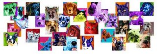
One of these days I want to make myself a huge mural using small square thumbnails of all of the animals we have created portraits for. I think that a huge print of that size with that many animals would look lovely above my desk. I can just imagine sitting back with my assistant and trying to name all the different dogs and cats that would be represented in a giant mural like this. The conversation would be "no that is not Bella, that dog over there is Bella ... ok maybe that is Bella the terrier and that is Bella the poodle". I really do remember 98% of the animals names that we have created art for, and the only ones that are a little fuzzy in my brain are the very quick rush jobs.
It might be even better to make the mural out of ceramic tiles. That would be an expensive project, over 1600 ceramic tiles! Now if I can just find the time to create this tapestry of pets.
Web proofing is one of the perks when working with digital artists. We have the ability to show our clients a couple of different versions of their art before we print it. We can even make minor color changes to the work and reproof on request. Click here to view a few of our most recent client proofs. Some traditional portrait artists are even getting in on the proofing game and allowing their clients to see their art as it progresses. Check out Kathy Weller's blog to find a few of her pieces in progress.
Wednesday, May 17, 2006
Zbig Rybczynski
part 1
Have just discovered some of Rybczynski's films during the MONSTRA animated film festival I am involved in.
The fascinating thing about Rybczynski is his capacity to simply go for it.
The short films seem like a crazy man's dream that came true. Anything can happen, but in any given dream its specific rules apply. And that's impressive: on one hand, apparently unlimited artistic freedom - abstract games, constantly playing with the image, cutting through it, working it like clay, as if it were a material object, and not, as we often see it, a canvas ready for representation. It is hard to say where the character ends and the form begins. It is impossible to say what is still the story and what is "just" the way it is being said. On the other hand, every film I've seen is a decision. Rybczynski discovers a set of rules and sticks to them. And this impressed me the most. This is like an acid test: there is a sense of certainty you can't miss. Maybe this is what I've always felt about the convention as a crucial technical concept. Rybczynski seems to work with convention as one usually works within it. For instance, in Mein Fenster (roughly translated as "My Window") the rule is simple: the world turns upside down, while we maintain our relative position. And that, and nothing more, happens. In the Oscar-winning Tango, numerous characters enter one room. Although clearly recorded at different times, the images are overlapped in such a way that we get a crazy dance of many people in one small room. And nothing else. This discipline makes it captivating, makes us follow the lines, makes us believe the world that was created. And, since the limits of the convention are being explored to the maximum, it is never boring.
Rybczynski uses images like geological layers. He does not play with the image as a background/form, but as a geological mound. For him, each line becomes a system that can be isolated, the way a geologist approaches and analyzes each single stratum. That slippage and the baroque elements are truly the product of a geology rather than a geometry of the image. The horizontal lines are to him what the layers of sedimentation are to a geologist and this, in my opinion, is highly original. He no longer plays with the plots, but with the horizontal lines, like a musician that lets his notes glide through the musical staff; Deleuze would like that, the fold; ah, yes, that there is truly the fold!
- Paul Virilio, Le phenomene Rybczynski, –Cahiers du Cinema,” January 1989
part 2
I had a conversation with Zbig Rybczynski yesterday. It is very difficult to be writing about it without putting silly, naive values on other people's choices.
At the time when he made his most famous films, he lived in Poland. He was a rebel, an experimentator. He had the guts and the technique. And any of the films I've seen so far shows it: he had really nothing to lose.
Is this an artist's life? What can go wrong? How can you move away from it, if it works?
Zbig hasn't made a film in many years now. For the last years, he's been working on technology. Revolutionary technology, says he, in his American positive spirit. He says he meets the most important people. He mentions names, talks about a revolutionary future. His company creates all sorts of imaging solutions - very hi-tech compositing, compositing for mobile phones, etc.
This is his second shot at the U.S. The first time apparently didn't go too well. Now, he lives in L.A., he's well off. He travels, he studies hard, he knows things. He talks about them, talks about the importance of education, of preparing yourself, of catching the train of the digital revolution. The revolution of simplicity.
Why didn't it last? How come this genious, Oscar winner, didn't stay in? I ask him about the U.S., whether he felt he could still do something artistically, or is it really just business. Oh, it's definitely just business, says he. And he seems to succeed in it.
What's wrong with this picture? Do I have the right to ask? Why would I value his artistic achievements over the latest work? Why do I feel this is giving up?
Or is this coming to grips with reality, the biting one, the one that requires this and that until you really need to get to business and stop playing around?
A few lucky ones got away still playing. But if they want you somewhere else, what can you do? If it all fits better somewhere else?
What's art got to do with it?
"Avantgarde". Turning into "innovation". Suddenly, from an art freak you become a serious manager. Or something. A car designer, ad designer, shop designer.
Maybe it's the fragility of a choice that impresses me most.
His great dream now is to make a new film. He says he has lots of projects, but then speaks of making a film. Not the film, just a film.
I wish him all the best.
update: see Zbig's Oscar-winning "Tango" here.
Tuesday, May 16, 2006
Performative helmets
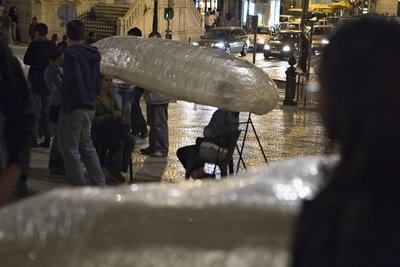
Two additional pictures of the performative helmets from the Monomads performance.
Technorati: art, contemporary art, new art, vvoi, vvoitek, modern art, cool
Sunday, May 14, 2006
Do dream of flying
From Dreams of Flying, by Jan Von Holleben
How high? How far? How long ago? How happy? How come? How?
How?
Another one I like by him is The Prayers.
(via)
Saturday, May 13, 2006
Ending
Hollywood films do not need introductions. They are self-explanatory, and any necessary context is given by the film. This is facilitated by the fact that a Hollywood film aims at universality, in the most pragmatic of terms. The vast majority of the "Western world" should get it.
I Wish I was Born in a Hollywood Movie, the newest work of Sarajevo-born artist Maja Bajevic, is quite the opposite. I simply wouldn't get it without an introduction. A simple flash presentation, with pictures in windows that split, blend, blur. Pictures of anonymous places, sounds that resemble Oscar Guzman's latest work... And little more.
Still, even experiencing it now, you already have a crucial piece of information: Sarajevo-born. Maybe it could have been meaningless; but it couldn't. Maja Bajevic was supposed to spend 8 months in Paris, waiting for the war in her land to be over. Instead, she spent 8 years there. And when she came back, well, nothing was meaningless, I suppose. In the curatorial introduction, we read about her past works, performances and photos and installations-cum-performances (like the wonderful Chambre avec vue (Room With a View) , where "she commissioned immigrant shop owners [in the French town of Aussillon ] to have ornamental motifs of their homelands engraved in the glass windows of their store fronts" (the 15-minute film that documents it has been shown on many festivals, so be on the watch-out).
But this time, it's different. Through the digital means, Bajevic explores a darker side of things. Not only do the pictures have a great amount of melancholy, but they all lead to dead ends, heavy with the burden of sound, dramatic in their absolute, concrete finish. So we go back, clicking on the x to erase the windows, to go back, and start again, chosing another path, seeing other fragments of things, other remains of events. Until we're stuck again.
This scares me. It scares me, because I read the introduction. And I know Rooms With a View exist. And this view suddently seems a part of them.
Friday, May 12, 2006
What Is an Installation
What is an installation?
It's a tricky way of avoiding the concept of sculpture, of course.
But that's not what I mean. What I'm interested in, this time, is: what is the status of an installation. How does it work? How does it perform? Obviously, there are rules, and obviously, there are conventions, incredibly strong ones, that let (make?) you look and not touch, touch and not taste, taste and not take away, take away and not break. And I'm sure someone has been analyzing the public's interaction with the works, in the sense not only of a sociological study of behavior, but also a more subtle analysis of the way people feel about objects that are put in front of them as work, as world, as partners of a conversation. What language do we choose to speak? Isn't it different from the artist's language? And how much do we take for granted?
All this comes to mind after a field visit with my Performance students from the Espaço Evoé school. We went to an exhibition by Luisa Cunha at the still-seen-as-commercial (and horribly presented on the net) gallery Chiado8. It's true, the gallery is owned by a large insurance company (it actually appears before the name!). But some of the works they have been showing are really good stuff.
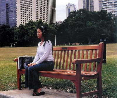
I've read about a work by Luisa Cunha called Words for Gardens some time ago. It was presented at the Sydney Biennale, and it made me jealous. It looked like a very simple, pure idea - talking to someone who is in the garden, and doing it via a stationary set of phones.
To my great surprize, I discovered the work in Lisbon has the same title. And it is clearly in a gallery space. How can you transform something that is part of a garden (from the images I figured it was really integrated in a park) (also here) into the white, cold space of a gallery? The process in itself is far from new: the land-art movement surely owes a great part of its fame to having many of the works transported (or translated) into gallery spaces. But this here was supposed to be an intimate moment of listening to someone talk about nature within nature. How can you transport that?
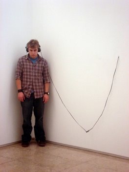
In a small, white room, three sets of earphones. Disappointment. So we go, and listen. The artist's voice, with a slight Portuguese accent, in English: "...You wish you could draw. You see. You see things. ... Grass. You can draw grass. On endless sheets of paper. ... Draw another intense point. Let it fade along another fading and slightly curved line projected in another direction. ..."
Can we still say this is an "about the experience of seeing"? No, or at least not quite in the same way. This is really a drastically different work. It's as if we called Rauchenberg's Erased De Kooning Drawing the same thing as the original piece. And curator Ricardo Nicolau knows what he is doing: creating tension. Now, Cunha's work seems to answer its first version: the empty space needs to be filled, imagined.
And here is my problem: I didn't imagine a thing. The space remained whiter than snow, and Cunha's words didn't sound more convincing than a radio publicity. Okay, a pleasant radio publicity.
But there were more of us. And we decided to treat the gallery space as a "stage", that is, a "framework". And, as in any good installation, new things started to appear.
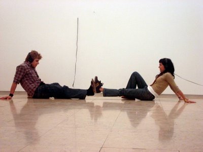
The earphones were distributed - one set on every wall. Also, each set had a long cable (clearly extended). Is this already an invitation?
To us, of course, it was. We worked on the use of objects and of space, on turning the context into working material... The rule was: you can only go as far as your phones allow you. Three people are performing, the rest is watching, and they go switching until everyone has tried. We spent about an hour experimenting various possibilities (the gallery, as most galleries in Lisbon, is empty most of the day, so we were only interupted once). It really looked like a setting made on purpose for a performance. The length of the cables allowed the three listeners to meet in the middle, but not go any further.
So, if I filmed this, would this be our work, or is it implied in the installation itself? This is not just a question of authorship. This is exactly the question of what "installation" means. The girl who was working at the gallery was very happy to see us experiment, as she said the "artist meant this to be a performative piece". But would we have done anything if we weren't in a performance class? Would we even see that the people who listen are unconsciously performing? And isn't this an entirely different chapter, another theme, something that should be dealt with without the... grass? One more thing: how different is the potentiality of action from the action we made? Are the long cables enough for the installation to perform? I often wonder what the Monomads would look as an installation, and this might be one of the next projects, but the change of the performative level is just drastic. Suddenly, everything becomes suggestion and potential and imagined worlds. And it is really not about human presence. It is more about saying something or restraining from any affirmation.
On our way out, we discovered a second room, with large drawings of grass. "And you go on in all directions. Intercepting the short fading and slightly curved lines coming out of intense points planted all over." Who goes in all directions? Me?
Technorati: performance art, performance, art installation, visual art, art, contemporary art, new art, vvoi, vvoitek, modern art, cool
Dog Wraps
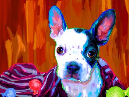
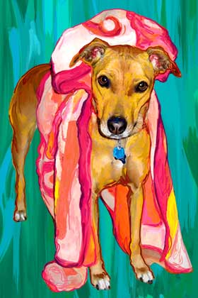
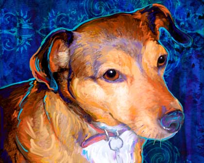
This week I worked on 2 pups that were sporting lovely wraps. When photographing your dog take advantage of after bath towels, bedding and other groovy "wraps" to add texture and interest to your canine photography. After playing with Keyla and Lola I dug through my photos of Pixel that I shot in Feb. to find one where I had wrapped her up in my knit scarf. I played around this morning with her photo to add her to today's post on dog wraps.
Thursday, May 11, 2006
5 down ... 9 to go
Well, I proofed 5 clients this week and I am so close to being caught up I can taste it. I am working on a good looking horse this evening, and I have one very large order that I have to start on soon for a patient local metroplex client.
Today I proofed Moses the tabby. Moses has a terrific in your face sort of glance. Cats are so much fun to work on. When a dog stares too directly at the camera it can sort of freak you out a little and make them look mean or threatening so I usually will rotate their heads in my art to sweeten up their demeanor. Cats on the other hand, well you sort of have to love their attitude and just go with it. This kitty looks sweet yet he is expecting something from the viewer ... a treat, a toy, I dunno?
Tuesday, May 9, 2006
Monomads
Wow. The show went just brilliantly well.
Here is what it's all about:
1. Concept. An intimate space in the middle of a busy city. Street art as a space for communication : a stage. Theater in the most unlikely place. But not quite street theater. Not in the sense of puppets and circus acts.
2. Inside. Stories of the homeless. Actual stories, told without any pathetic tones, no moralizing or tear-jerking. The lives, tastes, loves, sleeping choices and favorite football team, of those we avoid most. A confrontation with difference - a private meeting with a stranger.
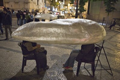
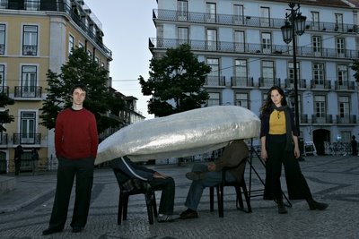
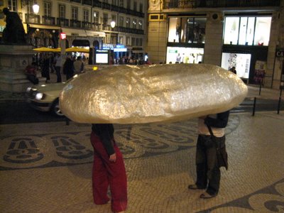
3. Realization. Five 2,5-meter-long egg-shaped, hallow forms with two holes on the bottom. Ten chairs.
4. Material. Scotch tape. At least 95% of the "performative helmets" were made with transparent scotch tape. Some also had a little resin and 2-3 layers of transparent film. The holes and the tips were reinforced with wire.
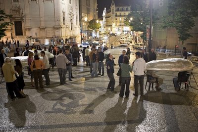
5. Experience. It's night. People go out to have a few drinks. As you approach one of the city's busier squares, on it you see several strange, large shapes that look like sculptures. There are people gathered around it. You come closer and notice there are legs sticking out underneath the sculptures. Actually, those are two people sitting with this thing on their head. Bewildered, you approach one of the production people. S/he says: "This is a performance that's part of the FATAL academic theater festival. One of the people inside is a performer and the other is a spectator. If you wait a little, you can try it. It lasts about 5 to 10 minutes and is free." You wait, then sit on the spectator's chair. The helmet is put on your head. You are isolated from the rest of the world. The sound changes completely - it hushes. But also visually, you have nowhere to run - all you see is the face of a young person. A head completely cut away from the rest - including the body. The person looks at you. S/he starts talking. You have been told to remain silent, so you just enjoy the ride. She talks in the first person, telling you about how she ended up on the street, who his parents were, and why the bakery window is the best place to spend the night. She speaks calmly, with no rush. It doesn't really sound like a theater monologue, but more like just someone telling his story.
6. Joker. The joker is another type of experience in the performative helmet. What you hear, then, is not a story. The performer describes a face. She speaks as if she were describing her own face. But after a while you realize she is actually describing your own face. Neutrally, without judging. Simply telling you exactly how your face looks to her.
The performance went on for three nights, between 11PM and 2AM. We had spectators non stop, often with big lines of people waiting. The performers gave their individual performances about 250 times, which was the maximum they could. Nearly a thousand people stopped to watch the performance as an installation and read the flyer we gave them (many more were watching from across the street). 90% of the "inside" spectators came out very impressed and enthusiastic about the project (needless to say some of them are theater-goers, but many others would never consider going to theater). Many people waited in all the lines to go through all of the performative helmets, since the story was different in each of them. There were a lot of smiling faces. There were tears. A young homeless punk who first wanted to ridicule the event, after hearing two stories asked one of the perfomers if they could change sides - which they did, and the punk told her life story. She asked the perfomer to keep the story as a secret between them.
Now, we are all exhausted. It was very intensive, with nearly none production support.
But this was so good, it would be a pity too keep it at that. If you know of any festivals/venues that could be interested in this work, let me know. We are now preparing a "festival package", in English, possibly with local performers, street-level research and acting and sculpting workshops.
Me and Performaria co-director Verónica Fernandes next to one of the performative helmets. Inside of it, the person to the right is performing, the one to the left - watching.
photos by José Miguel Soares
Technorati: installation, art installation, performance, performance art, theater, theatre, visual art, art, contemporary art, new art, vvoi, vvoitek, modern art, cool
Friday, May 5, 2006
Meanwhile
Rest Your Bum.
(via)
The cushion pieces are light and easily inflatable with a standard domestic hair dryer. They are extremly durable. They can bear weight of up to one ton.
(via)
Technorati: design, art, contemporary art, new art, vvoi, vvoitek, modern art, cool
Wednesday, May 3, 2006
Sneak Preview
Two pics from a recent rehearsal:
Technorati: performance, performance art, art installation, art, contemporary art, new art, vvoi, vvoitek, modern art, cool
Tuesday, May 2, 2006
Mr. Knuckle
Knuckle was a very fun project I worked on last week. The original photo was not bad at all. My only real challenge with the original snapshot was that one ear was not showing at all. I fixed that by duplicating the existing ear then flipped it, then I reduced it's size slightly, and warped it just a tiny bit to make it look different from the other ear. I also lifted and widened the eyes just a tad bit to sweeten Mr. Knuckle's expression a bit. This guy looks like a no-nonsense sort of chap and I really like this piece.
Monday, May 1, 2006
Close
The performance is almost on. I have been working 12+ hour days, but at this moment everything seems fairly okay.
What can I tell you so far...
The performance could be considered somewhere within performance art, street theater, documentary theater, installation or street art. It's called Monomads (Monómadas), from "nomad" and "monad". The performers will be using performative helmets (hehe). The point of departure is the nomad state - which in the urban context means mainly (though not exclusively) homeless people. Oh, and expect a rare intimacy. For good or bad.
The performance takes place in Lisbon, at the Largo de Camões (right in the center), on May 4-5-6, from 11PM to 2AM. To get an insight you need about 10 minutes, for a deeper insight you need probably about 30-40 minutes. So if you're around, drop by to see Performaria (that would sound something like Performery in English). And if not - I'll be back here as soon as I can - with a quick review of how it went - and then, the usual...
Technorati: art, contemporary art, new art, vvoi, vvoitek, modern art, cool
Subscribe to:
Posts (Atom)