If you spend a lot of time in photoshop or any software program for that matter you have probably learned a few keyboard shortcuts. Here is a great little quickie tutorial by Dave Cross on setting up your very own shortcuts in photoshop. I spent some time this morning on Planet Photoshop browsing through their terrific photoshop tutorials. This is a terrific site.
I must admit that I have only scratched the surface when it comes to using Photoshop's ease of production tools such as actions, and customizing my keyboard shortcuts. I would like 07 to be all about working smarter and not necessarily harder so I guess I need to set up a few of my own personal keyboard shortcuts today.
Why I Visit On-line Tutorials so much:
As a commercial artist I find it is easy to get into routines in my work and rely on the same techniques or the same habits of doing things that I have always done. I find the challenge in my work at this point is looking at things upside down so to speak or from a new angle to discover new ways of achieving my goals. This is never more true than with Photoshop. There are a gabillion ways of doing one thing in this software program. Those that are not familiar with Photoshop may think that all digital artists have one big "easy button" that we all use to colorize an image in the exact same way. The reality is there are dozens of ways to colorize an image, and different approaches will yield different results. By browsing tutorials you can find new solutions to issues you have been addressing that approach your challenges in different ways. If a new technique saves you even one step then that might be a few extra minutes you can spend at the park with your dog. Yea, my new mantra needs to be work smarter....work smarter ....work smarter.
Saturday, September 30, 2006
Thursday, September 28, 2006
Dan is Painting

My husband has started painting again and his first piece was a painting of our Scottie boy Tommy. I really love how he captured Big Tommy's crooked tail. This work is thick with paint and this low resolution web image does not really do it justice. Dan paints in oils and usually works pretty large. His new piece is a modest 5 feet by 3.5 feet in size. Dan still works full time in the printing industry so he does not have the time to play that I do here at Art Paw. I am very excited to see him making the time to paint again. He says this new piece is just a sketch to loosen up a bit. I can't wait to see his next painting. My own portrait work is all digital so it is really fun to get to see some old fashion oil painting happening around here. When walking into his paint studio our friends and visitors are immediately hit with the wonderful smell of oils and paint thinner. Dan and I met in college back in the 80's. We did not meet up again until the late 90's. When I was younger I never imagined that I would marry an artist and I feel very blessed to be with someone that approaches all aspects of his life with creativity and an unusual perspective.
The naked teacher: teaching performance art
CNN reports:
Mo Xiaoxin, a 56-year-old assistant professor at a university in Changzhou, in eastern Jiangsu province, shocked students by stripping during a lecture on "body art" to emphasize the "power" of the body and to "challenge taboos," the Beijing News said.
"There are no taboos in the field of research, but to do this directly in the course of teaching is obviously not appropriate," the paper quoted Tian Junting, a culture ministry official, as saying.
The lecture was part of a course within a newly established "human body art and culture" research institute -- China's first -- at Jiangsu Teachers University of Technology, the paper said.
Mo arranged for four other models, including a man and woman in their 70s or 80s, and a younger couple, to strip naked in front of the class while he lectured, the paper said.
Scandal? Or trivial event? Are we to see this through the eyes of an art critic for whom a naked body is just another element of artistic expression? Or should we rather interpret it from the students' point of view? Would it then be an indecent act, a very embarrassing one? Of course, the article says little about the context of the class. It was part of an experimental course on body art. But was it a practical course? Is a practical course in body art actually possible? I've heard of body art workshops where people were encouraged to self-mutilate. How exactly does that work? Does one train various techniques, until one gets them right? Is there a set of "exercises" one has to execute to pass?
If we accept that a significant part of contemporary art looks to go "out of the box", teaching it becomes a challenge. Trust me, I know. The whole idea is how to get someone to accept the excentric as central, i.e., how to see ("alternative") contemporary art as a basis, or a context for work. This is extremely difficult, much more difficult than just learning to appreciate it. On one hand, the students need to comprehend the strength of new works, the impact they potentially have; on the other, it's not enough to see it in a distance, in an attitude of all-encompassing tolerance. This - body art, performance, controversial or plain shocking installations - is to be, if not a foundation, at least a contemporary history. That means, it needs to be close enough to be useful, to be felt as something we might have done, but (often fortunately) don't need to do any more.
Does this mean the teacher was right? Only if he achieved his goal. Only if the people watching him not only got the point (their point, not necessarily his point), but also, will feel empowered through the experience.
But teaching it? Or: actually doing body art (if getting naked comes anywhere near as much as an introduction to body art) in front of the students? Two points irritate me here:
1) A teacher that instead of making the students discover things by doing them does them himself is at least suspicious. I'd rather have a scandal where the teacher convinced students to actually do body art. At least then, they are the performers, and not just forced spectators. The article states that the teacher tried making the students undress too. It seems it didn't work. Was there any room left on the stage?
2) On a more personal level, art that aims to "break taboos" rarely ever speaks to me. It's not too hard to watch. It's too easy. As one ex-body artist said, the performers are not the only ones sweating. The audience sweats too - of a specific embarrassment and more often than not, a deep desire to be somewhere else.
My doubts regarding Mo Xiaoxin are both as a teacher and a perfomer. But they have little to do with indecence.
Technorati:
Wednesday, September 27, 2006
Thinking digital differently
 Flowing in the baroque wilderness of fleshy forms, diving into the realm of whatifs and whynots, is a delicious project called pixelnouveau. Explore it, get lost in it as I did, discover the scent of digital daydreaming...
As any truly experimental project, it has its more and less successful bits - some works seem a little unfinished, as if not nurtured. Also, the navigation is absolutely complicated - but that makes it easier to wander aimlessly, appreciate whatever comes up, and not get the false impression that you're in control. The general feeling is of a rich, dense garden, whose sense still evades me. (Though not the senses).

hint for the desperate explorers: once at pixelnouveau, scroll to the right.
Technorati:
Size matters?
I'm sorry. The post from two days ago was bad. I'm putting it offline and leaving only a minimalist version.
 Claes Oldenburg and Coosje Van Bruggen, Cupid's Span
Size matters? How exactly?
----
Kant's distinction between aesthetic experience and sublime experience could mean that, for instance, when visiting a pyramid I am so overwhelmed by it, the experience ceases to be aesthetic and becomes sublime. If we hold on to this distinction, we could risk saying that the experience of art may be similar if it belongs to the same category: in this example, the Louvre pyramid can have a strong aesthetic effect, but it lacks the size that could overwhelm. Does our sensibility really work the way the kantian categories would like it to? I'm not sure. Today, size, even when we're talking about really large-scale sculptures, seems just another element of our overall artistic judgement (notice how we're backing up from the idea of aesthetic experience, though...).
---
Take a few works: Jeff Koons' Puppy, Douglas Gordon's 24-Hour-Psycho, and Chris Bors's answer to it, 24-Second-Psycho. Or even the Colossus of Rhodes a few years before.
Why, then, does playing with size/scale often feel like cheating? Is Kant the answer? Do we basically enter other categories here and become overwhelmed? If so, shouldn't the issue of the scale be ignored?
 Jeff Koons
---
Then again, scale is balance. Looking for balance is also looking for the right size. The right ontology, the right way of being, as if we were looking for some sort of homeostasis, balance or harmony, a balance which has as much to do with the object itself as with the context. But is Michelangelo's David any worse for standing in the Accademia Gallery?
---
When Cattelan makes a praying Hitler, the strike of genius is making him small, like an innocent being. Because size plays a role. That means size has a character, smaller is cuter, larger is more impressive, etc.

---
But then how do we cope with pictures of things? Why would our imagination compensate so well in a model representation, but have so much difficulty in regards to the original?
---
Going back to Kant, we could say that playing with the size factor is an expression of frustration with other qualities. Take Oldenburg, for example. Here is a fragment of a beautiful text he wrote in 1961:
---
For the lover of big-scale things: how to create large projections on buildings.
For the lover of small-scale things: very small objects. And also, a site full of small bits and pieces of small-scale video art by Alex Pearl, a reader of this blog.

Claes Oldenburg and Coosje Van Bruggen, Cupid's SpanSize matters? How exactly?
----
Kant's distinction between aesthetic experience and sublime experience could mean that, for instance, when visiting a pyramid I am so overwhelmed by it, the experience ceases to be aesthetic and becomes sublime. If we hold on to this distinction, we could risk saying that the experience of art may be similar if it belongs to the same category: in this example, the Louvre pyramid can have a strong aesthetic effect, but it lacks the size that could overwhelm. Does our sensibility really work the way the kantian categories would like it to? I'm not sure. Today, size, even when we're talking about really large-scale sculptures, seems just another element of our overall artistic judgement (notice how we're backing up from the idea of aesthetic experience, though...).
---
Take a few works: Jeff Koons' Puppy, Douglas Gordon's 24-Hour-Psycho, and Chris Bors's answer to it, 24-Second-Psycho. Or even the Colossus of Rhodes a few years before.
Why, then, does playing with size/scale often feel like cheating? Is Kant the answer? Do we basically enter other categories here and become overwhelmed? If so, shouldn't the issue of the scale be ignored?
Jeff Koons---
Then again, scale is balance. Looking for balance is also looking for the right size. The right ontology, the right way of being, as if we were looking for some sort of homeostasis, balance or harmony, a balance which has as much to do with the object itself as with the context. But is Michelangelo's David any worse for standing in the Accademia Gallery?
---
When Cattelan makes a praying Hitler, the strike of genius is making him small, like an innocent being. Because size plays a role. That means size has a character, smaller is cuter, larger is more impressive, etc.
---
But then how do we cope with pictures of things? Why would our imagination compensate so well in a model representation, but have so much difficulty in regards to the original?
---
Going back to Kant, we could say that playing with the size factor is an expression of frustration with other qualities. Take Oldenburg, for example. Here is a fragment of a beautiful text he wrote in 1961:
I am for an art that (...) does something other than sit on its ass in a museum.So, in the case of Oldenburg, where is all this art gone? What is it that makes one move from the majestic art of dog-turds to huge post-ready-mades? Could size-ism be a form of escapism?
I am for an art that grows up not knowing it is art at all, an art given the chance of having a staring point of zero.
I am for an art that embroils itself with the everyday crap & still comes out on top.
I am for an art that imitates the human, that is comic, if necessary, or violent, or whatever is necessary.
I am for an art that takes its form from the lines of life itself, that twists and extends and accumulates and spits and drips, and is heavy and coarse and blunt and sweet and stupid as life itself.
(...) I am for the art that a kid licks, after peeling away the wrapper.
I am for an art that joggles like everyones knees, when the bus traverses an excavation.
I am for art that is smoked, like a cigarette, smells, like a pair of shoes.
I am for art that flaps like a flag or helps blow noses, like a handkerchief.
I am for art that is put on and taken off, like pants, which develops holes, like socks, which is eaten, like a piece of pie, or abandoned with great contempt, like a piece of shit.
I am for art covered with bandages, I am for art that limps and rolls and runs and jumps. (...)
I am for the art of underwear and the art of taxicabs. I am for the art of ice-cream cones dropped on concrete. I am for the majestic art of dog-turds, rising like cathedrals.
---
For the lover of big-scale things: how to create large projections on buildings.
For the lover of small-scale things: very small objects. And also, a site full of small bits and pieces of small-scale video art by Alex Pearl, a reader of this blog.
Technorati:
Tuesday, September 26, 2006
Emma The Cape Parrot

Dianne and I worked on Emma the cape parrot today. She looks pretty cool hangin with Mona. She gives Mona a real tropical flair. I sort of want to give Mona an eye patch but I'm sure Emma's human probably gets tired of pirate jokes.
This week I am trying to finalize all of September's projects. Now is the time to start thinking about Christmas orders people. You guys will not be able to procrastinate and order custom artwork 3 days before Christmas and receive it on time so start gathering up those photos now and sending them in. Get your orders placed on the project board now. The holidays are much closer than you think.
Saturday, September 23, 2006
Design Mags and Eye Candy
When I was in my early 30's and designing greeting cards for a living my best friend and I use to go to Borders Books once a month to purchase and paw through their stunning design rags and design books for inspiration. While I still love to get my hands on a yummy well designed mag or book printed on quality paper I no longer crave those excursions like I once did. The web is overflowing with inspiration and info for artists and designers so there is really no reason to leave the house any longer just to get an eyeful. I do miss the tactile sensual experience of paper & ink and yea I do still indulge myself at Borders on occasion, however today regardless of my budget or schedule, inspiration is always just a click away.
Today I post just a few favorites from my rather long list of bookmarked sites.
Mags:
How Design ( I also subscribe)
Design Graphics
Applied Arts
Colors Magazine
Inspiration:
Netdiver
http://www.5oup.net/
Digital Thread
blogarians
Illustrationclass.com
Today I post just a few favorites from my rather long list of bookmarked sites.
Mags:
How Design ( I also subscribe)
Design Graphics
Applied Arts
Colors Magazine
Inspiration:
Netdiver
http://www.5oup.net/
Digital Thread
blogarians
Illustrationclass.com
Friday, September 22, 2006
Animal Art in the News
Charging Bull ... watch out Wal-Mart!
Wal-Mart has found itself in trouble over copyright issues involving a Bull. Artist Arturo Di Modica is the sculptor responsible for the famous charging bull statue near Wall Street. Evidently knock off copies of the art are being sold for profit by Wal-Mart Check out the full story at Bloomberg.com.
Australian Petroglyphs in Danger
The world's largest collection of ancient rock art is being threatened by a new gas project. Kangaroos, goannas, porcupines, and emus, are just a few of the animal rock art subjects facing damage by acid rain from petrochemical plants in Dampier Archipelago Australia. The animal art carvings are 6,000 to 30,000 years old and chronicle the cultural heritage of ancient Aboriginal societies.
Read more at cbc.ca
Rotting Shark and longevity issues around conceptual art
Ok this story from June seems like a good follow up to the last. Artist Damien Hirst is negotiating with his clients to replace the shark in his iconic work, The physical impossibility of death in the mind of someone living, 1991. The artwork consists of a large dead shark suspended in a huge tank filled with formaldehyde. The shark is "starting to change" shall we say, and the artist is agreeable to changing out the specimen as needed. I don't know, seems as though a rotting shark might be it's own statement, and even more interesting than the original. I also agree with those that posted to complain about killing animals and calling it Art. How many sharks will he have to kill to maintain his conceptual artwork over the course of a lifteime?
Read more at theartistnewspaper.com
Thursday, September 21, 2006
Banksy exhibition...gallery-style
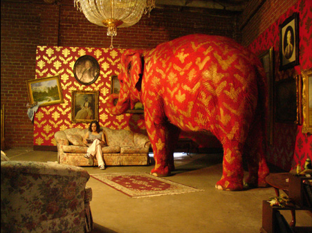
See this great text by Valerie Palmer about a recent Banksy exhibition. The elephant was apparently a fitting centerpiece and stole the show from the political ideas we're used to seeing from the British sweet-painting rebel. Bottom line:
The power of his work lies in the way it interacts with its environment and that obviously gets lost when you put it in any kind of gallery setting.I guess my wish came true.
Question: Is there any way for revolution to go mainstream?
My answer: No.
Question: What about Cattelan?
My answer: Come on, that's softball compared to Banksy. Cattelan's subversion is a Viennese Waltz compared to Banksy's creative punk attitude.
Question: So how can a guy like Banksy gain recognition?
My answer: He's got it already.
Question: More recognition?
My answer: What's the point? To "promote his values"? Let's face it: the value of critique is that it criticizes. Once it becomes part of the game, it smells of hypocrisy.
Question: What about subversion? Isn't that an option?
My answer: Possibly.
My answer after having though about it for a minute: But there's something cynical about it, isn't there? While in the case of Banksy, there hasn't been so far.
Question: Well, how is he supposed to make a decent living?
My answer: I don't know - find a sponsor? Hell, if I knew, I would be doing it already.
My alternative answer: Just as the jester's role used to be an intelligent critique, also of the ruler, and he made a living off it, so there might be room for an official jester... In the best of possible worlds, that is.
Technorati:
Wednesday, September 20, 2006
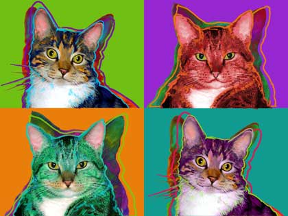
A Fine Fall Morning
It is really starting to feel like fall here in Dallas. After a triple digit summer the cooler weather has everyone around here feeling young and feisty. The pups have an extra bounce in their steps, and I feel like a kid anxious for Halloween.
With the weather so flawless I decided I could not sit at my desk this morning so Allison & I packed up the laptops today and went to the Dallas arboretum to work outside this morning. She is finalizing 3 Warhols today and I am working on a few painterly projects. I just finished my 2nd Petit Basset Griffon Vendeen. This girl is named Momma Rose, I love that name. She was fun and a bit of a challenge as her eyes were not showing up at all in the original photograph. I am very happy with her final artwork. Now I have to get back to Ding-a-ling the dolphin. I may have her proof ready by late tonight.
Tuesday, September 19, 2006
Growing Packs & Prides
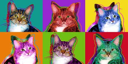
In the past few months we have been working with a few different repeat clients that are growing their packs or prides as the case may be. Last week we shipped a rather long custom portrait that was 20 x 40 inches. Max & Cooper have a new kitty sister Josie. So what was originally a 4-panel artwork created last year has now become a new 6-panel print to include sister Josie. We worked with our client to come up with a custom size that would work out well above an entertainment center. The new print has even more fun color. Yea, I do sort of love my job.
Style. Beyond the individual
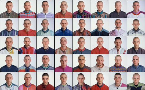
Exactitudes (= exact attitudes), by photographer Ari Versluis and stylist Ellie Uyttenbroek, is an exercise in style (or rather was, from 1994 to 2002 - it is now present online, in a traveling exhibition and in the form of a book). Style is what makes the person unique, but also, quite paradoxically, what makes her so easily categorized. Some say the search for identity isn't at all a search for authenticity (which is a controversial concept), but rather, a search for style. Identity, here, would mean a sort of a definition that allows one to make a drawing. So here we have it, those young boys are making the drawing of themselves - they are getting themselves defined, they are become unique, and totally anonymous at the same time.
It is quite an exciting balance/game/tension, between the self-as-unique and the self-as-participating. Exactitudes shows it clearly. Maybe a little too clearly. It might be because the work is somehow dated, and that, beyond the fact that styles have evolved quite a bit (another proof that identity might be more about style than we think). The pictures, their esthetic qualities, but also the way it was made: the styling, the forcing into categories. Is it necessary? The argument, found in the "about" part of the page, that everything is stylized anyway, simply doesn't seem enough. That's why the groups that speak most to me are ones where the difference, and the similitude, are there, impossible to hide, like in the Tattoo Babes series, or the Dreads one. The others often seem forced, as if the similarity sometimes wasn't enough and needed to be underscored - and it really needn't! Maybe in these two cases, the presence of the naked body seems like something more honest, less manipulated? Then again, come and think of it, the tattoos could be fake.
Technorati:
Monday, September 18, 2006
Swimming with the dolphins
This week I get to swim with the dolphins, at any rate I find myself in the deep end of the pool. I am very excited to be working on a non-furry client. I am posting this piece in progress as I have a feeling this one may take a few days. So far I have just played with colors and filters. I still need to go in and add lots of paint strokes and texture. I love the opportunity to play with unusual subjects and this will be my very first dolphin.
People often ask me what my most unusual request has been. It is hard to say, we have done lizards, frogs, hamsters, horses, all kinds of birds, monkeys, even a gold fish. I can not wait to see how this dolphin evolves. It is always refreshing to break away from my 4-legged subject matter and tackle something new. I'll try and post again soon on this guy.
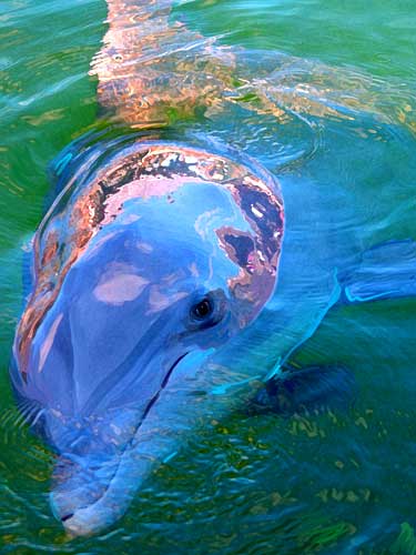
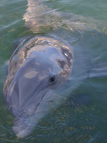
I started this piece without enough info and I just got an update from this cool dolphin's human. Here is the personal scoop on this clever girl: "The dolphins name that you are working on is "Ding-a-ling." She is the alpha female in charge of a family of 14 Atlantic bottlenose dolphins. She is around 30 yrs. old and drop dead georgous!"
Thanks to Sarah for the background info. Now I am really personally attached ... ya just gotta love those old Alpha girls! Wish I could swim with her.
People often ask me what my most unusual request has been. It is hard to say, we have done lizards, frogs, hamsters, horses, all kinds of birds, monkeys, even a gold fish. I can not wait to see how this dolphin evolves. It is always refreshing to break away from my 4-legged subject matter and tackle something new. I'll try and post again soon on this guy.
I started this piece without enough info and I just got an update from this cool dolphin's human. Here is the personal scoop on this clever girl: "The dolphins name that you are working on is "Ding-a-ling." She is the alpha female in charge of a family of 14 Atlantic bottlenose dolphins. She is around 30 yrs. old and drop dead georgous!"
Thanks to Sarah for the background info. Now I am really personally attached ... ya just gotta love those old Alpha girls! Wish I could swim with her.
Saturday, September 16, 2006
Andy Warhol Silent Spring

On Exhibit now at the National Museum of Wildlife Art is the show Silent Spring: Andy Warhol's Endangered Species and Vanishing Animals. Included in the show are 16 original prints of animals that are facing extinction. The exhibition is organized by The Andy Warhol Museum in Pittsburgh.
Check it out at wildlifeart.org
Al Magnus: taking children seriously
For Al Magnus, it all started with having children.
 How surprizing is that? Of course, these are images of fairly tales. Some actually ring a bell. Most are rather fairy tales in themselves. But to start off, remember they were not meant for us, but for the little ones. Hopefully, that can be a good enough excuse to enjoy, as we usually enjoy the things that weren't meant for us.
 Then, of course, there is more. The above image, called Paisagiste II (Landscape Designer II) has two versions. The first one is in color. This one, however, is quite different. By taking away the color, the general atmosphere becomes heavier. But there is another change. The boy pulling on the rope all but disappears. (Yes, there is a boy pulling on the rope). Suddenly, we discover the designer is not quite the one we thought it were. Maybe, because in the tales we know, we can only think of one designer.
 But isn't the designer someone with the power to reinvent? To construct, but also, to make a Very Silly Thing (La Grosse Betise)?
Maybe, the power of attraction of children's tales is not that they're far-fetched, incredible, fantastic, but that they design things in such a way that we feel this world-changing design on every step? This is a big difference, since we rarely associate children's stories with the creation of order. Come to think of it, it is an order that they have in common with some, maybe not all, art. And so, the trivial idea that artists are the adults that remained (or went back to being) children can be understood in a whole different way. Artists treat designing seriously.

Technorati:
Thursday, September 14, 2006
Pet Portrait Marketing Guide
A lot of artists have been writing to me just this past month about how to get your work seen. Just today a very nice lady wrote to ask how to get her Mom's custom portraits seen. Art Paw has a pretty strong web presence and many artists may think we are "lucky" or that maybe we know some easy secret to marketing that gives us an edge. The reality is there is no "easy" secret when it comes to marketing artwork. I would be happy to share a few tips that are working for us.
#1 Advertise off-line to drive traffic on-line.
We spend a few thousand dollars a year advertising in a variety of pet oriented national magazines. The cost for print ads can run as low as $200 and can go up into the thousands depending on your budget. We do small marketplace ads and try to keep our costs as low as possible.
#2 Show up at local pet events
National coverage is great, but do not forget to work your local market by showing up at dog and pet related events put on by local charity groups. Be sure and give to those local charities as well. Many rescue groups have yearly auctions and would love to have one of your portraits to auction off for their cause. They will often place your business cards and marketing brochures by your auction item.
#3 Search Engine Optimization
If you have a website make sure the engines can find you. I am always trying to read up on the latest news about optimizing for various web engines. I am not going to go into detail here and give you a step by step guide on how to do this because there are a gazillion web-sites out there that will teach you how. In addition to free information there are companies that will optimize your website for you for a small fee. If someone tries to sell you services for web optimization be sure and check to see how their web site ranks. You do not want to hire the company that is ranking on page 10 for SEO services.
#4 Printed Marketing Materials
The web is great and a well designed on-line portfolio is a good place to start but do not forget about old fashion marketing materials such as full color business cards, flyers, postcards and more. Leave these at your local vets, groomers and doggy daycare places. Slap a bumper sticker on your car with your domain on it ....get aggressive locally in getting your name out there.
#5 Spend almost as much time marketing your artwork as making it.
Yep, it sad but true, you should develop a real joy for selling because your first 5 years in business should be spent with at least 50% of your energies being put into marketing. If you are doing art fulltime and can afford to spend twice as much time selling your artwork as making it then you will succeed twice as fast.
#6 Network with other Artists
There are tons of successful artists on-line and while not everyone that you e-mail is going to feel compelled to give you any help it never hurts to ask. A word of advice in approaching other artists by e-mail, try and include your full name, web address and phone number. Do not try and be sneaky or pretend to be someone else. I have had a handful of portrait artists e-mail with their hotmail accounts to ask how my ad in a specific magazine is doing for me without even identifying themselves. Be totally above board and honest with people and they will usually be glad to help you. If you try to be anonymous it will usually backfire on you. Be willing to share a little of yourself when approaching other artists.
#7 Spend Some Time and Spend Some Money
I have never been shy about spending money on my business. It takes money to make money. I happen to love marketing and see it as a creative art form in itself. I am not afraid to invest time and money into selling because I know my work is good and that it will pay off if I invest in myself.
So if you are an artist get out there and start selling. Artists should also feel free to leave a comment here and share your own marketing tips. If you are a pet lover please order an Art Paw original today so I can figure out how to pay for my next print ad.
Wednesday, September 13, 2006
100 posts
Wow today is a milestone for me with the blog. This is my 100th post. I started my Art Dog Blog back in February of 05. Over a year later I have finally reached 100 posts. I feel like I should have something monumental to talk about today, but I'm afraid this may just be another regular old post. As I mentioned before this September also marks our 8th birthday here at Art Paw. I guess more than anything today I am very aware of my human trait of marking time, and the odd yardsticks we use to measure success. So do I have a successful blog, are people even reading it? I really don't know, all I know is I feel good about reaching that triple digit number.
So what is all this in doggy years?
My furkids don't mark time at all, just lamp posts, trees, and the occasional fence post. Our Scotties go on 2 walks a day every single day of the week so they go on around 730 walks a year. I have never once heard them bragging about reaching 200, 300, 400 or so walks. No, but I do hear from them if the walk is late. It is easy to look at our pups and wish we could be more zen about life. The reality is that simple actions like updating a blog on a regular basis can be viewed as a zen like discipline. All I know for sure is that I do enjoy blogging.
For V.
 The work, by Maarten Vanden Eynde, is called Rave Nature, but here is something interesting: the photo's file on the artist's server is named podium. I much prefer this second name. Also, as we can read here, contrary to many other works of land art, the work as such was not the picture, but the thing itself. It was part of a festival, and was actually an installation that at night would be lit with disco lights and a stroboscope, and smoke would come out while a song would play... I'm not really sure if I still enjoy it as much. One thing is for sure: this picture certainly doesn't convey the idea of rave. Which might be part of the trick, come to think of it. As if the stage was set, but impossible to comprehend during daylight? On a more general level, it's fascinating how the opening of interpretations, as would be the case without the night party, leaving the stage as is, at the same time attracts (makes it more enigmatic) and repels (oh, yah, I get it, conceptual work, got the concept, let's go). Is it cat vs. dog? Is it about the work (over)interpreting itself? Two other pieces by the artist I particularly appreciated:
 Both are from the Genetologic Research series. The second one seems to only really gain power when seen in the physical space, but we get the point.
Technorati:
Remixing stuffed birds


Pour les dents d'un blanc éclatant e saines (meaning: for teeth that are shining white and healthy) is an installation by Jeroen Diepenmaat. In it, stuffed birds play records by putting their bill into the groove. One of the impressive things about it is that it's not one of those suggestive works that actually only work as a symbol. It works! On his site you can listen to the sound this and other installations make, or you can choose to chill out to some collaborative re-mixing he's been making. All his works seem to be evolving around vinyl and old cars, and often include interesting ways of callaborating with others (artist, students, groups of unsuspecting passers-by...). Speaking of vinyl, it's impressive how old-style vinyl lovers keep reinventing themselves. Is there anything better for creativity than apparently disqalifying limits? Could this be a difference between the amateur and the professional? The amateur doesn't need limits to his areas of investigation...
(via)
Technorati:
Tuesday, September 12, 2006
In these dark days
Oh, entertain me, do entertain me, make silly things, funny things, call them art, call them rat, but make them pleasant and direct and, why not, simple, and use the tongue of greatest lovers, the tongue that tickles, that brings emotions to the flower of the skin, as the Portuguese like to say...

More here.
He's for a jig or a tale of bawdry, or else he sleeps. - Hamlet
(via)
More here.
He's for a jig or a tale of bawdry, or else he sleeps. - Hamlet
(via)
Technorati:
My Pixel Chiffon Pie
© Kathy Weller
Portrait artist and illustrator Kathy Weller finished her artwork of my Pixel over the weekend and it looks so great. Our little scottie girl is at that good versus evil, or "id at war with the ego" stage of development. One minute she is an angel and the next she is the devil. Kathy created a fun portrait that captures both sides of her personality. Check out her "What's Cookin Page" to see more. I love the color scheme and the flames on the devil side. I know this piece of art will always make us smile especially once our little girl grows up and becomes a civilized and mature Scott. I am often surprised by how many people commission custom portraits of their wee puppies, but you know it really does make sense to capture them at this unique stage. We send many thanks, wags & sniffs to Kathy for a great piece of art.
Sunday, September 10, 2006
September 11


***
I found the second of these two works by Peter Coffin as an illustration to this article by art critic Jerry Saltz. Two other discoveries Saltz provides are the Strange Powers exhibition at the Creative Time gallery (unfortunately judging from the participating artists, and not a visit...) and a quote by Erik Fishl:
Imagine calling two pets, one a dog, the other a cat. Asking a dog to do something is an amazing experience. You say, "Come here, Fido," and Fido looks up, pads over, puts his head in your lap, and wags his tail. You've had a direct communication with another species; you and Fido are sharing a common, fairly literal language. Now imagine saying, "Come here, Snowflake" to the cat. Snowflake might glance over, walk to a nearby table, rub it, lie down, and look at you. There's nothing direct about this. Yet something gigantic and very much like art has happened.
A few questions: If the dog stands for entertainment (as I believe it could), doesn't it value entertainment? I mean, in this example, why would the cat always be the better of the two? Don't you ever get the feeling the cat simply doesn't get it? And what about cat cynicism? Where does that leave art amateurs, huh?
Found thanks to the nonist
Technorati:
Saturday, September 9, 2006
Web Design Tools
So Saturday is usually the day I post a link to some clever photoshop tutorial that I have stumbled upon while browsing the web. Not today. Today I have 2 words to share ... Template Monster. Oh my gosh, this last week I have been digging through this resource site and have found at least a dozen web design templates I want to try out. Template Monster makes me feel like a kid in a candy store.
Art Paw and most of my other sites were designed by me from scratch in Dreamweaver. Back in 1998 we started our very first site and my husband actually built it using raw code. We threw it up ( sounds lovely right), we threw it up on to our free member homepage with earthlink. A year or so later we got our own domain and I started tinkering with site design and taught myself Dreamweaver over time. I still have tons to learn and feel like you never stop learning when it comes to the web since it all changes so fast. The cool thing is today there are so many resources out there to help you along.
This month we are celebrating our 8th Birthday here at Art Paw. A few of our early pages can still be found using the way back machine. We had some cool colors working for us, but I made a lot of design mistakes back then, yea, comic sans to start with. At least we can still laugh at ourselves. We still laugh when we think about how hard Dan worked to figure out how to code some silly little moving text sales blurb that ran across your screen when the site loaded. Like most web-animation it was sort of cool "once" then quickly became irritating. Ah well ... live and learn.
With so much on my plate right now I think the next web project I tackle will be created by modifying a pre-existing template ... heck why not. Template Monster is a great resource for any small business owner that wants to try creating or updating their website on their own. You still have to own some sort of web design software program to make any sort of pre-fab web template work well for your own needs.

Art Paw and most of my other sites were designed by me from scratch in Dreamweaver. Back in 1998 we started our very first site and my husband actually built it using raw code. We threw it up ( sounds lovely right), we threw it up on to our free member homepage with earthlink. A year or so later we got our own domain and I started tinkering with site design and taught myself Dreamweaver over time. I still have tons to learn and feel like you never stop learning when it comes to the web since it all changes so fast. The cool thing is today there are so many resources out there to help you along.
This month we are celebrating our 8th Birthday here at Art Paw. A few of our early pages can still be found using the way back machine. We had some cool colors working for us, but I made a lot of design mistakes back then, yea, comic sans to start with. At least we can still laugh at ourselves. We still laugh when we think about how hard Dan worked to figure out how to code some silly little moving text sales blurb that ran across your screen when the site loaded. Like most web-animation it was sort of cool "once" then quickly became irritating. Ah well ... live and learn.

With so much on my plate right now I think the next web project I tackle will be created by modifying a pre-existing template ... heck why not. Template Monster is a great resource for any small business owner that wants to try creating or updating their website on their own. You still have to own some sort of web design software program to make any sort of pre-fab web template work well for your own needs.
Friday, September 8, 2006
Friday so soon?

Wow the days have flown by this week. Today we will stretch around 7 prints and update 3 clients. That leaves only about 4 new projects on my plate for next week. With any luck I may clear my work load completely this month. That would allow me to focus on getting the site ready for Christmas.
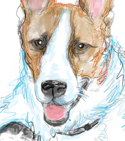
Yesterday I worked on Maybelle and Gus. These two handsome Corgis were a blast to play with. I just adore sturdy big headed short legged dogs. Some day I want to have a Corgi of my own.
Thursday, September 7, 2006
Próżna 2006 (translation of review by Dorota Jarecka)
I rarely do it, but it's worth it. The following is my translation of an article by Dorota Jarecka that appeared yesterday in the Polish newspaper Gazeta Wyborcza.
The Project Próżna 2006 breaks with the sentimental-folk climate of the "Singer's Warsaw" festival. Nobody here tries to prove that one can return to the past, bring it back to life or play it back.The Ulica Próżna 2006 Project
curator: Krystyna Piotrowska
until September 10, Warsaw
Every year the "Singer's Warsaw" festival attracts people to the otherwise deserted Próżna street and creates a fiction. The forgotten climate of a forgotten Warsaw appears again. The artistic project in the building at Próżna 7/9 is a whole other story: no orchestra rhythms, no singing cantors, no Jewish cuisine or cut-outs. Here nobody tries to make anyone believe that the one can go back to the past.
It's a rather painful than happy contact with the past, and the pleasant feeling of participating in a fiction is questioned and treated mistrustfully. The building was designed in the 1880's by the architect Brauman for Naftal Perlman. It was later bought by Zelman Nożyk, founder of the synagogue on Twarda street, the only one in Warsaw to survive the war [WW2]. The building extends along Próżna street, it has several entrances and reaches as far as the Grzybowski square. In 1940 it was inside of the first large ghetto. In the summer of 1942 the ghetto border was diminished and the building was left on the outside. That's why it wasn't brought down after the collapse of the 1943 [Jewish ghetto] insurrection. After the war it had state-owned apartments. Nine years ago it was bought by the Lauder Foundation, who sold it two years ago to a developer called Warimpex.
The house, together with a few neighboring ones on Próżna street, are something unique in Warsaw, since it survived both the Warsaw Insurrection [in 1944] and the reconstruction of Warsaw, but they also didn't undergo nearly any remodeling or improvement. They look just about the same as they did in 1945. When the Lauder Foundation bought the house, the locators renting apartments had to move out. There is always someone there in the abandoned houses, ripping out the old tiles or stealing the balustrade. The water pours in through the roof. We can check by ourselves: in the last years the house at Próżna 7/9 turned into a ruin. It would require an archaeologist to distinguish between war damages and the devastation of the last few years. All the signs mixed together. The house is a conglomarate of damage.
That is the house that artists have entered. Since the very first meeting with art here, we are nearly swept off our feet. Katarzyna Krakowiak, a young sculptor (teacher at the Academy of Fine Art in Poznań), filled the floor of one of the entrances with sidewalk tiles. They give to the first step, caving in. We discover they are laid on an air-filled, rubber foundation. We walk as through concrete waves, on a shaking ground. The work is called "Swindle of Balance".
Another work present was Artur Żmijewski's "Our Songbook". It consists of a film made in Israel - emigrants from Poland, 60 to 80 years old, sing Polish songs. It is an astonishing document. It shows there are no easy national qualifications. Żmijewski says: there are limit identities, fluid ones, impossible to name by a political or media language - and even less by the language of official passports. In his film, the artist shows the counsciousness of a specific group of people living in Israel, but one which is neither the consciousness of all Jews, or of all Poles.
The "Ulica Próżna 2006" project is exactly such a collection of individual messages. Krystiana Robb-Narbutt created a narration about her family which didn't survive the ghetto. It is made of toys inside of glass aquariums. The history is told with a naive language, seemingly inadequate to the events. Yet the subject is the very search for a language. The props used in this story (the toy wagon stands for the transport, the Christmas decoration "angel hair"[bands of very thin stripes of translucid plastic] is the grey hair of an old woman) are a conscious choice of an immature language. Because any other language lost its value and can no longer tell the story.
The common language becomes ridiculed. Something is "Jewish", something is "Polish" - but what does that mean, exactly? In Krystyna Piotrowska's installation, a real, live carp swims in the bathtub. Next to it, the artist put two recipes for carp taken from an internet cuisine book - carp "Polish style" and carp "Jewish style". The Polish one is a little more caloric, but it's pretty much the same. And the carp doesn't know what nation it belongs to.
A wooden model of Próżna street, as it is to look after the remodeling (to be made in near future), stands in one of the rooms. The developer wants to create a luxurious hotel in this building. The empty, enormous apartment on the second floor where I managed to enter, with the traces of the old life, with the colors of the old paints still on the walls, will be gone.
Próżna street cleaned of its junk and cleanly painted is a problem for me. In Poland what tells something about history is not reconstructed antiquities, but crumbs, wrecks, litter. The flashy, crystal clean street will stop being Próżna [meaning "Void" or "Vain"] and become Empty street. Yesterday, walking through the house at Próżna 7/9, I had the feeling that I'm walking through the real museum of the history of Polish Jews. How can we save it?
- Dorota Jarecka
Extra: from the curator's note:
The way Próżna street looks makes it completely visually autonomous from its surroundings, the current center of Warsaw. It puts it in an aesthetically and historically provocative oposition to the contemporary city. It constitutes a dramatic shock of a dead and decaying fragment of the city of the past with the live and indifferent city of today. It is the image of a conflict that is both ethical and aesthetic. It is the fruit of a German crime from times of War and of the post-war indifference.
Such a dramatic tension in the city space is an inspiration for the creation of the Artistic Project "Ulica Próżna 2006". The goal of the project is to show how the newest language of art can relate to this past and this present, which the opposition of Próżna street with its surroundings calls upon. (...)
The Artistic Project "Ulica Próżna 2006" is also open to interpreting it from the perspective of such contemporary phenomena as cultural, religious or political foreignness and animosity. Also today, they lead towards crime on a mass scale. - Krystyna Piotrowska (Polish fragment here)
Technorati:
Habits and Routines
Too often we think of our routines as boring, and habits as things to break. My dogs have taught me to look at routines with a unique perspective I never had when I was younger. Every little daily ritual is celebrated by our Scotties as though it may never come again. They never grow bored with their walks and they never get tired of the same old meal each night.
Lately I have been working on developing habits and routines that feed the soul so to speak. Like half of America I am trying to develop a habit of going to the gym a few times a week. That is going ok and I feel a little healthier. My favorite new routine is to spend one morning a week at our local arboretum garden center. I am taking the laptop and working on one pet portrait in an environment that is overflowing with life and it's own little eco-system. This routine gets me out of my studio and allows me to refresh and work at a slower pace, away from the phone and the constant distractions that seem to characterize any successful business. What type of mini-breaks can you work into your work week that will refresh your spirit and break up your normal routine?

Lately I have been working on developing habits and routines that feed the soul so to speak. Like half of America I am trying to develop a habit of going to the gym a few times a week. That is going ok and I feel a little healthier. My favorite new routine is to spend one morning a week at our local arboretum garden center. I am taking the laptop and working on one pet portrait in an environment that is overflowing with life and it's own little eco-system. This routine gets me out of my studio and allows me to refresh and work at a slower pace, away from the phone and the constant distractions that seem to characterize any successful business. What type of mini-breaks can you work into your work week that will refresh your spirit and break up your normal routine?
Wednesday, September 6, 2006
Art that speaks for itself
One of the most important issues I have been struggling with recently is the question of commentary within the artwork. Take a conceptual work and leave out the comments. What do you get? What is a life of a concept without a conceptual framework? Behind the rhetorical question lies a complicated issue. First, it's with the relation between the esthetic experience and the contextual, often intellectual approach. Then, going more specifically toward a commentary that is included in the work itself, we have questions of self-reference and self-presentation, and things get messy. Several issues: isn't it a sort of self-publicity, or rather, a self-justification, which serves as an excuse for any "misreadings", that is, readings different from the one intended? Of course, an artist's text (also in the case of an artist's statement) can get quite smart and distanced, so as not to get too involved. People like Cattelan or Matthew Barney are masters at that. But sometimes the work lives off the description. It seems to only make sense through the concept - and not because the concept is the work, but because either a) the work seems an excuse for the concept, or b) the concept guides us through the work like a map. It's the second case I'm interested in. Take Book, a formally simple work developed by four artists, two of them in the U.S., two in Belfast. Look at book. It is an artist's sketchbook exchanged every week for 36 weeks, creating a sort of an artistic dialogue between the two sides. The conversation of images, so common these days, might tell us little (especially given the small size of the images, which doesn't allow a more patient analysis). But everything changes dramatically when we receive guidance (I recommend the audio version, which is very pleasant and, well, human). Things become clear, make sense, and... sometimes appear as obvious (!).
Yes, an auto-guided work. Isn't it something problematic? Do we need a guide?
What's the problem with a guide? Well, for one, he makes it difficult to drive by ourselves. He also intervenes in the very aesthetic experience we're having, and can easily spoil it. In the case of Book, we can turn the comment off. But it's not that easy (like turning the TV off for someone I know). And then, there are works which impose this guidance. Sometimes it's a subtle comment by the author, other times, the curator makes his ideas all-too-clear, but at times it's simply there, put so clearly within the image, the film, the play, we can't miss it. Does it always make the work poorer? Because we're not driving? Can't someone else drive?
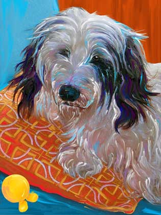
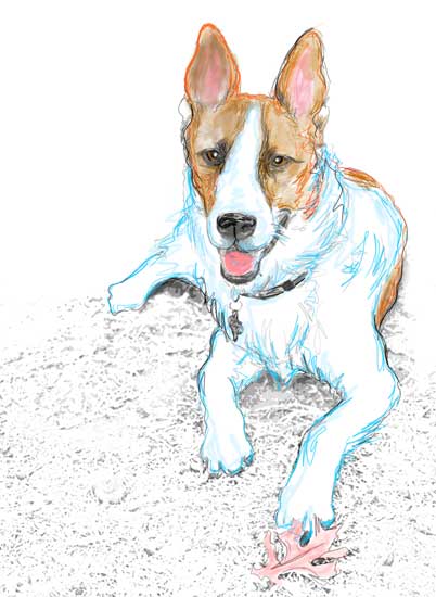
Miss Ruby
This pup sketch is another quick and loose Wacom drawing created on my laptop during a labor day weekend road trip to the hill country. This girl is Ruby and she belongs to my best friend.


Tuesday, September 5, 2006
Darker
I have just played the internet version of Russian Rulette, by Carlos Katastrofsky. This is what I got:

Monday, September 4, 2006
Easy still
Yes, we are still in the slow, gentle recovery zone. That's why all these really sweet links. Here is another one:
The story is too easy, etc etc. But let's just let it go for now.
Enjoy the fall of an angel. By Geoffroy Barbet Massin, produced by the digital editing studio Mikros Image.
I once asked Alex Kelly from Third Angel, who was a teacher of mine, what he did when he found something was too pretty, so pretty it was unbearable, like kitsch, but not really kitsch, only too pretty. He answered, "there is no such thing as too pretty. Enjoy it."
Bulldog Sketch

This Bulldog sketch was created in the car on a road trip to the Hill country in Texas. I think he turned out pretty good.
Saturday, September 2, 2006
Oh, why not


All paintings are by Esao Andrews. He also designs skateboards, in case you're interested. Here is an interview with the talented young man. Oh, and if you see his photos (on his page), mind you those are ballerinas' feet.
Subscribe to:
Posts (Atom)