Monday, June 30, 2008

Gaining new perspectives at White Rock Lake

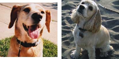
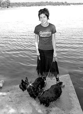
"Lola & Scotts at White Rock Lake Dog Park"

We live in Dallas Texas in an older neighborhood called Casa Linda. We are a 5 minute drive from White Rock Lake. This is a man made lake, that thrives and hosts a variety of wildlife, smack dab in the city. On the weekends we take the dogs for long walks there, and Dan rides his bike around the lake at least 3 times a week. On some occasions we will drive around our lake after dinner and smooch in the dark like a couple of teenagers. We love living here and never seem to take White Rock for granted. This weekend I purchased a canoe for Dan for his birthday and we got out on the lake, and paddled to the middle. It was so amazing to be in the center looking out. Seeing some of our favorite spots from a distance with water all around really opened my mind up in a lot of ways.

photograph by Dan Collins

So even though I worked this weekend and handled two portrait clients, we managed to squeeze in some play, and the mini-break of 3 hours was like an entire vacation. Later that day I laughed to myself and decided that our small 2 bedroom cottage is actually a "Lake House". No longer do I see my home as a tiny bungalow that can barely contain my growing business... nope we live in a lake house and we have a "boat".

Yes ... we are living the life!

Do you have treasures in your own backyard that you may not be "treasuring". If you are a city dweller go out and find those magical spaces in your city that are over-flowing with birds and other wildlife. There is no better way to recharge your battery!


Photos Above From a White Rock Lake Flickr Group ( not my own).

Scatter and Painterly Art brushes for Adobe Illustrator

A set of six abstract vector brushes for Adobe Illustrator by Celithralia. The pack contains three art and three scatter brushes...

You can get a variety of effects by experimenting with different stroke color, size an layer opacity.

To use the resource first, you need to expand the .zip file, load it in Illustrator and open the brushes palette (Window>Brushes). Download


Sunday, June 29, 2008

Travel and Business Icons

A pack of 26 vector icons for Adobe Illustrator thanks to sizer92. Download
To open the archive you'll need WinRar or another archiver application that supports .rar files.

Vintage Dog and Pet Photos


Handsome Scottish Terrier at 1930's dog show / found at Flickr

Cool vintage Doxie / found at Flickr
Vintage Dog and Child / Found at Flickr

Anyone that follows this blog knows that I have a bit of a Flickr Fetish. On weekends I often like to post my favorite finds. Last week I stumbled a really cool collection of photos that were not specific to Flickr or to animals really. Check out the Young Me- NowMe Gallery over at Color Wars.
You will find some vintage personal pics from folks and their modern day recreation of that pose or shot. The girl below is just one example.

Saturday, June 28, 2008

New Mountain Dog Painting At 5:00 AM

"Obie" Loose and Messy
Woke up at 5:00 AM this morning and could not get back to sleep. I figured what better time to work on pet portraits. This Bernese Mountain Dog is Obie. The proof sample above is not my favorite, but it was fun to get really loose and messy with that one. I like the art proof below a lot ... you can see All 6 proofs by clicking here.


Friday, June 27, 2008

Preface (old version)


I enjoy the reflective essay. But there are many voices and mine is only one of them.

When I began blogging I wanted to create a site where I could publish lengthy quotations from the books I read. Without being in graduate school, I live the life of the interdisciplinary scholar, always sifting through a different book and taking notes. Although these books have little to do with each other, I draw connections.

I draw connections because I see connections. Many think I am mad. The art of linking is a mad art. Linkages can be found anywhere.

Linkages between life and art, linkages between science and religion, linkages between architecture and writing.

Because I do a lot of reading I’m constantly discovering tidbits of wisdom; and that’s what I had originally called this website, “The Philosopher’s Tidbits.”

Since then, things have changed.

The first changes began to show themselves when I added to the pages my own ideas. It began with a short essay, and then a longer one.

I continued to publish lengthy quotations in between my essays. The purpose was twofold. By typing the quotes into my computer, I learned the material of these great thinkers. And two, I suspected that I could increase my page views if I published a famous quote on the Net every couple days.

I also have a long history of copying and recopying.

My earliest memory of obsessive copying is during my sophomore year in high school. I was taking an AP European History class and it was impossible for me to remember anything without copying it down in small print. I was very meticulous and neat. My handwriting drew the attention of my classmates. Before the AP test, I had two stacks of ink-covered pages.

And then in college I remember one of my professors gave us an assignment to keep a “literary theory journal". While she only meant for us to jot down a couple definitions, I set about the Sisyphean task of collecting two volumes of notes and quotations on literary theory. These journals epitomized my habit of overachievement; labors so absolutely unnecessary that they became marvels in their own right.

Therefore: I have a tendency to write things down, especially the thoughts of others.

The line between graphomania and reverence is a thin one. At times I copied down the thoughts of others because they inspired me. At other times I copied them down because I needed words to explain things about life. And there were also times when the physical act of copying satisfied a deep urge inside of me.

Could I have been using the words of others to form a wall around myself?

I am a writer.

I am also afraid to write.

Reaching for ready-made sentences relieves the terror of having to say something original.

And the words great thinkers used seemed different from my own. Their words were more permanent. Their aphorisms like pieces of jade.

I am an idealist. I will always look for the best, and try to achieve my best potential.

The pitfall of this thinking is that I am often mesmerized by what is esteemed “great”. And by fixing a perpetual gaze on others, I undermine my own abilities.

Sometimes I’m just lazy and would rather quote somebody else instead of writing an original sentence.

Whatever the value and greatness of another’s words, nothing compares to the freshness and originality of my own tongue.

I have taken refuge in the words of others for too long; now I am ready to speak.

I no longer want to be afraid.

At a certain age, a person’s identity and purpose gains momentum—

Until the direction cannot be easily averted.

We are—one day we realize—exactly who we have longed to be.

Whatever posturing we did in our youth blends indistinguishably into an essential personality and person—

This is then a symbolic and literal transition from the words of others into our own.

Our own language.

A prelude to the knowledge of our own being.

The Paint Brush Tool in Adobe Illustrator

The most popular category in Vector-Art.blogspot.com is Brushes. There you can find many free vector brush sets for Adobe Illustrator and some custom vector shapes for Photoshop. Probabably, there are some newbie visitors who are not familiar with the paint brush tool or how vector brushes work. The video tutorial below explains the usage of those features in Adobe Illustrator CS3. Тake a quick look at the brushes collection too, surely you'll come up with some interesting ideas.

Elliot the Chinchilla Persian Cat


This blue eyed kitty art has been set up for digital painting. Allison set this portrait up for me on Wednesday. I still have a bit of work to do on Mr. Elliot and a few more projects in line ahead of this one. I look forward to playing with this sweet little Persian.

Allison is our resident cat person and her last day is today. She has been with us for 2 years now. This gal has taken over all the web work, she helps with painterly projects, and she even reluctantly learned to stretch canvas. She will be missed around here. She is moving to Chicago to pursue her dreams of being a full time web designer.

We have also hired a part time summer intern named Jamie. Jame is going to help us with canvas stretching, shipping and whatever else we can think to throw at him. He starts today.

I run a very small portrait studio and I always get very attached to my artists. Hiring young students brings a certain energy and vitality into a business and yet you know going into it that their time with you is going to be limited. I always hope that my artists learn a lot here and remember Art Paw fondly.

Good Luck Allison! Now Go Find Your Passion.

Thursday, June 26, 2008

Vector Snowflakes

A pack of six different snowflake vectors from jeni-cek. Inside the zip file you will find an Illustrator (.ai) file, a Photoshop Custom Shape file and a pdf. Download

Color Tricks

Great color tips for Photoshop and Illustrator from Digital Arts Magazine
"Do your colours fail to dazzle? Do your lines lack oomph? Sebastian Onufszak shows some nifty Photoshop and Illustrator tools for getting great results every time.
Creating an image this striking takes talent with a pen and paper, genius with illustration software – and a lot of planning. Here, Sebastian Onufszak guides you through how he created this poster-style picture, all the way from his first sketch to the finished composition." View full tutorial

Squid & Dogs!

Yesterday I went on a spending spree over at Etsy. I bought a handful of squid themed goodies and a couple of dog art prints. Check out these terrific Etsy Artists.

"Elspeth and Yorrick ACEO Limited Edition"
by Scarlett

I am not usually a fan of the big eyed kids look, but this clever illustration was so absurdly wonderful, I just had to have it. This gal has talent to spare, check out her shop.

"Scrabble Tile Pendant" Lime Octopus

by HomeStudio - Creativity by Mark & Stefani, a collective


I am a big time scrabble player so when I saw these cute little pendants created on scrabble letters I just had to have one ( or two). Check out Home Studio, they even have a Chihuahua pendant.


"Vintage Natural History ala Davy Jones Locker"
by Blue Bird Lane
I have no idea what I am going to do with these tags with vintage squid art, but again .... I had to have them.


"Boston terrier on a tricycle"
By Brian Rubenacker
You have to check out Brian's artwork. In addition to lovely dogs he has some really wonderful robots. I think what I love most about his style is his sophisticated sense of color. Look at the print above and wrap your mind and eyeballs around that combo of mint and dirty gold with a punch of red ..... ZOWIE! Oh and yea, then there is the humor of a dog riding a tricycle ... makes me smile. This is going in my office.

"Scottish Terrier Print"
by John Golden

And last but never least is a Scottie print .....yay. I had favorited this guy months ago, and finally had to put it in my shopping cart. John is another very cool illustrator that does dogs and, yes robots.

Wednesday, June 25, 2008

Repurposing in graphic design

"Bailey" ( see all 6 proofs)
"Harrelson Kitties" ( see all 6 proofs)
"Bliss" ( see all 6 proofs)
Repurposing is a word I heard for the first time a few years back at a Photoshop seminar. I had been "repurposing" for years, and never had a fancy name for it. Here at Art Paw we repurpose or "recycle" our backgrounds and often try them on new portraits. We can change the layout or colors on the ground to achieve new results. The whole concept with "repurposing" is to create a library for yourself of original images or graphic elements that you can revisit later with new projects. All of our backgrounds are original creations and not "off the shelf" clip art solutions.

As you can see from the 3 images above one background can look entirely different on 3 different portrait projects. Instead of just plopping the ground behind our pet subjects, we always try to readjust the layout or slightly tweak the colors as needed. In the 1st sample above you see a lot of periwinkle, then the kitties have a little peach in their ground while Bliss had a wee bit of pink thrown in. One thing to keep in mind with repurposing: never allow it to make you lazy, you have to continually come up with fresh stuff and new ideas for your library of tools.

In what areas of your job can you repurpose files, tasks or other elements to help your work flow? Do you find yourself reinventing the wheel with each new creative project or do you have an arsenal of past work and inspiration to draw from?

Tuesday, June 24, 2008

More Thoughts on Building


Since my last essay I've done some thinking about the questions I've raised.


A friend also helped me to understand what I was trying to articulate.


She suggested that my point was:


To create something, a building, a work of art, we need sufficient space; without space, nothing can be built upon.


Another way of putting this: openness yields creativity.


With a strong desire to create, and to reflect on creating in the process, I am interested in the notion of "building" as a metaphor for life and art.


In my essay I wanted to join the metaphorical idea of building with the literal one.


Recently I have re-discovered an interview I read in Tricycle Magazine (Spring 2008), which deals with a similar topic.


The magazine interviews Christopher Alexander, a renowned architect and author of the book, A Pattern Language.


Here are some original tidbits from that interview:


"It had to do with the Whole and whether things can be aligned with the Whole and unfolded from it. At Harvard, when I was doing research for my Ph.D., I spent a lot of time in the anthropology department, simply trying to find out what it was that people in all the so-called primitive societies had been doing when they built their buildings. Most of these buildings were, at their best, beautiful, and at the very least, harmless. They were building in a way that helped what I call unfolding--that was almost a given. People wanted to revere the earth, revere God, and maintain the Whole. And that is not the motive now."


"Yet it is the Wholeness that binds things together. My own experience as a builder is that you cannot do this unfolding unless you do it as an act of worship. Craftspeople, ancient and modern, know a tremendous about about this. If you're not steeped in that entity, if you really don't think about it or don't believe in a version of it, then when somebody says, Okay, now build me this motel, you've got absolutely nothing to go on."


"If people think something ought to be a certain shape and then they start making it that shape instead of doing what the unfolding tells them to do, they will royally screw it up. Because of concepts! Concepts interfere with this process--indeed, this is the teaching of Zen, isn't it? You can only act appropriately according to Zen teachings, if you are free of concepts. Because human concepts, no matter how cleverly conceived they are, almost always work against the Whole. And that's what we've been witnessing in architecture now for about one hundred years. The world is now prevented from unfolding."


Later in the interview, discussing universal design principles, he says:


"So why are these forms appearing again and again in different ways? That's what essentially led me to believe that the unfolding we're witnessing is a more fundamental process. The space unfolds to form these configurations, and the particular force that we say are responsible are really just examples of a much more general process that's going on."


"The Whole is always taking shape by differentiating itself in a way that is harmonious with what has come before."


Now I'm going to quote my own essay and bring the two ideas together.


Here is what I said in my essay:


"I want to erect buildings. Not concrete ones. But I believe in the architecture of ideas. I believe there is a harmony to life and a harmony to our relations with others. There is perhaps no secret to discover but only a monument that we have been creating for the longest time. The monument contains our history, our meanings, our vast disconnected thoughts and it connects them all through this great edifice of time."


Revisiting Alexander's interview, I wish to make a slight revision to those words of mine.


Alexander would agree with me about the invisible structures, about the harmony of our relations with others, about the Wholeness of our lives, our lives as spiritual edifices, and our individual accomplishments as personal buildings.


But he would also add that we, as individuals, do not create this Wholeness.


As individuals we perhaps allow the Wholeness to unfold. We can build in a way that "helps" the unfolding.


And this is something that Heidegger never thought of because he was too entrenched in concepts, even though he was trying to point to something beyond them.


The history of Western Philosophy is all the same in this sense: conceptual and abstract.


Hear what Lin Yutang has to say about Western Philosophy:


"Philosophy in the Western sense seems to the Chinese eminently idle. In its preoccupation with logic, which concerns itself with the method of arrival at knowledge, and epistemology, which poses the question of the possibility of knowledge, it has forgotten to deal with the knowledge of life itself."


He concludes, using a prodigious metaphor:


"The German philosophers are the most frivolous of all; they court truth like ardent lovers, but seldom propose to marry her."


Perhaps I descended somewhat into abstraction in my first essay, but my purpose wasn't to put forth a single idea so much as to allow the unfolding of my mind.


If I can merely touch the Wholeness in my writing that Alexander talks about in relation to buildings, I will be satisfied.

A Pug Named Bruno

Painterly Style Pet Portrait
"Bruno Proof #5 above"
Original photo above
This cute little guy is Bruno and his Mom is a very old Art Paw client. Hmmm that did not sound right at all. She is not old, but she did commission a pet portrait with us years ago when we were first starting out ... I think we were both just teenagers back then. Bruno's new artwork was created in my painterly style and the approved proof is # 5 with the fun and funky Mod circle ground.

When Shelley ordered her first portrait with us, way back in 2002 we were focused on Warhol looks and Master Paw Prints. The pop art image below of Daisy was Shelley's first project with us. That expression and side "eyeball look" made Daisy an instant Puggie favorite around here.
Just a few of our other painterly Pugs on Youtube Video
click to play

Monday, June 23, 2008

Fade Away


by dozign

Many New Pet Portraits This Week

Photos lacking in detail ... not a problem at Art Paw!
( Original pet photo above)
( digitally painted & altered version above)
Compare the two images above to see how all important the eyes are. If an image is lacking in detail or possibly a bit low in resolution I find that my first goal is to make the eyes sharp and to give them contrast and sparkle. If you can make the eyes work well then the rest of the portrait will follow. If a client supplies a photograph with little more than black hollows for eyes, I will do my best to paint in and dress up what I have to work with. Since the eyes are really the windows to the soul it is always best to start with a great high resolution photograph that shows off the eyes very well.
We have added a handful of new works to the site this last week, and have around 6 more to proof this week so check the art dog blog daily for new artwork.

Figure Ground with Adobe Illustrator

Figure - Ground is one of the Gestalt Principles widely used in Graphic Design, especially in Logo Design. The perceptual factors of Gestalt are creating visual frames of references that provide the designer with psychological basis for the dimensional organization of the graphic elements he is working with. By using contrast between elements the "Figure-Ground" principle is fundamentelly allowing the viewer's eye to "read" imagery. Figures are the positive elements defined by spatial relatinships which exist among all of their parts. Ground stands for background, white space and negative space format that composes the visual image. See examples below.


In the past, graphic designers have had to put a lot of effort to precisely illustrate figure - ground concepts. Luckily we live in technologically advanced times and Adobe Illustrator is making the process way easier...

In this tutorial you will learn how to create a simple figure - ground vector. All you need to do is to overlap letterform elements and create the spatial relationship between them by using one of the shape modes in Adobe Illustrator.
For example, I will use the letterforms "V" and "A".

1) First, create a new file (print or web).
2) Select the type tool, choose a typeface, and black for color, then type the first Letterform.
3) With the same tool, type the second one (you can impovise by changing the font but I will stick with the same - Myriad Pro Bold 60 pt).


4) Using the selection tool select the second letterform (in our case "A").5) Move the "A" over the "V" in a way that parts of the letter forms overlap.


5) Open the pathfinder palette - Window>Pathfinder or Ctrl+Shift+F9 / Command+Shift+F9 (Mac).
6) Select both letterforms with the Selection Tool and then click on "Exclude Overlapping Shape Areas".


Before you finish, you can go back and experiment with different fornt. When you're satisfied click on the Expand button and save your work.
Imagery by PsuedoDragon

Saturday, June 21, 2008

Pen Tool Skills : Bezier curves

Another great tutorial from ComputerArts Magazine, that may be a great warm up exercise for newbies still feeling unconfortable with the pent tool in Adobe Illustrator
"Used properly, the Bezier-curving Pen tool in Illustrator is extremely powerful and versatile. Ben the Illustrator shows you how to get the most out of it
From furniture to album sleeves, few would argue that the 1960s bore witness to some classic designs. It was also the decade when the Bézier curve came to prominence, as employed by the French mechanical engineer Pierre Bézier.
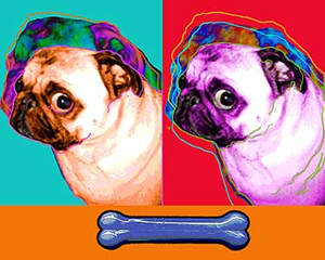
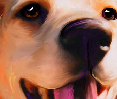
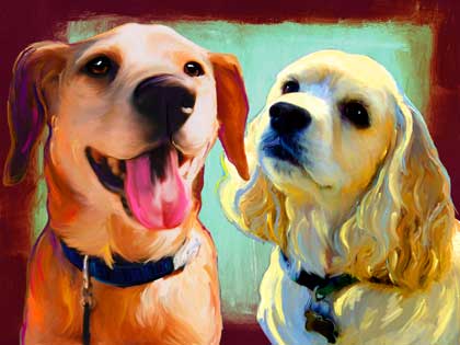
The Pen tool’s use of Bézier curves makes it one of the most valuable features of Adobe Illustrator, and it can create beautifully flowing lines, perfectly realistic shapes and super-fresh graphics." Full tutorial and files

Laurel Leaves

A set of laurel vectors for Adobe Illustrator. Simple solution if you feel stuck with ideas for a logo design project. With Laurel Leaves you can express: stability, glory, victory... add more in the comments below if you want. Download

Wednesday, June 18, 2008

Video Video Video


Octopus Mosaic
Originally uploaded by artpaw
Seems like everyone is focused on video these days. Tonight I experimented with my web cam to show off a new Mosaic I have been working on. I uploaded to Flickr because I hoped my Flickr pals would be kind when and if they comment. This short 90 second clip is very rough, but if I waited until I looked great and sounded great .... well I would never post anything.

The other video I want to share is from Moira over at Dog Art Today. She has created a fantastic dog art video and she included our artwork of Bella. Thanks Moira and good job. If you double-click through to youtube then please leave her a kind comment, she is trying to get this baby to go viral, and I think she has good shot at that.


Oh and I want to share a quick link from copyblogger about video and marketing:
Check out Gary Vaynerchuk

Intro to Blends in Adobe Illustrator

Usually digital illustrators use blends to achieve gradient effects in their artwork (Select objects then Object>Blend>Make). Please don't confuse blends with gradients, they are two different things. Think of blends as gradations between multiple vector objects. In Adobe Illustrator the blends are actually live transitions between objects that will automatically update when you distort or change the position of one of the blended objects. The automatical number of those transition steps is based upon the difference in shape and color between the the original objects. (see the examples below)To access the steps as individual objects the blend has be expanded (Object>Expand), but after it will no longer be live. A manual way to control number of transition steps is if you access the the blend options dialogue box (Object>Blend>Blend Options>Spacing>Specific Steps).
difference in shape
difference in color

Florescence Brushes for Adobe Illustrator

Fresh stuff from cherryflip. A set of 38 Vector Flower Brushes for Adobe Illustrator. Download. By the way, if you come up with a concept using resources you found here , feel free to post links in the comments.

Tuesday, June 17, 2008

"Fiesta" By Christine Brallier

Check out this terrific Mosaic by one of my Flickr pals. I was so impressed with her photo set documenting the progression of this piece that I asked her if I could make a little slide show movie for her. Christine is a very talented artist and you can find more of her work here:
http://www.cbmosaics.com/

Monday, June 16, 2008

What color is your Monday?

Wag The Dog


My Monday is a grounded group of greens bordered by some zippy reds and violets. This pallet was inspired by Olive's artwork.

Sunday, June 15, 2008

The Bridge


Martin Heidegger, German existentialist, writes:

"to be sure people think of the bridge as primarily and really merely a bridge; after that, and occasionally, it might possibly express much else besides; and as such an expression it would then become a symbol of those things mentioned before." (Poetry Language Thought)

So just what is Heidegger getting at when he says, "much else besides"?

Clearly he is not talking about the physical and concrete bridge.

My guess is that he means: bridge as symbol, bridge as metaphor, bridge as analogy.

Literal and figurative meanings of words seem to stand at opposite poles of representation.

Let us begin with a concrete bridge. And instead of a bridge, let's use a building.

What makes a building unique? A house, a museum, a skyscraper, a stadium. These are structures that serve a purpose. Right? The purpose of a house is to give shelter. The purpose of a museum is to display artifacts or artwork. The purpose of a skyscraper, generally speaking, is to give shelter or provide office space. The purpose of a stadium is to stage sporting events.

The hollow-space inside a structure makes it usable. This is the practical dimension of a building. The concrete.

What is architecture?

To me, "architecture" refers to both the building itself and the style of the building. Architecture is also the construction of the building.

Besides serving a purpose, we can position ourselves outside of the building merely to look at it. That is, to see the building objectively. To see the building as art.

I am aiming to discover a linkage between two worlds. The first world is the concrete world. The second world is harder to describe. But let me try.

Bernard Tschumi, a renowned architect, reports to the NY Times Magazine (June 7) in an interview:

"My apartment reflects my views as an architect. It is minimal, austere. The architecture doesn't impose itself upon you. The apartment is a stage for other things to take place."

I am very interested in this aesthetic: "a stage for other things to take place."

Call it the aesthetics of negative presence.

A building is a container, a vessel of sorts.

The container should not intrude upon the space inside. The words on the page should not draw too much attention to themselves. The vessel should be clear, transparent. Through the vessel you should be able to see other things.

Two elements come into play: the material and the non-material (or spiritual).

They are intimately linked, although they do not appear to be. Heidegger writes that buildings "are locations that allow spaces." He goes on to say, "That is why building, by virtue of constructing locations, is a founding and a joining of spaces."

Tschumi prefers an apartment that is "minimal". Too many objects take up floor space in architecture and in life.

The more you do, the less you feel you have accomplished. The more you buy, the less you feel you have. Our lives become increasingly more diminished with each new acquisition and activity. We will always crave freedom so long as we are bound to a collection of things.

Lin Yutang writes, "It is that unoccupied space which makes a room habitable, as it is our leisure hours which make life endurable."

I do my best thinking when I am not intending to think. I do my best thinking when I am walking outside, among the trees and the whistling birds. The only roof over my thoughts is the sky. My intellect can spread into a larger vessel, the vessel of nature.

A writer builds structures, not unlike buildings.

These structures "allow spaces" for conversations. Writing invites participation by an audience just as buildings invite people to come inside.

How do we "stand inside" a poem or a novel?

Sometimes when I'm reading a novel, I feel as though I am immersed in a vivid, dreamlike world. But I'm also aware of my reaction to that world. The imagery may evoke sadness or joy in me, or produce a train of exquisite thoughts.

It seems as though a structure has gone up around me without my realizing it. An invisible structure was errected, a container, a vessel for my thoughts and emotions. And now I am baffled by this fourth dimension.

Where does the material end and the spiritual begin? Or are they so conjoined that it is impossible to seperate them?

When I'm reading I'm only aware of physical sensations and mental ones. But somehow they mix inside my experience. The spiritual and physical intermingle.

But why am I curious about this topic? Why has it nagged at my conscience, propelling me into this essay?

This essay is the conjoining of disparate ideas, the founding and joining of spaces. And these are new spaces for me to stand in and inquire about the material and the non-material. But what does it mean? What am I trying to accomplish? I am not sure yet. Perhaps I will continue to examine these ideas. I am afraid they have not been penetrated yet.

So there are visible and invisible structures. A poem is an invisible structure although it's meter and stanza breaks may be visible. A marriage is an invisible structure; sealed by the trust between two partners. A symphony has an invisible architecture. We listen from the audience and hear so many layers of sound built one upon the other.

I want to erect buildings. Not concrete ones. But I believe in the architecture of ideas. I believe there is a harmony to life and a harmony to our relations with others. There is perhaps no secret to discover but only a monument that we have been creating for the longest time. The monument contains our history, our meanings, our vast disconnected thoughts and it connects them all through this great edifice of time.

Who know? The edifice may not be here tomorrow. But whatever I build, I know, will remain in someone's mind.

I will repeat the sentence I quoted at the beginning of this essay. Maybe it will shed greater meaning on the topic now that I'm through; maybe not:

"to be sure people think of the bridge as primarily and really merely a bridge; after that, and occasionally, it might possibly express much else besides; and as such an expression it would then become a symbol of those things mentioned before." (Poetry Language Thought)

Facebook

I've entered the 21st century and joined the latest "digital social networking" craze. Something called "Facebook"...hmph...never last :)

Here's my profile: http://www.facebook.com/profile.php?id=1322447505

Happy Father's Day


Happy Father's Day
Originally uploaded by artpaw
Happy Father's Day Everyone! This is an old photo of my Dad & Mom. He was probably about 20 years old here, and my Mom was 17.

Saturday, June 14, 2008

What have you learned from your dogs?

My dogs teach me a lot. Each is so different from the other and so of course they have their own unique lessons to share. Here is a list of 5 things I have learned from each of my Scotts.

5 things I have learned from Big Tommy

#1 If you love something throw it under the dresser, or absence makes the heart grow fonder. Tom has a bad habit of playing against our bedroom dresser and losing his ball. When this happens he whines until we retrieve it for him.

#2 Celebrate your joy in song. Tom sings in a high pitch when you lightly rub his ears.

#3 Be a kind leader. He is a gentle sweet Alpha.

#4 Sundays were made for the lake.

#5 Play all out, then play some more. Tommy is our most athletic dog and our healthiest.

5 things I have learned from Ajax

#1 Anytime can be snuggle-time.

#2 Even the lowest man on the totem pole can be a brave warrior and fierce hunter. Ajax has caught more than a couple of squirrels in his 4 years.

#3 Laugh often! Our little boy throws his head back open mouthed and giggles when you start laughing and rubbing his chest & belly.

#4 Avoid processed foods. Our allergy prone boy eats only the best holistic diet that includes cooked chicken & rice and high-end organic kibble.

#5 Expand you pack. Ajax enjoys having lots of friends, both canine & human.

5 things I have learned from Pixel

#1 Be brave in this scary scary world.

#2 When in doubt, bark first ... ask questions later.

#3 Always run with your pack, there is safety in numbers.

#4 Walk softly & chew on sticks.

#5 Sometimes the sweetest love is the hardest to win.

Leave me a comment and tell me what your dog has taught you ... be sure and include their name.

Friday, June 13, 2008

40 Hours of Vector Drawing


Science Machine from Chad Pugh on Vimeo.

Animating Vector Characters

Alexis West shows how to bring your vector characters to life in Flash, turning an Illustrator image into a cool interactive animation.Being able to dream up and create a cool character or picture is one thing, but Adobe Flash lets you take your work to a whole new level.
Creating animations is a simple, if rather time-consuming, process – and you can even make your image interactive by adding buttons and other elements. As Alexis West shows in this tutorial, with Flash and a bit of creative thinking, the possibilities really are endless. View Full Tutorial

Color Bunnies

Just stumbled across this terrific ad for Sony... happy clay bunnies multiplying and bouncing around the city. Have a great Friday everyone. Get outside this weekend. Find your own clay bunny.


Thursday, June 12, 2008

Vector Halftone Patterns

A collection of 52 seamless halftone patterns for Adobe Illustrator by faeriedreamer


To use, load the PDF file in Adobe Illustrator by selecting File>Open>Browse (not by dragging it in the program). For preview click on the image below.


NY Times Week in Review: The Ethos of the Net


From an excellent article in the New York Times, "The Wiki-Way to the Nomination," Sunday Edition (June 8, 2008), by Noam Cohen, here are some insightful observations about the ethos of the Net, and how it's shaping the way we see the world.


Philosophical quotations:


"But at the same time, Mr. Obama's notion of persistent improvement, both of himself and his country, reflects something newer--the collaborative, decentralized principles behind Net projects like Wikipedia and the 'free and open-source' software movement. The qualities he cited to Time to describe his campaign--'openness and transparency and participation'--were ones he said 'merged perfectly' with the Internet. And they may well be the qualities that make him the first real 'wiki-candidate.'


"In this scheme, Mr. Obama's role, at least in rhetoric, is less leader than facilitator, a conduit for decentralized collaboration as described by James Surowiecki in his book 'The Wisdom of Crowds.' 'The ethos of the Net is fundamentally respectful of and invested in the idea of collective wisdom, and in some sense is hostile to the idea that power and authority should belong to a select few,' Mr. Surowiecki wrote.


(bold mine)


Link to the Article

Another Spotted Tongue

"Olive"
This has been the week for spotted tongues. This happy girl is Olive. Her original photograph did not have tons of detail, but it did have tons of joy. I decided to sketch in some loose and happy lines on this shaggy pup's coat. I would say that 90% of the time we do close head & shoulder crops. Every now and then we get in a photo that just begs to have the full body included and this is one of those times.