Tuesday, November 28, 2006

2 days left to order painterly portraits


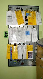
Wow, this month has flown by. There are only 2 days left to order our painterly style portraits ... yes, because I am still the only one here doing that style. I am planning to be pretty strict on the deadline this year. As you can see from the snapshot of my pending board the orders have been coming in all month long. The pending board represents about half of the work we have in-house. We also have a wall-pocket for revisions and the to-be-printed stack. The Warhols and Master Paw print styles have a deadline of 12/04 and that is next Monday! Local Dallas clients can always call us to see if we can squeeze them in at the last minute since shipping is not an issue. I really thought we were going to be a tad bit slower this year, however it is not stacking up that way. Ah well, not to worry .... we will get everyone proofed and printed very soon.

Monday, November 27, 2006

A New Pet Portrait Artist Blog


I heard from a another portrait artist the other day and she is an old e-mail buddy that actually did our dog Atticus in acrylic a year ago. I commissioned her to do something for Dan after Atticus passed. Anyway, check out Linda O'neill's new blog. Please visit her pet portrait blog and post a comment or two. Linda is a very talented portrait artist working in Colorado. I just ordered some Atticus Greeting cards from her. I was so thrilled to see she had chosen to include our boy in her new line of cards.

We were also surprised and elated to see our Pixel in Kathy Weller's new doggy calendar. She is even Miss January ...what an honor! I am going to purchase that calendar right now. I have often wondered how my clients feel when they find their pet's artwork on gift items at our site .... now I know ... it is pretty darn cool. It is really fun to be the client!


Many thanks to both of these talented women for their friendship and inspiration. And thanks for immortalizing my fur-kids.

Between us (and the body). Shen Wei


A Chinese photographer moves to the U.S. Here, he discovers bodies. Bodies as social places. Bodies as identifiers, as the places of definition. How does the place one belongs to relate to the body one owns (isn't this a beautiful expression? to own a body...)?
Shen Wei's series Almost Naked is a guided tour of identity caught in body. Or of the body as caught up in identity. Whichever way you put it, there is a feeling of self, that is, that the pictures are not of the person's body, but of a person as she reveals/hides herself. There is a certain foreigner's curiosity of how the others deal with who they are, what they are, and what they can present to someone else. This curiosity, and the way the subjects deal with it, is one of the most delightful aspects of Wei's work.
There is sometimes a feeling of a dangerous zone, of a fragile state that almost makes one look away, as if there was something indecent about showing oneself. As if it were an exposition and not a capturing of something. Then again, curiosity is stronger and I dare you not to look at all the pictures with great attention. The attraction of intimacy, combined with a gentle sense of humor, is right on the spot. Shen Wei says:

Once I achieve the trust of the model, I can feel their energy and their desire to be seen and be explored but at the same time still reserve some for themselves. It is in those Almost Naked moments that my subjects are the most exquisite, when things occur, and what generally is not displayed initially in public is exposed. I emotionally and physically strip the sitters when the trust and friendship is built between us. The key to building that trust and friendship is to make them feel at ease with conversation and personalized emotion contact. It can sometimes be psychological, sometimes more sensual, sometimes more or less sincere, depending upon the personality of the sitters and the intimate level of the environment. It is the art of psychology within making art.


None of the people smile.

I found this through the placebokatz blog, which to my great joy (as always when that happens) has put a link to this humble page.

Saturday, November 25, 2006

Yinka Shonibare and the artist's freedom

Yinka Shonibare, Scramble for Africa (2003)

Shonibare's most famous works play on the idea of origin and power. The first lecture is clear: headless people are scrambling for Africa. They are dressed in European clothes, but made of African fabric. They are false. But this goes further. The type of cloth they use, called batik, is used throughout Africa (and not only) and considered a local tradition. But, as Shonibare says, that is not the case:
...the fabrics are not authentically African – they were produced by the Dutch in the 19th century and then subsequently by the English for sales to the African market.
That makes the situation even more absurd and scary. What is left of Africa? And what can be left for Africa?

But there is another issue related to Shonibare that has been interesting me more. The freedom of the artist vs. the necessity of his functioning well in the system.
Let's start off with this:

Yinka Shonibare, The Swing (after Fragonard) (2001)

How much does the artist need to know about what he is doing?
And really the idea behind it is to draw a parallel with the relationship between the contemporary first world and third-world countries. I want to show that behind excessive lifestyles there are people who have to provide the labour to make this kind of lifestyle happen.

But generally I think I made a piece of work about this painting because I actually admire the work very much. And I like the contradiction of taking something that’s supposedly ‘ethnic’ and putting that onto classical European painting.

All this seems fairly light, naive, compared to what the critics have to say about Yinka Shonibare's works. Does this mean he is unaware of the worlds he is creating? Is he simply using strong imagery that brings about a huge load of references? Possibly. Does that change anything? Does that make him a worse artist? Should the artist be his own critic? Should he be a philosopher as well?

Obviously, the artist part of being an artist is to make art. And then, see what happens. That's in the ideal world. In the one I know, the artist also sells his product, by being who he is, by having the life he has, by speaking the way he speaks. This doesn't signify the impossibility of defending oneself through work alone, but certainly makes it all the more difficult. And brings another issue.

What if Yinka Shonibare didn't make contemporary ethnic art? What if his work were just contemporary, and dealt with, say McDonald's or sex or any other issue? And let's imagine, for the sake of the argument, that it weren't any worse than what he is doing now. Would we know him? Who would he be? Would it matter that he is black, was born in London, lived in Nigeria and studied at Goldsmiths? There is a very irritating way the art world defines itself through basic associations of life and work. Possibly this has to do with the art having moved into a direction that is so difficult to judge (although artists like Shonibare play remixing the old school in a somewhat old-school way) that more is required in order to give it value (clearly also market value).

What happens to the freedom of the artist? What freedom does the artist have? Will we ever know of Shonibare's landscape sketches? And more broadly: how does an artist deal with the fact that many of his better ideas might not actually be better as seen from a social/market perspective, while some of his simpler, more obvious ideas are caught on and bought on the spot? How many more African-dressed figures does Shonibare need to make? How many can he handle? Isn't this exactly the same branding phenomenon as in other areas of commerce? Can we still call this investigation and digging in? How often do we see an artist still digging many, many exhibitions later, when he really shouldn't? I believe Louise Bourgeois said about Francis Bacon that it is true that he always paints the same painting, but it's a very beautiful painting.

Isn't there something wrong with this picture? Some sort of an obsession that has more to do with the way one is seen than with the way one sees? Of course, Bacon had enough guts to spill them over and over again on the canvas. But let's put it bluntly: most of us, most of artists, are not Francis Bacon. And still, they keep on painting the same painting. Looking for what? Perfection? Style? Truth? Exploring? Or self-branding, self-censoring?

Yinka Shonibare, Toy Painting 26 & Toy Painting 27 (2005)
Tuesday, November 21, 2006

Steam engine train trip

Well this is the time of year that I usually stop taking any days off and I try to work straight through until a week before Christmas. Sunday was an exception to that routine. I took a much needed break and went with my Father and my Husband on a train ride through East Texas. The trip took about an hour and a half. It started in Rusk and ended in a little city called Palestine. The steam engine train cut through a forest at a whopping 30 mph. All of the cars were packed and we were hanging with the very young and the very old. It was quite fun to be traveling with both young families with toddlers and senior citizens ( many of whom had train ride memories from long ago). The slow journey was quite relaxing and there was nothing to do but take in the view from our window and enjoy the fall colors. There was no cell phone reception in this big hunk of metal out on the middle of the country-side so even the few teenagers on board had to relax back in their seats and be with their own thoughts for the ride.

Click here to read more about our Historic Texas State Railroad.

It is back to the electronic easel for me this week. I am trying hard to get about 10 new portraits on-line before Thanksgiving. I'll try to post some of my new projects soon.

Dad is to the left and husband to the right

Our Train!

Shadowing light. Jindřich Štreit.

This magnificent artist has been recommended to me by my brother. Just look:

And more...


I feel like showing most of the images on the site which represents him, www.talent.cz.
One thing makes me wonder. All of the pictures above were taken in Czechoslovakia before 1989. The question that comes to mind is: what can be the role of the circumstances on a photographer's quality? If a photographer is a document-maker (in a broad sense, and I mean a photographer that goes out of the studio), than doesn't the reality he has access to play a crucial role? How would he deal with a less unreal reality?
Jindřich Štreit tried. Many of the pictures were taken in France, some in Germany (?). And they do look more pale. Some of them are very pretty, some play with the idea of social criticism, but it seems far from the quality of the Czech works:
So is this a question of time? Does the world today have less to offer to the eye of a photographer? Apparently not:

The picture was taken in 1997. But in Siberia. Which still remains somewhat exotic. Exotic. There's the rub. Maybe the politician that bows while saying hello is just as exotic to someone from a different culture as many of those pictures are to us? (And then, of course, what is "us"? Isn't it an impossible word when publishing something on this site?)
So the question is: can the world be really becoming boring, or is it just becoming more alike to a certain standard we are used to, and this standard is just as ex-centric to someone from somewhere else as this someone is to us? And another, more specific point: what is the artists position in this mutating situation? Or rather, what are his possible positions? How does the role of a witness change in these changing times?

Saturday, November 18, 2006

Cafe Press and Custom Gifts

Today's resource link is for any artist or ordinary pet lover wanting to create unique custom gift items with their pet's image on it. Most of you have probably heard of Cafe Press, but if you have not you need to check out their printing services. They do all of the printing on our gift items such as mugs, t-shirts, greeting cards, journals, clocks, pillows, magnets, and much more. When our clients order custom artwork we create a gift-shop page for them to shop from, and Cafe Press handles all printing, shipping and order taking for us. It is a pretty cool system, and with a money back guarantee I know they will handle all my clients well.

I have turned a few artists on to Cafe Press over the years. Actually I have referred over 60 artists to Cafe Press in the past 5 years. Check out these two shops from a couple of my pals and by some cards today, as they are on sale 25% off until tomorrow only. The floral artist is Sheila Finkelstein, and the Japanese dog art is from an old client and girlfriend in Japan.


Through Cafe Press we have created a huge giftshop (over 5000 items) with every breed of dog & cat that you can imagine. We donate 10 % of our giftshop sales to local rescue groups. Check out our snowflake cards and stock up while they are on sale. Sale ends tomorrow.


Make art to experience and not art to read about

"7. Don’t make modern art.

Modern art tends to be ironical, cynical, self referential, afraid of beauty, afraid of meaning
-other than the trendy discourse of the day-,
afraid of technology, anti-artistry.
Furthermore contemporary art is a marginal niche.
The audience is elsewhere.
Go to them rather then expecting them to come to the museum.
Contemporary art is a style, a genre, a format.
Think!

Do not fear beauty.
Do not fear pleasure.

(...)


Real people are starving for meaningful experiences.
And what’s more:

society needs you.

Contemporary civilisations are declining at an unsurpassed rate.
Fundamentalism.
Fascism.
Populism.
War.
Pollution.
The world is collapsing while the Artists twiddle their thumbs in the museums.

Step into the world.
Into the private worlds of individuals.
Share your vision.

Connect.
Connect.
Communicate.

8. Reject conceptualism.

Make art for people,
not for documentation.
Make art to experience
and not to read about.
Use the language of your medium to communicate all there is to know.
The user should never be required to read a description or a manual.

Don’t parody things that are better than you.

(...)

Don’t settle yourself in the position of the underdog: surpass them!
Go over their heads!
Dominate them!
Show them how it’s done!

Put the artistry back in Art.
Reject conceptualism.
Make art for people, not for documentation.
Make art to experience and not art to read about. Use the language of your work to communicate its content. The audience should never be required to read the description.
The work should communicate all that is required to understand it. "

-
Realtime art manifesto (fragment)
by Auriea Harvey & Michaël Samyn

(but see e.g. the comment to this post at networkable social object for a critical view of the above)

Friday, November 17, 2006


Delicious.
The only thing that irritates me here - and I suppose that's just a silly problem - is that the brilliant guys that created this, Winkler and Noah, have absolutely no problem whatsoever selling these wonderful, environmentally friendly messages...

... and next to them, selling some of the most environmentally unfriendly ones. It's as if there was no difference. Who are they, you might say, to decide on that? They simply do their job, and that is, to come up with something that sells well whatever it is its supposed to sell. Hmmm... I guess you're right.
But just go beyond the surface of it's all the same and compare this to Adbusters. While Adbusters try to be the Good Guys (with all the risks that are part of it), Winkler and Noah would be an example of the UnGuys - neither good or bad. Excellent quality for sale. Sound right?

(via)

Thursday, November 16, 2006

The Perfect Gift


Keep the world full of surprises.
If you don't have any books to cross, and are really not in the mood for a birthday party performance, then think of something else. Make it fluffy, hard, shiny, matte, transparent, sticky, disgusting, funny, shocking, simple, personal, whatever you make it,
hide it.
Anywhere you want, as long as it's a place accessible to anyone.
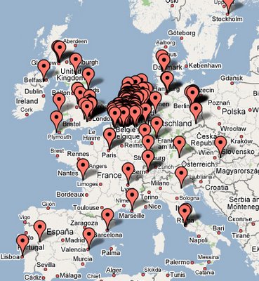
Then, go to Drop Spots, and put your drop spot on the map. So far, it seems to have been extremely popular around Belgium and the Netherlands. I suppose the authors - Brijetta Hall, Dan Phiffer and Ed Purver - might have something to do with it?
So far, there is only one drop spot in Lisbon. Hopefully this will quickly change. I'll try to participate as well.
(There isn't a single drop spot in Poland! Get to work, people!)

***

How far are we today from the first experiences with 'pervasive internet' by the folks from Blast Theory? Not very far. The gaming industry is getting all happy, there are new initiatives (especially with locative media, but not only - see this absolutely amazing site with pretty much everything you thought was possible already cataloged). But one can feel all this is still very young. Artists don't really know what to do of all these possibilities. It seems like the world is suddenly too large, not too small. And so these are small experiments for something that, I think, will be much more impressive, overwhelming, and deep-going than anything we see around today. Are you as curious as I am?

Picasso & Lump

Picasso & Lump is a great book for both art lovers and Doxie fans. Book contains charming photos of Picasso with Photo-journalist David Douglas Duncan's Doxie "Lump". Picasso painted a portrait of Lump on a plate and the little guy later found his way into Picasso's suite of 45 paintings reinterpreting Velsquezs masterpiece Las Meninas.

Wednesday, November 15, 2006

Arts Magnet High School Senior Show

Last week we had the pleasure of attending Teryn's senior show at the Arts Magnet. Teryn is a talented young artist that works with us on Saturdays. It was really fun being at a High School Art show. I must say that the work seemed to be of a much higher caliber than when I was a senior at The Arts Magnet back in 1980. I was very fortunate to attend the Dallas Arts Magnet way back during it's infancy. The school has come a very long way since then and students now have to undergo a rigorous portfolio admissions process. Dan and I were both very impressed with Teryn's artwork. She has a very sophisticated approach to all the various mediums and her drawing skills are far beyond that of the average high school student. I am posting a shot of her next to a terrific self portrait that she titled "Hey".


For many kids in the average American high school the prom can be just about the biggest night of your life. For an art student your senior show, well .. . it is a pretty big deal. Miss Teryn was working the room like a total gallery pro. She was having a blast with all of her friends while still checking in on her boss from time to time, helping me find all of her pieces and telling me about some of the other work around us. She looked like a pixie in a blue vintage cocktail dress from the 50's. For a quite soft-spoken young lady she seemed very at ease in the limelight. We are very proud of Teryn and we will all miss her when she goes off to college next year.

Tuesday, November 14, 2006

New Pet Portraits today


"Cody & Quincy"
(proof #2)

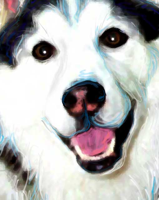
Zowie ... I have been pushing pixels today ... got a lot of work finalized. Today I proofed a few multi pet orders. I finished Molly & Isabelle, Bear Myah & Hula, and Cody & Quincy.

Cody & Quincy were by far the most difficult as their image was really low in resolution ( like tiny ). This was a memorial project so re-shooting was not an option. I am very happy with their final proofs. These pups had winning smiles so even with the photo-challenge I really enjoyed playing with these two. I hope their human is happy ... I always worry so much on the memorial projects ....I just want them to be perfect.
Cody After (proof#1)

Cody Before (original image enlarged)

Layers

Of course, of course. This is not what it seems.
This is not a concrete column. This is not graffiti. This is something entirely different. It is a picture, a photo of graffiti. It is printed on dibond, the type of aluminum that is used for traffic signs, for example. And these metal sheets are then screwed onto a plywood construction. And all this is put in a different, non-street setting (in this case, the «lovely Dicken's Library of the Mary Ward House, Bloomsbury, London», but in another, more gallery-like setting, which make it seem much poorer, almost as if it were a strictly site-specific installation).
But what is striking about this is that it is exactly what it seems - a dislocated object, a rupture in reality, an addition that questions its context. In that sense, it is correct to say this is a column with graffiti. Because here, in this space, that is what works, what creates the tension. And then, all the other levels come into play, in this sort of a hide-and-seek of «objectiveness». It all stops somewhere, because it is a self-commenting (self-referential, if you like) convention. It plays on the very fact that it's a fake. And that it is still incredibly near to reality. So near, the showing fragments of plywood actually seem glued onto the concrete pillar.
The fact that the installation is in a library seems crucial (no matter why it actually got there). It speaks volumes about what we are, who we are. Our «means of expression» and aesthetic values and the gut need for destruction (or is this just me?). At the same time, it is a taming object. It tames the defying attitude of the original by turning it into a slick, clean, savvy copy of itself. Now, this is the pillar of knowledge. Of civilization. Of us. It is what sustains - or what makes us believe it sustains the heavy walls of our libraries. And if we ridicule it for being a fake structure, we might just bee too confident in our own walls. Underestimating the actual proximity of the object, and the image.
Kristin Posehn, Replicant (2005-2006)

Sunday, November 12, 2006

"A Good Dog"

I am currently reading a great book by Jon Katz about an intense and challenging Border Collie named Orson. The quote on the inside jacket that made me purchase the book reads: "People who love dogs often talk about a 'lifetime dog'. I'd heard the phrase a dozen times before I came to recognize its significance. Lifetime dogs are dogs we love in especially powerful, sometime inexplicable ways" - Jon Katz

I would highly recommend this book. It is a light read, and it is fun to read aloud with a partner. Adults often forget how nice it is to share a story and how comforting it feels to be read to. We don't have any kids around to read to but our dogs all seem to love our story hour.

Saturday, November 11, 2006

Magdalena Jetelová. How much should we know?

See this>
These are powerful images. Dark, quite genuine in their landartishness, in their hands-on approach to the material. No gimmicking with the pictures here, just plain, gloomy black-and-white pulp.
My recent lectures, concerning Shakespeare, his work and times, put these images in a great perspective. What is the disappearance of the battleground? And the rupture between violence and human territory? Is it about the transmitting of the violence as a value, from generation to generation? An ever-available tool? Then the battleground disappears, since war becomes a state of mind rather than an act, which is but its realization. It is the possibility of all wars against evil, be it another culture ("barbarians" means "the foreign ones") or another, more sophisticated concept required to execute the inherited right to violence ("war on terror", of course...). So the battleground disappears, and there is a rupture between violence and human territory - because it isn't about the land any more. It is about identity. About preserving what is mine, because it is mine, and because it is what it is and is in danger of becoming what it is not. Suddenly, seen from this point of view, war is everywhere. It is unbearably flexible. It becomes this dark, black mass that is there.
Then there is another level. Atlantic Wall is the title of the series of pictures by Czech-born artist Magdalena Jetelová. The Atlantic Wall, (ever heard of the Siegfried Line?), were huge fortifications made by Hitler during WW2 along the coast of the Atlantic. What does that knowledge change? How different is the spectator's position? Now go a step further in the mythological aspects of the Atlantic Wall. And now, go for an informed review. How does your response to the work change as you discover the various layer? Does it necessarily get «better»? You don't need a spoiler to make it a spoiler. In this particular case, the Atlantic Wall looked at with all the info, seems like a mere illustration to a book. A beautiful illustration, but not more. It is very difficult to forget. Go back to all this Shakespeare, which from this perspective can seem like naive babbling of an ignorant.

Among Jetelová's many great projects, one of the most powerful ones is the Domestication of a Pyramid (to see more pics, on her site go to global-pyramids, then click on pyramid corners).


Once again, my silly question: How much should we know? In this case, I preferred to remain innocent and not inquire. After all, once I know, I cannot unknow, can I?

More Pet Portrait Clients

Ginger and Diane have become great doggy pals over the years and we have done a handful of art pieces for Miss Ginger (boxer). Diane is a total animal lover and recently started a line of jewelry for dogs. We hope to tell you guys a lot more about that just as soon as I can convince her to get her work on-line.
Diane & Ginger
Spike The Chihuahua


Spike is a new pop art client. This very handsome rescue boy dropped by in person with his human to pick up his portrait so we snapped a few quick shots.

And Now for Some faux home-shots

It is great when you can get some really fun "reality shots" from your clients, but artists that are really handy with photoshop should also consider the magic of stock images. Photography stock sites have tons of groovy interior design shots that make for nice presentation backdrops for portrait work. I used the vanishing point tool, drop shadow, blur, and levels in photoshop to blend the portraits below into their fantasy environments. You can see more room ideas by clicking here.

Riley The American Bulldog

Xena

GiGi The Pit Bull

Friday, November 10, 2006

Patron's Choice Award


YAY, I won an award at EBSQ for my digital collage called " The Robot TV Ate Lassie". Ok, I will have to admit there were not a gazillion submissions on this show ( almost as many awards as entries) , but hey ... they liked my entry. I also received a couple of awards this year for their pet portrait swap show. At the time I did not post about that since I felt like I was receiving an award for the kind of artwork that I do all the time. In other words it was not something new or risky for me. This entry was different as it had a 1950's theme, and it was more of digital collage just for fun, so yea I feel like tooting my horn a little. Of course this is a great reminder that I need to do more artwork for myself. I find that my non commercial artwork always fuels new ideas and keeps me fresh at my job. EBSQ is a great little community with monthly art shows and a wide range of artists working in all mediums. This is the first year that I have participated in any shows at ebsq.

Thursday, November 9, 2006

Pet Portraits In the Home

Over the years a few clients have sent me pics of their pets next to their portraits, or shots of their Art Paw originals in their home. I would like to encourage all of my existing clients to e-mail us a snap of your art in the home. E-mail us a photo & we will post it. I really enjoy getting a glimpse into your world.

Kung Fu Fu's Art

Lola Next to her Art

Penny & Pony's Art

Tuesday, November 7, 2006

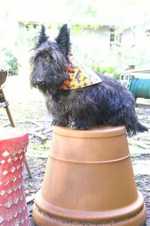
My Scottie Dog Ajax


So yesterady I am minding my own business, walking out of the shipping and stretching studio out back and I see my little Scottie Ajax sitting atop a large planter. This little guy has always been sort of cat-like, perching in unusual spots. I command him to sit & stay while I run in to grab my camera, of course he senses my excitement and promptly follows me inside. So I repositioned him to snap a few shots. As you can see from the original photo he was not all that keen on "pot-sitting" when it was not his own idea. I sketched around a bit with his photo this afternoon and tilted his head so he looks a tad more enthusiastic. Yes that is his bat-bandanna left over from halloween, I finally removed it today during a muddy paw washing. What am I doing playing around with my own photos ... I dunno, I need to get busy on portraits.