Don't forget to enter Sergeant's photo contest for the chance to win a large 34 x34 pet portrait. This is a great chance to win some terrific prizes for you or your pooch.
Sergeant's Pet Care Products And Pet Specialist Steve Dale Team - Amazing videos are here
Other studio news this week:
Getting a handful of prints out the door today. My candle packaging project has been completed and should go to press next week. We have a lot of work in-house at the moment. I am hoping to carve out some time next month to take a tile mosaic class. I am so hungry to get my hands dirty with a fun craft project. I love working at the computer all day but there is something very satisfying about creating something in 3D.
Tuesday, May 29, 2007
Sunday, May 27, 2007
Friday, May 25, 2007
I am 45 today

(above) I am the little girl in the middle with the 50 cent Toll sign .... ha always the entrepreneur. I was 7 here in this photo. It was November in Texas and we were running around with our shoes off. The two kids to the left are cousins and the boy to the right my brother.
Where have the years gone? I am 45 years "young" today, I guess that is like saying the glass is half full. I am glad to be here. I am glad to be here.
Thursday, May 24, 2007
In need of morning coffee?
I am dragging today. Going to focus on printing finished portraits and also my candle packaging project. I am not doing anything till I have my morning caffeine.
Just stumbled across this and while a bit off-topic for the dog blog, it fits the morning very well. So enjoy the "art coffee".
Just stumbled across this and while a bit off-topic for the dog blog, it fits the morning very well. So enjoy the "art coffee".
Tuesday, May 22, 2007
Frog The Bulldog

This morning I have been playing with Frog the Bulldog. A Flickr pal suggested I title this "English Bullfrog", I like that. This is a painterly portrait project and one of about a dozen I have on the board right now. I am trying very hard to get caught up around here. Allison will be making proof pages for Frog and a few other pups tomorrow, so check out the homepage on Weds. for changes.
All orders are being worked on in the order they were placed and paid projects are given top priority. What this means is that if you sent in a photo or two and never gave us your payment info then your project is on our pending board. Here at Art Paw we allow folks to place orders in a variety of ways and one of those includes opting to pay by phone "later". The only problem with that option is you do have to follow up and make that phone call to get your project moving. I will be spending tomorrow afternoon trying to finalize all of our dropped ball projects. If you feel you may be in that category give me a call toll-free so we can get the ball rolling again on your project ( 888-225-4278 ).
Monday, May 21, 2007
A Shutter Bug
Old capture from 2 weeks ago. Swamped with orders right now guys ... I will blog on doggy art very soon.
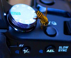
I loved capturing this bee on Dan' camera. He was explaining something about my camera to me and I looked down and saw this little fellow trying to take a picture. I snapped a few and this was my favorite.
I loved capturing this bee on Dan' camera. He was explaining something about my camera to me and I looked down and saw this little fellow trying to take a picture. I snapped a few and this was my favorite.
Saturday, May 19, 2007
Ursula Sokolowska - the self as projection
Indeed, it looked suspicious.
You see, the combination of a mouth and a flower is usually considered sensual.
 But in Ursula Sokolowska's art? This may be erotic. Actually, it may be considered sexual. But there is something too disturbing about it to make us think of a feminine, sensual image. The way the mouth is open, somewhat like at a medical exam - and then there's the projected image, which highlights some of the traces while completely eliminating, flattening out others. Thus, the mouth is both deep and shallow. The image spreads, but is strangely attached to the body that supports it.
See another example, my favorite:
 Here, the limits are out-of-focus, only the lips remain crystal clear. And the void inside. This is one of the most purely baroque images I know, combining an apparent decorativeness with a powerful tension between the still and the life. As if beneath the surface of artistic illusion we received a sudden gust of reality.
 And now, the proportions change. Sokolowska seems to focus more. Focus more on herself, and just focus more. The images can be seen as absolutely terrifying. Like some nightmare, some horrific vision.
And this is a vision, a vision of the artist's past, images of her childhood as the child of Polish immigrants. What we see are all the scary things one might associate with emigration: poverty, tough family relations, a feeling of loss and despair. A small child in hostile surroundings, be they a forest or a kitchen. And from time to time, the mother figure.

 The child's face is taken from old pictures. And projected on faceless dolls. It actually looks like this face does not belong here. Which is possibly the most frightening.

But then, we should not forget the distance that is played out when using projection. Once again, the depth and the shallowness/surface play a subtle game. What we see is not a memory. It is a highly formalized game with memory. What captivates in these images is the uncertainty as to whether the form has made the ground safe enough for us to look. After all, a girl is staring at us from the picture. Funny thing, to use the technique of projection. As in a Freudian projection. Or in an image that is sent away from us, just to appear again. Paradoxically closer than the original.
You see, the combination of a mouth and a flower is usually considered sensual.
 But in Ursula Sokolowska's art? This may be erotic. Actually, it may be considered sexual. But there is something too disturbing about it to make us think of a feminine, sensual image. The way the mouth is open, somewhat like at a medical exam - and then there's the projected image, which highlights some of the traces while completely eliminating, flattening out others. Thus, the mouth is both deep and shallow. The image spreads, but is strangely attached to the body that supports it.
See another example, my favorite:
 Here, the limits are out-of-focus, only the lips remain crystal clear. And the void inside. This is one of the most purely baroque images I know, combining an apparent decorativeness with a powerful tension between the still and the life. As if beneath the surface of artistic illusion we received a sudden gust of reality.
 And now, the proportions change. Sokolowska seems to focus more. Focus more on herself, and just focus more. The images can be seen as absolutely terrifying. Like some nightmare, some horrific vision.
And this is a vision, a vision of the artist's past, images of her childhood as the child of Polish immigrants. What we see are all the scary things one might associate with emigration: poverty, tough family relations, a feeling of loss and despair. A small child in hostile surroundings, be they a forest or a kitchen. And from time to time, the mother figure.

 The child's face is taken from old pictures. And projected on faceless dolls. It actually looks like this face does not belong here. Which is possibly the most frightening.
But then, we should not forget the distance that is played out when using projection. Once again, the depth and the shallowness/surface play a subtle game. What we see is not a memory. It is a highly formalized game with memory. What captivates in these images is the uncertainty as to whether the form has made the ground safe enough for us to look. After all, a girl is staring at us from the picture. Funny thing, to use the technique of projection. As in a Freudian projection. Or in an image that is sent away from us, just to appear again. Paradoxically closer than the original.
Technorati: photography, visual art, art, contemporary art, vvoi
Thursday, May 17, 2007
Family loss, and new stray
What a week. My husband lost his 95 year old Grandfather Tuesday morning and we spent the day with family. Whitman was a very sweet old guy and a real character. At 95 if you aren't called a character then you aren't having enough fun. It is often tough in family situations like these to feel like you can do enough for folks. I made tea and tried to make sure everyone had something to drink, but other than that I felt pretty helpless. Everyone is sad and misses him yet at 95 there is more of a feeling and need to celebrate his life, and share old stories. As a newcomer in my husband's family it is fun to hear all the old stories for the first time.
When we returned home that evening Dan found a stray puppy that had been dumped in the neighborhood. We were both exhausted from the day, and his phone kept ringing with loose end problems at his work. Still we worked together for over 2 hours, bathing this little guy, and picking over 100 tics off of his inner ear flaps. He was so covered in tics I do not know how he had a drop of blood left in him. It felt really nice to be able to do something for this little guy after a day of loss. He is a happy little fellow now and ready for adoption. The Scotties do not know what to make of him. I think they can tell he is just a visitor.
If you live in Dallas: please ask around and let me know if you may know of a good home for him. He is at the perfect age for adoption.
Wednesday, May 16, 2007
Szpilman Award: carpe diem, one ephemeral step at a time
An absolutely delightful organization called the Szpilman Foundation (whose motto is "Organizing Moments for People") (and who unfortunately has a lot of their site in German) is for the 5th time organizing an absolutely delightful event:

As for the winners. Well, so far I am not convinced... Which might mean there is room for one of us! The projects I seem to like the most are the ones made by the very people from the Szpilman Foundation (outside of the contest context), such as creating a performance with a lot of strangers and extremely little time.
Of all the finalists and winners of the Szpilman Award from previous years, my favorite one, I think, is this one:

Shannon Bool, Partially Renovated Floor
I am ready to admit that it's very simple, and that similar works have been around for a couple of years. And I like it.
What I like about Bool's work is the sense of transparency. In her later works she insists even more on the relation between what is found (and so, present, previous, old) and what is introduced (see her portfolio on the link on this page). There is an element of vandalism that is always intriguing. Still, I find that this earlier work is so special precisely because it plays the vandalism card like a double-edged sword. For once, we can say that the original, wooden floor is the vandal! This is something to think about, in many contexts. Art history, architecture, urbanism, but also more general: the offense of going back.
Another question is if this should qualify for the Szpilman Award. Generally speaking, many of the selected works do not seem to be as ephemeral as one might want them to be. They are too well documented, too gallery-conscious, too stable, and that, to me, makes them problematic. Not that I insist on total formal rigor, only the time factor seems to me like the very essence of the Award. Beyond the fact that it makes the works often difficult to "sell", or at least to consider on par with other types of art, it simply is about something slightly different. Lighter, maybe.

The project is brilliant. I still haven't been able to figure out why one of the elements of the prize (besides a 'dynamic amount of money') is a residency in the Polish village of Cimochowizna. But hey, they pay for transport and all!
The SZPILMAN AWARD is awarded to works
that exist only for a moment or a short period of time.
The purpose of the award is to promote such works whose
forms consist of ephemeral situations.
As for the winners. Well, so far I am not convinced... Which might mean there is room for one of us! The projects I seem to like the most are the ones made by the very people from the Szpilman Foundation (outside of the contest context), such as creating a performance with a lot of strangers and extremely little time.
Of all the finalists and winners of the Szpilman Award from previous years, my favorite one, I think, is this one:

Shannon Bool, Partially Renovated Floor
Shannon Bool purges the floor in her studio at the academy of arts
of the paints and muck of the last 15 years in order to bring back the
original oak parquet.
I am ready to admit that it's very simple, and that similar works have been around for a couple of years. And I like it.
What I like about Bool's work is the sense of transparency. In her later works she insists even more on the relation between what is found (and so, present, previous, old) and what is introduced (see her portfolio on the link on this page). There is an element of vandalism that is always intriguing. Still, I find that this earlier work is so special precisely because it plays the vandalism card like a double-edged sword. For once, we can say that the original, wooden floor is the vandal! This is something to think about, in many contexts. Art history, architecture, urbanism, but also more general: the offense of going back.
Another question is if this should qualify for the Szpilman Award. Generally speaking, many of the selected works do not seem to be as ephemeral as one might want them to be. They are too well documented, too gallery-conscious, too stable, and that, to me, makes them problematic. Not that I insist on total formal rigor, only the time factor seems to me like the very essence of the Award. Beyond the fact that it makes the works often difficult to "sell", or at least to consider on par with other types of art, it simply is about something slightly different. Lighter, maybe.
Technorati: contest, art contest, visual art, art, contemporary art, vvoi
Splish Splash Photo Contest
Sergeant's is holding a photo contest with a bath time theme. Enter to win fabulous prizes including the grand prize of a 34 x 34 Custom Pet Portrait in any style by Art Paw. We are of course thrilled to have been chosen by this well known pet care supply company and we will be telling all our pals to enter. Steve Dale will be judging the entries.
Don't send us your pics .... you need to do all that over at sergeants.com. Be sure and click on the "Talk to Steve" button for some fun Flash info.
Click here to enter
Don't send us your pics .... you need to do all that over at sergeants.com. Be sure and click on the "Talk to Steve" button for some fun Flash info.
Click here to enter
Artist's Development Toolkit: introduction to a review
This is extremely difficult. Trying to analyze yourself as an artist is a hell of a job. There seems to be never enough distance, and especially in contemporary art the frontiers are blurred, not only between genres, but also between types of activity. Some ideas are half-realized, some become realized too quickly, or in a direction I don't necessarily find ideal. The core I am left with is a very unstable one. Of course, this is probably saying more about myself than about the general state (!) of being a "contemporary artist".
The Artist's Development Toolkit is perfect for someone who already knows fairly well what he is doing and where he is heading. It helps in organizing ideas, in realizing the roads that still remain under-explored, and above all, in looking at the (mainly production-based, not artistic) obstacles in your career in a cool, distant way. All this through a self-help methodology. You answer questions, than you read your questions and get some suggestions on how to analyze them. (Don't forget to click on the little "+" signs, they give you extra info that is often much better than all the rest).
To someone really confused, it might bring only despair. It doesn't give answers, doesn't guide you. And we're not talking artistic guidance, but production, career guidance.
It is also an extremely long process. For the patient ones.
So if you're patient, not too lost, not too desperate, if you have a specialized field you're working in, a public, if you pretty well know where you are heading, this may help you. If you really, really need help, then maybe it's better you go and get some - and maybe use this as additional support.
Let me know how it worked out for you!
Oh, and if you want more artist resources, see here.
Technorati: contemporary art, art, contemporary art, vvoi
Tuesday, May 15, 2007
Business Card Video
I have been needing to reorder and revamp our business cards around here. I stumbled across this funny video today on card design. All of you design lovers will get a kick out of it. Be sure and turn up your volume.
Saturday, May 12, 2007
The match made of wood: David Lefkowitz
 Some of the most brilliant work being done these days is tautological. (And when that is not bad, it is good). It brings about the best of what is absolutely unspectacular - while managing to keep it at an incredibly low-profile level. It brings about thrilling experiences of the nearly-left-over or nearly-forgotten. At the same time it gets eerily close to both the esoteric and the trivial. And that is a fascinating tension.
If the depth of art cannot be imposed, doesn't that signify there is room for fetching the trivial and bringing it all the way to the esoteric? Isn't this a road we make constantly, constantly redefining what we mean by trivial, and what is too far out?

 See more of Lefkowitz here and here. Buy his work here.
PS: Have you noticed how this trunk (named Stump 2 by it's author) is elephant-like?
(via)
Technorati: painting, installation, art, contemporary art, vvoi
Chihuahua Art

Last week I worked on a couple of sweet Chihuahuas. Tug and Spike are pals. I am posting Tug's artwork today. The original image on this was another low resolution challenge. It did have a lot going for it in that the pup is adorable and "blankies" always say love, home and warmth. I am very happy with how this little pup turned out. The deep red and mint green are a new color combo for me. I enjoy working with background elements like ordinary covers, sheets and towels. It is fun to reinvent these items into rich plush fantasy linens.
Click the image below to see the pixelation that occurs when you enlarge a low resolution image.

When working with low resolution images you will find that the jagged pixelated look that occurs on enlargement has to be addressed before you can even start to play with color and texture. I have found that my best method is to blur the image to smooth it out and then burn in detail.
Thursday, May 10, 2007
Ducky

Cathryn Jiggens, Ducky
What is this flight that doesn't take off, what are those hands that do not belong to the body, what are those wings that need rescuing, and this all too closed eye, and this all too open beak? What are the fingers whose tips have drowned?
Technorati: photography, art, contemporary art, vvoi
Design Projects

I received a couple of cases of wine last month with the label design that I completed earlier this year. Mr. Big Paws (a.k.a. Tucker) is famous now. Check out Jaffurs Wine on-line. The owner creates a wine each year that has the proceeds going to a local non profit dog park.
This month in addition to a few commissions I am working on a magazine cover, and a cool packaging project for a local candle company. I should be able to post the candle pics by the middle of June. I am very excited about all of the fun design opportunities that are coming our way lately. The candle project will also have a portion of the proceeds going to help an assortment of animal related charities.
Wednesday, May 9, 2007
Creating Contrast for Phoebe
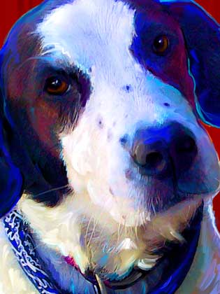
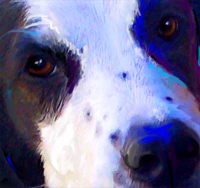
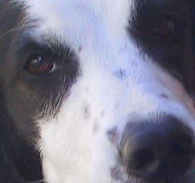
This week I will print & finalize a few portraits including Phoebe. I loved the sweet expression on this pup's face. The original photo was pretty good. The main thing I needed to do was bump up the contrast and paint in some missing detail. One thing I always try to create with each piece are really deep dark blacks in the black areas. The more contrast a piece has the better. See the two details below to see what a little contrast can do.
Photoshop Tip: For those of you that dabble in Photoshop I will share one of my favorite tips for tweaking contrast. A lot of people will go right to the "Adjust Contrast" filter and slide the little slider until it looks good. That is one way to tweak the contrast however to get your blacks as deep as you may want them you will often blow out your whites too much. A better solution is to choose "selective color" and choose just your blacks and then bump them till they look right. Of course curves would be another good option.
Tuesday, May 8, 2007
American Bulldog Pup

I shot this photo at our local dog park last weekend. I love this breed. The dog park is great on the weekends ...so many different types of dogs to watch. Since most of my portrait work is done from snapshots I find that going to dog parks and dog shows allows me to really study the different personalities of the different breeds and this is good working knowledge to have as a pet portrait artist. Of course this little guy was a feisty pup doing all the puppy things that all dogs do.
With Diane and Dan's help I have been revisiting an abandoned blog that I started last year. I may even try to recruit our resident cat gal Allison to help me keep up with this second blog. Check it out if you have time: dallasdogparkblog.com
Monday, May 7, 2007
Red Hot Poker with Bee
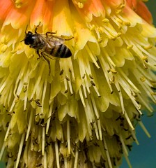
I'll be getting back to the blog this week, and posting more dog art very soon. I have been really swamped with orders lately and that is a good thing. I am off on Mondays and I went to the arboretum this morning with Dan to shoot flowers. These flowers had tons of busy bees doing their pollination thing inside each tiny petal.
I guess a busy bee is an appropriate image to start the week off with. At any rate, that is what I am posting.
I guess a busy bee is an appropriate image to start the week off with. At any rate, that is what I am posting.
Six degrees of separation
You know the idea.
Now go here - and see where you get.
Now go here - and see where you get.
Technorati: internet art, art, contemporary art, vvoi
Sunday, May 6, 2007
Notes on the show «Where Does The Light Go When It's Gone?» by João Fiadeiro.
 Notes on «Para onde vai a luz quando se apaga?». Premiere May 4, 2007, Culturgest.
1. The performance does not concern the disappearance of light. Rather, it is about the disappearance of shadow. The shadow of causality, of logic, of story-ness, the shadow of the human realm as we know it. Here, what we have are states. Functions. The performers don't act, they remain in action. The very first scene, where the musician walks along all the walls of the stage scratching them with a small microphone, says it all: this is going to take time, and you better deal with it. If you're not happy with it, you might just as well leave now. I will remain as long as it takes. And when it's over, it's simply gone. This doesn't need to lead anywhere but here, to the sound table. It doesn't need to tell a story other than my trip from there to here. Unsatisfied? Yes, I can understand. But can't you just appreciate it, for what it is - somebody's notion of honesty?
2. What is your function? Are you being the person that listens? Or the one that speaks? Are you the guy that draws lines? Are you the dancer girl? And what does that mean? Do you fit in when you do your thing? Do you ever not fit in? What comes out of your standing here?
3. The dancer girl - Márcia - never actually dances. She sort of warms up, tries a jump or two, prepares her body. She gets comfortable. And leaves. While she does that, a snail race is being prepared. During the general rehearsal, when Lenaic put the snails, she didn't align them to make them advance in the same direction, and they just dispersed all over. I asked her after if it was on purpose. She said no, and at the premiere they are quite carefully aligned. And I miss the havoc. I regret having asked the question.
4. The risk is huge. About half of the show is improvised. The structure remains, but the way of filling in, of respecting the tough rules of Real-Time Composition, is up to the performers, and depends on every show. It can always go wrong. It would really make more sense to see two show in a row, every time.
5. The general rehearsal goes very bad. They are aggressive, tired, unimaginative. They choose either the simplest and flat solutions, or they jump off into something completely nonsensical and unrelated. Things seem chaotic. The show ends with a quote from Deleuze, about how happiness/joy empowers. It sounds ironic.
6. The premiere goes incredibly well. Everything is right. The improvised parts all come together. The performers are strong, at first still somewhat too heavy and inexplicably over-present (too dramatic, too «significant», as if they were constantly in the middle of to be or not to be), but the performance quickly gains a good pace.
7. At a certain point, Lenaic leaves the stage with a microphone, and we hear her describing everything she sees. At the same time, Gustavo remains on stage alone, creating an abstract and quite beautiful installation. She walks up to a security guard and starts asking her questions. When asked about what was important to her in working here, the guard answers that the people she meets: «So many good experiences and good encounters. Different people. Artists, normal people...» The audience bursts with laughter. Gustavo keeps on with his paper line.
8. These beautiful visual images, all created in front of our eyes. Imagine witnessing the creation of an installation. One that includes spoken text, and maybe an actor or two, from time to time. But really, it's just like watching a construction sight. Exciting, boring, curious.
9. I talk to the performers after the show. They all seem very happy. Only at a certain point Cláudia, João's long-time collaborator, looks at me and says: «Oh my god, what is it going to be like tomorrow? I don't know why it goes well when it goes well. I still don't know.»
10. For the neophytes: don't expect a fridge.
To see a video of a fragment cut from the final version of the show, go to re-al.org, then click on Artistas - João Fiadeiro - Para Onde Vai A Luz Quando... - Filmes - 1.
Friday, May 4, 2007
How dare we make art?
After World War 2, Karl Jaspers wrote a by now classic text about guilt, The Question of German Guilt
The question is, how far can we go? Shouldn't we abandon all forms of art (and entertainment), then, if we are to concentrate all efforts on saving the world? Is there an actual possibility that it would change something?
Of course, that sounds rather extreme. (And that's why Jaspers considers this a metaphysical guilt, shared by everyone and beyond the possibility of making it disappear in any way but through self-sacrifice). But somewhere here lie very difficult issues: why should one spend my time making quite self-centered installations when one could be working in an effective, world-changing organization? Should art be justifiable, like any other product, service, activity?
It isn't about art giving the possibility to do more. Because quite frankly the above video is an exception, and works exactly because it is one. Maybe, it is about the possibility of assuming uselessness?
Beauty is a great motivator. Indeed. (In João Fiadeiro's most recent performance (soon more about that), a sentence from Deleuze (roughly remembered by me): «I started reading Leibniz's Ethics. I am discovering that joy brings more power to act»)
But can we honestly say we make art, and see art, to motivate us? Isn't it a goal in itself? And if so, can't we spend our energy in a better way? How dare we make art?
Wednesday, May 2, 2007
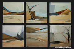
Namib desert paintings
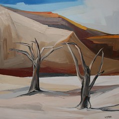
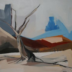
Here is 2 of my new paintings. The theme is exploring the Namib desert with its bold colours,
light and dark contrasts aswell as the opposing feelings/ emotions of warmth vs emptiness.
A set of six paintings to be sold seperately.
Tuesday, May 1, 2007
Addart
Here's a brilliant step in the long and often difficult challenge of playing the market's rules as an artist. More precisely, the idea is to use the same mechanism that keeps ads away from our web browsing - and turn it into art.
Adblockers are pieces of software that help filter out the commercials that appear on most web pages. Addart goes a step further - and replaces the empty left-over space with, you guessed it, art. So what you get is actually a sort of a virtual art gallery in all the places where you had publicity. Wouldn't it be nice to apply that in real life?
The work is still in prototype mode, but looks promising.
In the example below, the publicity is replaced by Mario Bros. clouds.

(via)
Adblockers are pieces of software that help filter out the commercials that appear on most web pages. Addart goes a step further - and replaces the empty left-over space with, you guessed it, art. So what you get is actually a sort of a virtual art gallery in all the places where you had publicity. Wouldn't it be nice to apply that in real life?
The work is still in prototype mode, but looks promising.
In the example below, the publicity is replaced by Mario Bros. clouds.

(via)
Subscribe to:
Comments (Atom)


