Tuesday, July 31, 2007
Basic Shapes in Illustrator CS
Happy Birthday Bear!
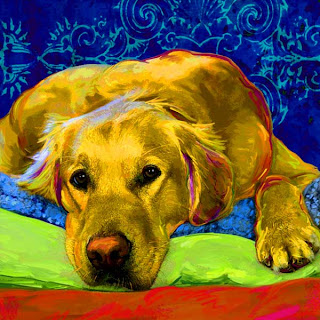
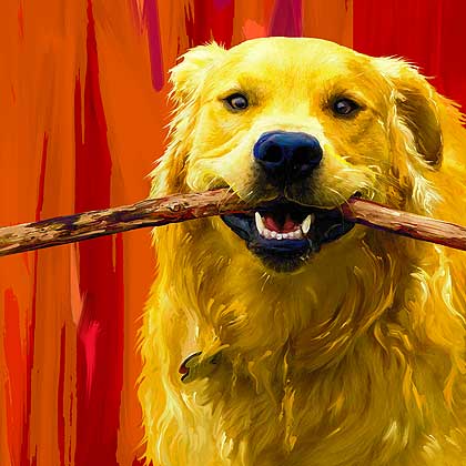
Bear is 3 today. This good looking young Retriever is on the project board for today and I am going to be working on him this evening trying some close-crops and adding in more paint strokes. This will be his 2nd portrait. The image above is a working sketch of Bear's portrait in progress. We have a more relaxed shot this time. Below you can find his fun "Bear with Stick" portrait.
Bear's humans are professional wildlife photographers and so their photographs are always a pure joy to play with.
Public art

Leon Reid IV in São Paulo.
Idea: the beauty of art in public is that art cannot be public. Art is necessarily private, intimate, as any experience (yes, also the so-called "group experience"). So art that is out there, when it's good, makes contact also because it creates a special, intimate zone where the public regains its human dimensions.
And yes, to answer your question, I am tempted to think this applies to any public art, of any size and in any context.
(Leon Reid IV via)
Monday, July 30, 2007
Experiencing Bergman
Saraband was to be my first real Bergman experience. The film was publicized as extremely slow and extremely beautiful and true - "yet another Bergman classic". I am allergic to film classics. I went to see it on the same principle as I read Hegel and Heidegger - to make sure I know why I don't like it.
I went with a couple of my friends, we were having a great time all day.
The film has a horrible poster of an elderly couple embracing. He has an old sweater, looks filthy, they are both as serious as any Nordic film couple should be. I figured this was one of Bergman's last films.
The experience was stunning. It certainly isn't a classic - thank God. It has a total simplicity about it which only apparently puts it in the bourgeois linage of Strindbergs and other Ibsens. Actually, it's much more delicate, sensitive, it does not play out any scandal (which I am very tired of), only shows how relations between people evolve.
There isn't much more, really. Yet it is the proportions, the subtle movements of the plot, that won me over. I found myself with a sort of enthusiastic empathy for the characters that I didn't know I could have. Yes, it's the artistic containment. But it is also the not-overdoing-it. The getting to what makes up a person.
What impressed me most was that I didn't find any of the annoying symbolism of Persona. There is no need for metaphysics if you look carefully enough into what is in front of you.
Saraband was Bergman's last film.
I have heard an anecdote about Bergman's severe approach to moviemaking: during one of the shootings, his cinematographer's mother fell very ill and was said to be dying. The cinematographer wanted to go. Bergman looked at his long-time, faithful collaborator and said: "If you leave now, you son of a bitch, you can never come back!".
I don't know which film they were supposed to be shooting. But it simply couldn't have been Saraband.

Sunday, July 29, 2007
Parantheses from Barthes' Camera Lucida (1&2)
(1852)
(this is how life is made up of small solitudes)
2.
(one needs to classify, to group, if one wants to constitute a corpus)
(Professional/Amateur)
(Landscapes/Objects/Portraits/Nudes)
(Realism/Pictoralism)
(if it exists)
(a certain photo and not the Photo)
(spoken out)
(from what it represents)
(which happens in the case of any other image, charged since the beginning and by principle with the mode in which the object is simulated)
(professionals can)
(out of commodity it is necessary to accept this universal which, at the moment, only sends us towards the tireless repetition of contingency)
(I believe the sharks, according to Michelet)
(I didn't know yet that out of this stuborness of the referent in being always present would appear the essence of what I was looking for)
(there is no photography without something or someone)
(to take pictures of)
(the voice of science)
all the parantheses from chapters 1 & 2 of Camera Lucida
Friday, July 27, 2007
New Candle Project
Thursday, July 26, 2007
Help Australian Shepherd???
She is so stunning. Dan named her Luna after Luna Lovegood from Harry Potter.
Microchip your pets people!!!
Wednesday, July 25, 2007
Vik Muniz : how much cool is too much?
 This is pretty.
Aesthetic experience, yes. Or maybe just a hint of a possible one? How is one to distinguish?
Here is Brasilian artist Vik Muniz presenting his work to an American, non-artistic audience. Notice how technically sophisticated the presentation is. And how the classic dynamic of informal intro - funny bits - thoughtful part - witty ending is well executed. You can clearly see he worked in advertising - he knows how to sell his product. Also, notice what impresses the audience: the technique, the means. The sugar drawings. You did this with sugar?
What's wrong with that picture? What makes it sound like a trick and not like something "creative", in the sense of our dear old contemporary art? Maybe because what is appreciated, in the case of this audience, is mainly 1) skill, and 2) wit. So why is that not enough? Maybe because we tend to dismiss it as having more to do with craftsmanship than with art. But is it really so? The sugar drawings are of kids who work on sugar cane plantations. Still not enough. Something too easy about it, too directly linking two worlds, not letting us travel far enough?
Entertainment. That's what disturbs the artsy eye. He aims to please. He makes his own art look like a fun adventure, not a serious, deep labor. From time to time, he sends a message to the more attentive viewer, but mainly it's just, well, cool.
But an attentive viewer will see there is a lot in there. There are delicious (sorry, I couldn't resist myself) approaches to contemporary art, and some pretty effective dialog undertaken (the dust reproductions, but see also the pigment ones). Effective. Effect. Material. Fluffy little clouds of cotton. Happy. Too happy? Is too happy not contemporary enough? Or is it that sugar is, well, simple, limited? And chocolate, too... Unless, of course, you are Bobby Baker. But maybe, as in Bobby Baker's case, this is to be taken to another level? (The people at PS1 certainly think so)
My favorite part, as you might guess, is at the end, when he speaks about theater and about illusion: "It's not really about impressing, or making people fall for a really perfect illusion, as much as it is...about giving somebody a measure of their own belief, how much they want to be fooled".

You may also want to see Muniz's erotica (made of Silly Putty), although I don't find it particularly attractive.
Vector Illustrations Price
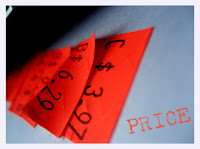 According to the IStock web site, the price of ten credits –– the least that a customer can buy at one time –– will rise to $13. Currently, the division charges $12 for ten credits. The price of 600 credits will be $600 after Aug. 19. Until that date, customers can purchase 625 credits for the same $600.
The number of credits needed to purchase a still image will apparently remain the same after Aug. 19, but some vector illustrations and video clips will require more credits, the division said.
The purchase of a single still image will continue to require one to 15 credits, depending on the digital file size. Vector illustrations will require the expenditure of one to 25 credits after the change. Currently, no separate category exists for vector art.
5 More Tips For Pet Portrait Artists
In the order they were received here are 5 more great tips for pet portrait artists...
From Kathy Weller
#1 " More information is better than not enough.
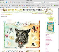
#2 "Treat each customer like gold.
Kathy Weller is a portrait artist and accomplished illustrator. Last year she worked on a sweet and lovely portrait of my girl Pixel.
From Linda O'Neill
#3 "Take great care in packing and shipping your artwork...it shows how much care and effort you put into your business."
#4 " Gladly offer to do some minor revisions once you present the final#5 "In addition to that...include something extra when you ship out a painting to a client. Even if it's just a greeting card, it makes them feel unique and special and that you took the trouble to do it. Going that extra mile is what's it's about."
painting to a client. There might be some eye color, coat color,
background details that they would like changed...and it usually means
capturing that extra essence of their dog that means the world to them."
Linda O'Neill is one of my first pet portrait pals and she is a gifted painter. A few years ago she beautifully memorialized my boy Atticus.
The artwork in the screen-shots above are copyrighted by the respective artists.
Tuesday, July 24, 2007
My Glass Squid
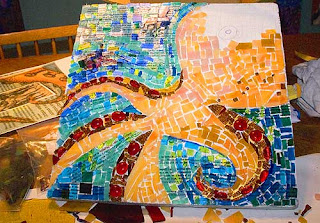
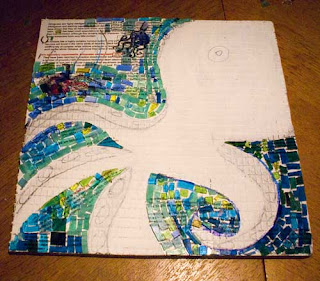
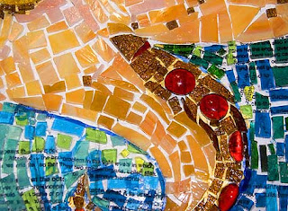
I have been taking a mosaic class for the past few weeks and I am very close to finishing my first project. I am really excited about it and quite proud of my efforts. I am sure if I continue on with this media I may look back in horror at my craftsmanship on this first piece, but that is ok. You have to start somewhere. I need to finish the head on this guy and then grout the piece so I can start on my next squid.
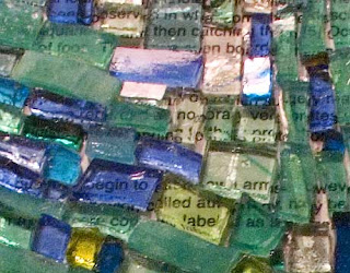
You can see from the image above that there is a layer of text beneath the glass in the area that is the water. The text is wikipedia info about the octopus. I also have some of my own squid drawings beneath the surface. The words are meant to be a visual texture more than anything else. Working this way feels a bit like collage.
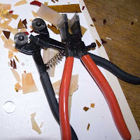
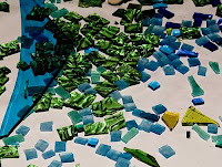
People have asked me if I am going to start doing people's dogs in mosaic. I do have plans for a few Scottie dogs for myself, but I do not think I want to do this on commission. This small 13 x 13 piece will probably end up having over 30 hours of work in it by the time I finish, and so it would be very tough to price work of this nature. I think I would also be frustrated by the limitations you feel when trying to achieve detail. Most clients want their pet portraits to really have a lot of detail and to look a lot like their pets, something hard to achieve in mosaic. Besides, it is fun to be doing something just for me.
Monday, July 23, 2007
iStockphoto to raise prices in August
iStockphoto, the Getty Images "microstock" subsidiary that sells low-cost imagery and video, will announce Monday plans to raise prices and therefore photographer revenue next month along with a number of promotional activities.
The company sells credits that give customers rights to use contributors' photos in materials such as advertisements, Web sites or brochures. The higher the resolution, the more credits an image costs, and the credit cost will increase from $1.20 to $1.30 on August 19, said iStockphoto Executive Vice President Kelly Thompson. (Credits are cheaper in bulk.)
Because photographers get a proportion of the credit cost ranging between 20 percent and 40 percent, the increase will mean a few more pennies at least per sale for photographers, too. That may not sound like much, but some popular photos sell hundreds or even thousands of times over, so there are economies of scale at work here. Read more
Art > > framing

photo by Jindrich Marco (via)
I get a sense (...) that somehow I trade majorly in comical irrelevance and apparent digression. Narrators/voices that are never really getting to the point, or who are straying from the point very often and as far as possible. Also the totally irrelevant fact from the background pulled out as preposterous foreground. Makes me think (on a tangent) of that description of movie extras (or is it scenery painters?) - as 'background artists'. Manipulation of background. As if foreground were (is in fact) only ever an excuse for what you are *really* doing, elsewhere.
Tim Etchells, on his excellent (and bloggaly self-centered) blog
The White Desk
by Benoit Lemoine & Cecile Boche
Sunday, July 22, 2007
Two absolutely unassociated quotes hereby given a common ground

One suggestive bracket for the project and very close ot the idea of the interview which guided Żmijewski in the realisation of this cycle, is Truth Serum. Althamer is asked a series of question while under sodium pentothal. Żmijewski begins with the usual prosaic issues: Where do you live? How many children do you have? (...) And at the end, a question about art: 'What is the significance of the fact that you make sculpture, dolls, films?' 'It gives me joy,' replies Althamer. 'I like when people laugh.'
- in: Artur Żmijewski. If it happened only once it's as if it never happened. (my bold)
Lisbon and Berlin are, currently, comparable places of creation and experimentation: there, artists seem more free to explore the limits of their undertakings [plus libres d'aller jusqu'au bout de leur propos].
- Léa Lescure, in: Mouvement, #44, July-Sept. 2007
And if you really need a connection, here is a quote and a song (uhmmm... press play):
“A new born child has no teeth.”—“A goose has no teeth.”—“A rose has no teeth.”—This last at any rate—one would like to say—is obviously true! It is even surer than that a goose has none.—And yet it is none so clear. For where should a rose’s teeth have been? The goose has none in its jaw. And neither, of course, has it any in its wings; but no one means that when he says it has no teeth.—Why, suppose one were to say: the cow chews its food and then dungs the rose with it, so the rose has teeth in the mouth of a beast. This would not be absurd, because one has no notion in advance where to look for teeth in a rose. ((connexion with ‘pain in someone else’s body’.))
L. Wittgenstein, Philosophical Investigations (for a simple analysis followed by a ridiculously complicated statement, see here, and for a note on Bruce Nauman's work inspired by this quote see here)
Saturday, July 21, 2007
Advertise On This Site
Squadron Festival 2007
 Busy preparations for one of the most awaited festivals this year have already commenced as Squadron have just launched their official Squadron Festival 2007 website (www.squadronfestival.com).
For the first edition, Squadron Festival together with the support of Pure Promotions will deliver three international heavy-weight headliners, and that being none other than the true Godfather of House Music 'Marshall Jefferson'. This man is responsible for literally defining house music as we know it today and boasts the repertoire of being the man responsible for turning House music into a universal sound by introducing it for the first time ever straight across the ocean to Europe with his legendary classic 'House Music Anthem - Move your Body'.
Squadron Festival 2007 will also feature two of the most requested DJ's - Dr.Lektroluv & Spacid, both residents at the popular yearly I Love Techno in Belgium. Squadron being the originators and leading electro music event organizations in Malta & Pure Promotions being the most sought after House event organization on this island, the two now join forces in an aim to bring together Malta's most prominent music scenes, in one big festival.
Make sure to check out www.squadronfestival.com for more info, downloads and features!
SQUADRON HISTORY!
Squadron has played a most important role in the ever increasing popularity of the so called 'electro' sound. Having been involved in the music scene for over 4 years, Squadron events have successfully managed to breed a new era of freaks who were not interested in dancing to the music which had dominated the scene for the past years.
Squadron provided the means for these people to listen to all sorts of genres jammed into one night, ranging from true Electro and Chicago house music from its purest days, to the more evil days of acid techno, mixed in with the less sinister Italo-Disco sounds of the early 80's. Besides bringing innovation in music locally, Squadron has also managed to fashion their very own unmistakable Squadron brand artwork, a fusion between classic chic art-deco and modern vector illustrations.
Since their first ever event back in April 2003, Squadron flyers have been sought after gems for flyer enthusiasts around the island.
Seeing that crowds at Squadron events have been on the increase and having already brought over the creme the la creme of modern electronic music artists namely Legowelt, Bangkok Impact, Alden Tyrell, Aux 88, DJ Godfather and Dr.Lektroluv, Squadron now shift their ambition in bringing over legends from both our era and these past two decades. One can expect anything from early Chicago house legends, 80's Miami Bass/Oldschool live shows, Classic Detroit techno DJ's and hard rocking new era electronic artists inspired by all of the latter!
The following artists have been brought over by Squadron: Legowelt, Dr.Lektroluv, Spacid, Le Syndicat Electronique, Alden Tyrell, DJ Serge, Bangkok Impact, Aux 88, Luke Eargoggle, Orgue Electronique, DJ TLR, DJ Godfather, The Chicago Shags, DJ Kafka and Rollinka.
Krijn Van Noordwijk - saying more
 Really, there seems to be something you left aside. As if something could explain your silence, your persistent silence.
 I am watching, but I am not sure if what I see is what you want me to see. How am I to interpret it? Shouldn't there be some clearer way of knowing where it's you, and where I'm just daydreaming?
 After all, I can see you and I can tell, you are this person, from here to here, you have physical limits and those limits constitute you.
 Why is it, then, that your look escapes me, that your words seem shallow, as if only touching on the surface of what you are saying? Is there a code? Some sort of password I need to get somewhere?
Come on, be honest. There is nothing. What You See Is... Then why do I see so much, and get so little? Why do I feel we share something we can't admit? Should I shut up? Let it go? How dare I?

All the pictures taken from Krin Van Noordwijk's site, which deserves a close look (although it's not very comfortable to look through).
(via)
Friday, July 20, 2007
Re-blogging
 (here)
Happy Famous Artists on the Wittgenstein Forum. Here, this is a triple inside joke. And it makes me smile.
 (here)
Machine That Tries to Tie a Shoe
by Adriana Salazar
 (here)
Placed outside of the White Cube Gallery Masons yard at 3.30 am on Sunday night in response to the Damien Hirst's "For The Love of God" diamond skull exhibition.The "For the Love of God" prank was created using 6522 Swarovski crystals
and took Laura, the artist, a month to create.
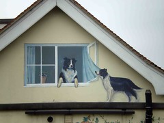
Dog Muralist
The Power of Re-blogging
Re-blogging, in my view, is a wonderful way of discovering what we have in common, of creating trends and actually promoting artists and events. Copying someone else's text might lack in originality, but isn't that one of the things which gives, say, the sciences so much credibility? Doesn't it empower those who speak? A quote is a powerful thing. And if at first I frowned upon seeing the very same news appear in several art blogs, I now find it thrilling. So what if I've already read some comment - right besides it there are three others I've never stumbled upon. It's strange to see how the "artistic milieu" has a tough time dealing with the idea of a wave, a tide. Some blogs of course go for it, even all the way. But it's as if it were wrong, or worse, poorer. If you really need it, you can just consider that the different contexts in which the news appear shows the broadening scope of a work, it's range of impact. But actually, I find the "art milieu" so far behind in respect to self-promotion, PR and the like, I wouldn't mind seeing ten times as many re-posts. Ah, a world filled with art...
Thursday, July 19, 2007
Gravel, Mayes, Sondin-Klausner and the art ripple
First, here you have it: a video of former US senator Mike Gravel, who is now a candidate for US President.
I need not say this is brilliant. And funny. And this and that.
Now what you need to know is that, contrary to what many news-desperate journalists claimed, this is not part of his campaign.
It is actually the work of two young artists and art teachers, Matt Mayes and Guston Sondin-Klausner. You have all the background explanation in this lengthy interview:
The funniest comment on this event appeared in the LA Times. My favorite part is:
Gravel's works confront us with our own existences and our deaths, the brute thereness of truth, the skull beneath the $400 haircut, the cellulite under the pants suit. His is neo-existentialist, post-apocalyptic, post-post modern art, a silence that screams and cajoles.
(...)
I suggest to you that a Gravel presidency would lead to an entirely new America, doing to us what cubism did to post-impressionism: dragging us moaning in glorious epiphanic pain into a new world.
(Some people actually didn't see the irony.)
It is amazing to see how even after they acknowledge that the video is not a political ad, commentators still analyze it as such. This brings about a few issues:
- The power of presence. No matter how many times you explain the context of your action, if you are facing a camera/the viewer, you are identified as yourself, and are thus, yes, creating a ripple.
- It's impressive how people find it difficult to accept that this is no stunt, no ad, no campaign. It might be pointing towards one, but, as Gravel says himself, he didn't even get the chance to buy the two artists a cup of coffee. Apparently, though, the (American?) viewers find it hard to disassociate a politician with his political life.
- There is room for art in politics. Also thanks to the net and YouTube and the like. You just have to be witty.
- If someone had an idea for promoting his product and decided to take a fairly known politician to do it, it could be difficult to execute. Especially if the idea was odd and came from an unknown individual who had a (seemingly) low social impact. But, and this is my thesis, because it is art, it was accepted. Meaning art at last has managed to become a political lobby! Or, to put it more calmly, there seems to be a space opening up for artistic/social games that extend towards politics.
- Mike Gravel himself has clearly underestimated the power of what he participated in. But he seems to be a courageous guy, fighting vehemently for many issues other politicians avoid. So this is not a random choice on the part of the artists, it is a deliberate participation in a political debate. Which brings me to another question:
- Couldn't we see this sort of activity as a narrowing of artistic perspectives? Yes, I mean by using them to a concrete political goal, making a very specific statement, letting go of so many other issues we could have... If you drop by here from time to time, you know my view: art is not just some golden puppy. Sure, it can be. But there is nothing wrong with opening up to a "broader audience". And letting in some fresh (political! social!) air.
The link between artists and the rest of mortals is a delicate issue, mined with all sorts of surprises and turn-arounds. Many works that at one point seem completely isolated from society (think Duchamp's Fountain, but also many films, actions, etc.) some time after are cherished as a wonderful expression of what "society feels" (heheh). But also, and this is the part many of us forget, many initiatives that are made with the goal and conviction of bonding with the world (think the Living Theater), when seem from a perspective look a little (or very) ridiculous, and certainly not attaining the utopic communion with the onlooker. So it is great to see a work that in a very simple way manages to convince people to stop a second and watch the ripples in the water. And, because of the particular context, help them make some sense of it.
Mayes and Sondin-Klauser also made another video with Gravel, Fire, which I find somehow less appealing, probably because the editing with a several-minute-long close-up of fire was to me, hummm, boring. And also, as often in minimalist works that never end, I find it slightly arrogant to have me there staring and waiting what will happen, just so I get the idea that this will last. I get it. No need to push the issue.
(found here)
Oh Those Puppy Eyes
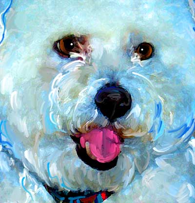
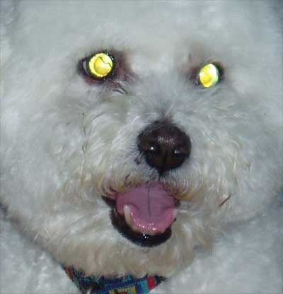
Around here the eyes have it! I spent last Friday afternoon going over the fine art of painting eyes with my staff. Too often our glow eye originals do not even have a hint of pupil showing and so we often have to paint in all of the parts of the eyes. The tricky part is often getting that glassy quality.
Max is an adorable dog with a happy smile. He is one of those adult doggies that will always look like a puppy. This pic had so much going for it we could not let a little thing like glow eye get in the way of creating a fun and happy pet portrait.

Wednesday, July 18, 2007
Murphy The Doxie on Etsy Homepage!
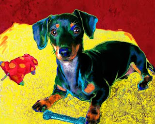
Our artwork of Murphy the Doxie made the Etsy homepage this morning. Our 15 minutes of fame has faded already though as I just checked in and Etsy has refreshed the homepage content already. That is one thing I do adore about Etsy though, their back-end tech guys really have designed a great site that always has something new, and fresh happening wherever you look. Allision went in today and beefed up our offerings so check out our Etsy Shop when you have time. I am taking a tile Mosaic class and hope to be listing tile mosaic pieces within a few weeks. I also want to create a section for original drawings.
The infinity of art
 by di-ve.com Tuesday, 17 July, 2007
However, at its core beats the same original artistic heart as before. The upgrades to the system, the redesign and the technical advancements in the design programs work to change the outcome of the art, but in the end it still boils down to the talents of the artistic user that controls and guides the software to create art work.
ICA Ltd a leading and innovative communications agency based in Malta is hosting a Digital Arts Expo in 2008. The DA 2008 is split into Digital Art Galleries, Exhibition stands and Educational Workshops/Seminars for the creative enthusiast and professional alike.
Innovation is something that the DA 2008 is looking for, so having two of our in house talents Martin Bonnici and Roderick Darmanin, do what artists generally don't do and compete against each other in a digital Photoshop Tennis match sums up the extent that we are prepared to go to.
Photoshop Tennis is when two or more Digital Artists do the unthinkable, and try to improve on their opponent's digital creation. One artist starts off with his design and forwards it to his opponent. The opponent then takes the original design and adds his art to it thus changing the original. The rules are, the concept of the original design needs to be kept, but anything can be added or improved on.
With this in mind, we are very proud to present the players of the first "Digital Playoff" of the DA 2008 Expo;
Martin Bonnici (b. 1985) balances his time between working as a Post-Production Artist/Flash Designer and recreating his thoughts and dreams in still and moving pictures. Whereas his day job pounds him with demanding clients and projects, his late nights working on short films, animations and studying special effects allow him to flex his creative muscles and vent of the pressures of his happy little existence.
Roderick Darmanin (b. 1985) torn by the evils of work and play is forced to splits his talents. As a day walker he is a Graphic Designer extraordinaire and a vivacious Vector Artist. Using Photoshop, Illustrator, Freehand and Indesign, he earns his money at one of Maltas up and coming agencies. By night he enters the murky world of Speed painting.
Let the playoffs begin. With the art designs below Martin and Roderick have started as they mean to go on, so to follow the digital excellence as it progresses log on to the DA 2008 website at www.digitalartsexpo.com.
Registration and participation is free, so join in and be part of Malta's digital culture. Limitations are yours to exceed.
Tuesday, July 17, 2007
Animate your illustration
 Adding animation to your illustration work can reap great creative and financial rewards. But what does it take to make the small jump from Illustrator to Flash, Photoshop to After Effects and page to screen? Nick Spence finds out.
For any illustrator safe in the static world of editorial illustration, animating your work may seem a job best left to others. New skills, new software to learn, thinking not just about the image but also about time, will certainly present fresh challenges. But the rewards for adding animation to your creative canon should outweigh any lingering doubts about venturing outside of your comfort zone.
The rise of broadband and mobile content in recent years has opened up vast new opportunities for anyone creating animation and motion graphics. Online interactive content is big business and much has been made of the potential funds available in web advertising. The internet is now also the ideal platform to showcase your animation skills, with broadband best able to cope with the most demanding video and audio showreels. Many savvy illustrators have added impressive animation sections to their personal online portfolios to great effect. Continue
article by www.computerarts.co.uk
The easiest way to convert images to line art
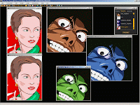 Faster than a tracing hand, this powerful software is the raster to vector converter you need for Illustrator (Adobe), CorelDraw (Corel), Flash (Macromedia), WebDraw (Jasc), Sodipodi (freeware) and any vector-based software. Vector Eye instantly converts scanned black-and-white or color raster images (bmp, jpg, tiff, png) into editable vector files (svg, ps, eps).
Just save it in the appropriate format for your purpose and drop into your favorite editor or authoring tool to complete or animate your design. You could also use the batch system to launch hundreds of vectorization processes. Download
Vector Cloud Brushes

Download:
Ver. 1.0 Ver. 2.0 Ver.3.0
Working with clients / 5 Tips for the pet portrait artist
#1 Remember that the client is always right.
I learned this little jewel in retail and it still serves me well. Yes, you as an artist are the one with an art degree, and maybe you are the one with years of experience behind you. That may all be true and nice and dandy. The thing is, as soon as you agree to do portrait commissions you have hopped straight from the elitist world of "fine art" and you are now in the murky waters of "commercial art". I am not saying that the two art worlds do not overlap and intertwine. The thing to keep in mind is that as a portrait artist your own personal tastes and preferences may on occasion have to take a backseat to that of your clients. You are creating artwork that must fit their lifestyle, their interior design aesthetic, and sometimes their budget. With that said you still have the ability to guide your clients and work with them in making good design decisions. Some of my pet portrait clients have never worked directly with an artist before and so they are often quite open to my creative input. By also being open to their ideas I make the entire process more fun for them and allow their own creativity to come into play.
#2 Listen well
Communication is everything. I find that simple e-mails are great to get started on a project and yet once a portrait goes into design revisions I really need to have a personal phone call with my clients so I know that I am getting to the heart of what is not yet working. Too often I skim through reading e-mails and I can miss an important item that someone may have mentioned and I often can misinterpret what has been written in an e-mail.
#3 To proof or not to proof?
Most clients love a proof, or in the case of Art Paw they love seeing a set of proofs. If you choose to send a client a proof you must be ready to do some tweaking on request. That is too often the nature of proofing. I know of one artist on-line working in traditional media that provides a proof and the client can either choose to accept it or ask for a refund. If the artwork is rejected it goes up for auction and other dog lovers can bid on it. She then donates a portion of the proceeds to charity. I actually think this is a brilliant way to work, and if I were to ever start working in oils I may adopt this approach myself.
#4 Project Reports
This goes back to communication and this is an area I am always trying to improve on myself. If you have a busy studio and you are juggling well over a dozen clients a month you will find that sending out project reports once a week will keep folks in the loop and let them know that you have not forgotten about their commission. I have even seen some artists use their blogs for this and that seems to work well for them.
#5 Ask your clients to help you
OK the project has been delivered and they are thrilled ... now ask your clients to tell their pet loving pals about you. They probably will anyway, but I do make a point of asking folks to spread the word about Art Paw.
Monday, July 16, 2007
Vector Animation
Hot Vampire Girls
 Well a jacuzzi full of blood...with hot vampire girls, that sounds fun. This vector illustration reminds me of an awful scene from Tarantino's HOSTEL 2. I coudn imagine that blood bath can be attractive. Artist page
Designing Logo In Illustrator
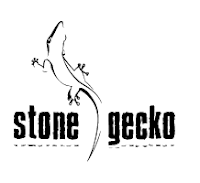 In this tutorial I hope to illustrate some of the process of logo design using Adobe Illustrator. However, I must stress, this is not so much a tutorial on the use of Adobe Illustrator as it is a way to show you one method of the "process" of refining an image to a corporate identity (logo) or stylized illustration.The basic process here could be applied to any application.
It should be noted that the example provided here was done mostly for this tutorial and I have bypassed a few of the earlier stages of logo design and concepting such as thumbnail sketching, etc.
The logo is for a company called stone gecko, so I thought an illustration of a chameleon/gecko type animal would be good. Part of the concept originanlly was to make the gecko"s lines apear blocky or stone like, but the process began to go out of the scope of this tutorial so I opted for a more simplified approach.
This tutorial assumes you have at least a basic working knowledge of Illustrator, for example you should know how to select objects and change their outlines and fills. Being comfortable with the pen tool is also a big plus. Go to tutorial page
What a computer virus really looks like
Too much virtual art research can be hazardous to your, well, being.
(See here and here)
Sunday, July 15, 2007
Hed Kandi Street Art
Shoot Your Creativity

Free Rising Sun Vector Brushes
