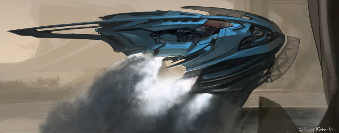
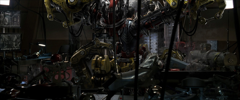
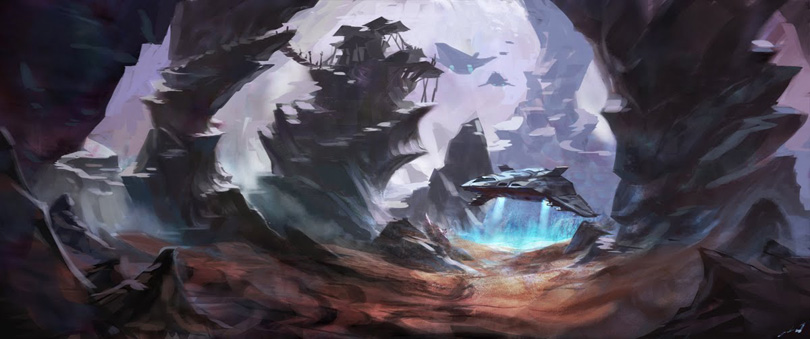
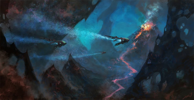
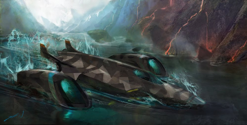
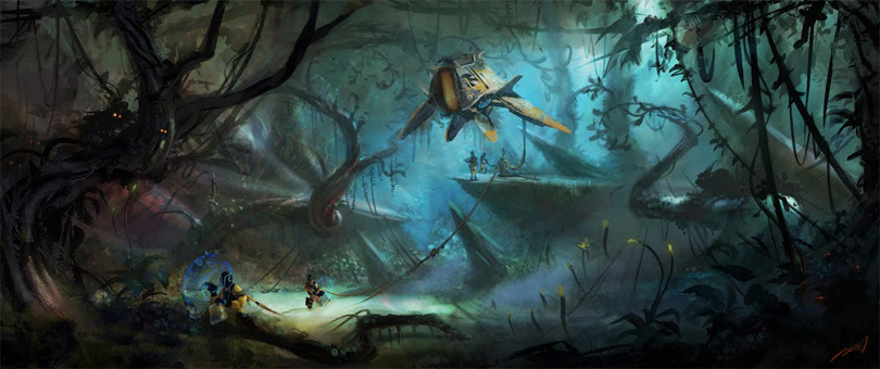
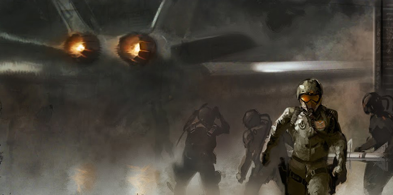
Scott Robertson was the second big artist to send art when I first started this blog. He's got a new art book coming out titled DRIVE, published by Design Studio Press. Looks like a ton of work... Can't wait for mine. Annis Naeem and Danny Gardner were heavily involved with this project as well.
Also, bye bye 1024 resolution. Time to move on. New layout is 1180 pixels wide. I've got a killer layout coming soon though. Stay tuned!
Keywords: digital concept vehicle art transportation design art book drive from scott robertson annis naeem danny gardner published design studio press amazon dsp culver city hollywood california
Thursday, September 30, 2010
Challenges For Pet Portrait Artists
Ask any pet portrait artist what their number one challenge is and they will tell you getting high quality photographs from their clients. Ask any digital pet portrait artist and they will tell you the same thing and they will specify getting a "high resolution image" is almost impossible. I have created a video with FAQ's about how to send us a photo at the proper resolution, and my assistant Lola is starring in it as the questioner ... check it out below.
We have so much available to us with technology and I know most of my clients have pretty decent digital cameras, heck even an inexpensive point and shoot can produce photographs at a size of at least 500K. So what goes wrong and why do 9 out of 10 clients have trouble sending high res. images?
• Some e-mail programs will auto-crunch your image when you send it without you even knowing it. If you think this may be happening you can upload your pics directly to us here: http://artpaw.com/uploadorder.html
• Some clients upload all their pics to facebook as a storage solution, not realizing that facebook will auto-crunch the yummy resolution right out of their photos so that the images load quickly on the web. They look great on your monitor and you never know that the file size has been reduced until you download it for printing.
• Some clients use the Kodak site to store their images and then send us a small web version from their main gallery. Know that Kodak still has the high resolution version that you can access and this page on their site will explain how to access your original files: http://gallerystudio.custhelp.com/app/answers/detail/a_id/471
• Some images are tiny to start with because they are cell phone images. Most cellphones take really tiny resolution images because you can store more on your phone that way.
• Some clients send images from their free Flickr accounts. You must have a pro account at flickr to access your original high resolution version of your photos. You can learn more here: http://www.flickr.com/help/photos/#89
We have so much available to us with technology and I know most of my clients have pretty decent digital cameras, heck even an inexpensive point and shoot can produce photographs at a size of at least 500K. So what goes wrong and why do 9 out of 10 clients have trouble sending high res. images?
Here is my top 5 List of why some client images are so tiny in resolution:
• Some e-mail programs will auto-crunch your image when you send it without you even knowing it. If you think this may be happening you can upload your pics directly to us here: http://artpaw.com/uploadorder.html
• Some clients upload all their pics to facebook as a storage solution, not realizing that facebook will auto-crunch the yummy resolution right out of their photos so that the images load quickly on the web. They look great on your monitor and you never know that the file size has been reduced until you download it for printing.
• Some clients use the Kodak site to store their images and then send us a small web version from their main gallery. Know that Kodak still has the high resolution version that you can access and this page on their site will explain how to access your original files: http://gallerystudio.custhelp.com/app/answers/detail/a_id/471
• Some images are tiny to start with because they are cell phone images. Most cellphones take really tiny resolution images because you can store more on your phone that way.
• Some clients send images from their free Flickr accounts. You must have a pro account at flickr to access your original high resolution version of your photos. You can learn more here: http://www.flickr.com/help/photos/#89
Blocked Keys
The etude by Gyorgy Ligeti I would like you to pay attention to is the second one. It starts at 2'15".
Here is what a competent source has to say about the work:
The third etude, "Touches bloquees" ("Blocked Keys"), uses the same technique that first appeared in "Selbstportrait," the second of the Three Pieces for Two Pianos. Certain keys are held down silently with one hand while the other hand plays a very fast chromatic line on and around the blocked keys, which of course do not sound. The result is a complicated rhythmic pattern that gives the music a somewhat mechanical quality. At first the silent gaps are all the duration of a single eighth, but eventually the gaps are two eighths, then three, and continue to increase in length until the texture becomes increasingly sparse. Again, this etude is about the creation of illusion; we see a continuous pattern of eighth notes on the page, but what results in performance are quirky rhythmic patterns that are not discernible to the eye and would be all but impossible to notate in a more traditional fashion to achieve the desired effect.Actually, it wasn't so much about the listening for me. What put me in a state of awe was the seeing. It is the clear struggle between the hands, the tension between the immobile one and the one that runs crazily above it or under it. Also, the tension of the one that is supposed to stay immobile, simply blocking some keys, but cannot resist the opportunity and spurts out sounds now and again, as if to underline it has total power. And then they switch. And we hear it, we hear this body negiation, we hear it once we see it, once we understand the game, it becomes obvious.
The music becomes obvious. Because it's about music, right?
And the soldier-fingers, constantly attempting to design the space through movement. A movement whose purpose is not something else - like a sound - is a dance. If you ever needed proof, here is one.
Halloween Papercraft: Coffin Treat Box
It is getting close to Halloween which means it's time for some spooky papercraft! These simple coffin treat boxes are offered by the folks at holiday-crafts-and-creations.com. There are two different templates for the coffin lid, one with a "death by chocolate" slogan and one without. Also included are instructions on how to make skeleton brownie treats to go inside! Download links for everything you need to build these can be found here.
Wednesday, September 29, 2010
Cow Art
Cow Art
© rebecca collins /artpaw.com
Working on cow art updates today. This fellow's art is a little too colorful and loose so I am working to tame things down a bit. All of my work at Art Paw is custom and while I like a lot of loose brush work and bold colors, I totally can understand that some interiors need a more calm and neutral palette. I have enjoyed playing with this fellow, I always have fun with different types of animals.
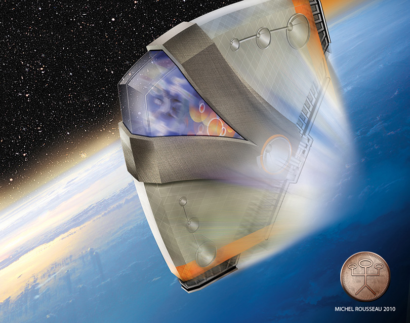
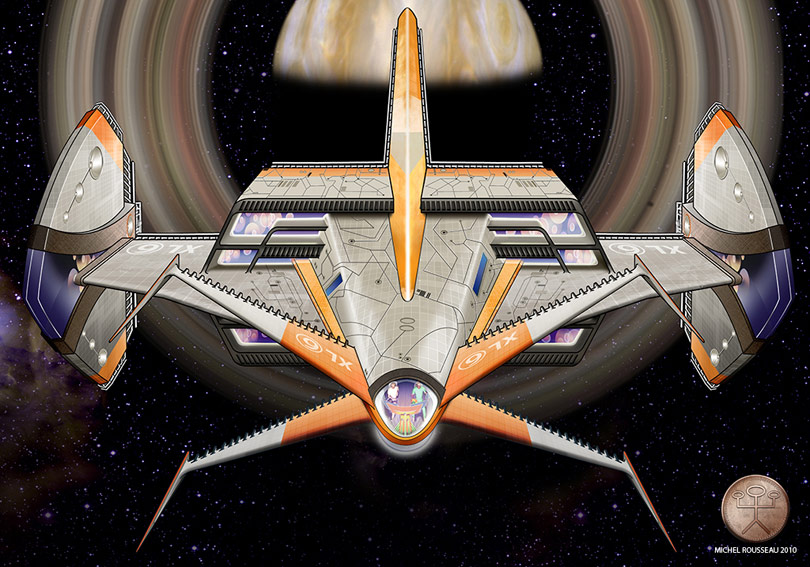
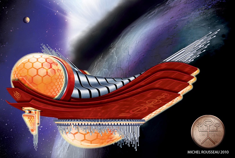
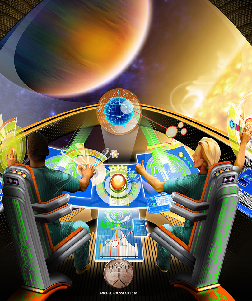
Michel Rousseau concept ship art
Michel sent these in and writes: "From my childhood TV memories when puppets were heroes and scaled models with fireworks, spaceships. These are images from the way I see it today, more like a grown up sci-fi adventure."
Keywords: concept ships by michel rousseau XL6 the next generation on from fireball XL5 graphic design photography illustration senior graphic designer for the last 15 years studied at laval university in quebec canada works with poser illustrator and photoshop
Tuesday, September 28, 2010
WWII Paper Models: Spitfire and Panther Tank
These two World War II papercraft models are free samples offered by the commerical paper model company, Paper-Pro Modeling. Most of Paper-Pro's products are deformed models that don't require any glue to assemble. On the left is a British Supermarine Spitfire fighter plane and on the right is a German Panther tank. Look for the download links for these models on the right hand side of the page here.
Our Big Tommy
Those of you that follow me at facebook or here on the blog know that Big Tommy had a rough week last week. He was diagnosed with an inoperable tumor on his heart. He stopped eating for a couple of days and he felt pretty weak. I am pleased to report that he is feeling much better through the miracle of Prednisone. Steroids can really make a pup feel a lot better than they are. He started acting like his old self on Sunday and these past 2 days have been really great. It helps a lot that the weather here in Texas is finally starting to feel like fall. We spent a lot of time outside on Sunday and the pics above are from that afternoon. The sketch is an old one from 2008, although I am trying to do at least one new sketch a day of him, sketching is my coping mechanism and a way to focus on him without driving him crazy with more attention than he can possibly stand.
I am working and trying to finalize and update a few portrait projects from September. Tommy likes my work routine and is hanging out in the office with me like he always has. We know our days with him are numbered and I am trying to mix as much normal routine as possible in with the extra good meaty food he is getting and the extra park visits. Each extra day with him is a gift at this point.
....................................
Take some photos this week of your pets! I can not tell you how many times I have created artwork from really blurry out of focus snapshots because they were like the only photo that my clients could find of an animal that had passed on. Other times I have worked from quality photographs of pets taken on their last week where they don't have the normal sparkle in their eyes. So get the camera out this week and take some pics of your animals, they are with us such a short time.
Organize your digital memories! Ok this is where I am at right now. We have 3 or 4 computers with home snapshots on them. I have found tons of great old photos of Big Tommy and the other Scotties, but they are all over the place, some may even be on a machine that is not working ( need to get someone to try and retrieve those files). I need to set up file folders for the pets and then burn some back up cds of my images, and even print out some good shots and put them in a photo album like people did back in the dark ages before digital cameras.
Hold your fur-babies close! Don't feel sorry for me, we all go down this road at some point with our fur-kids. Just remember to celebrate your love for your pets each and every day, and get that camera out.
Monday, September 27, 2010
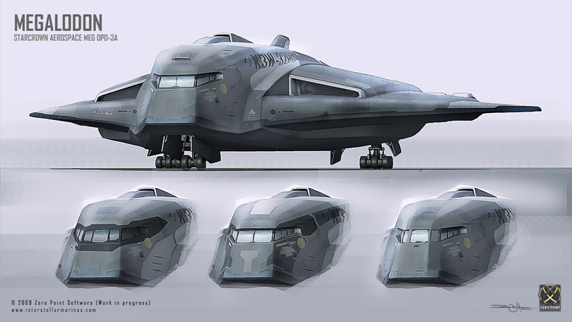
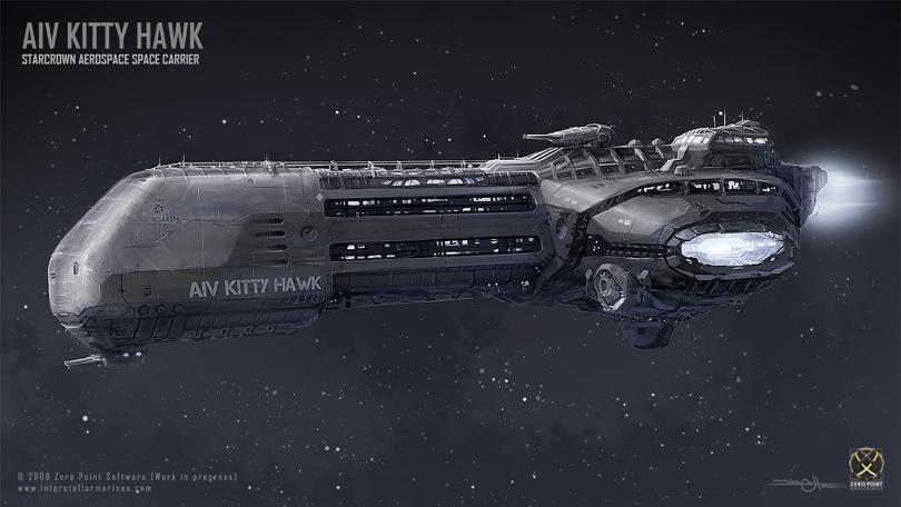
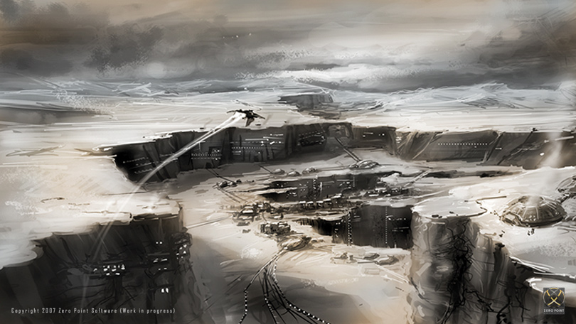
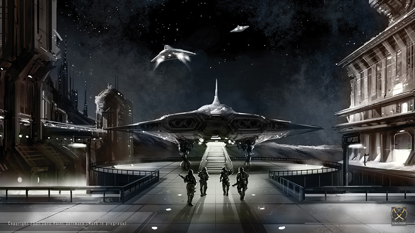
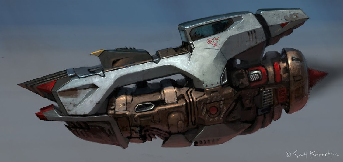
Concept spaceship art from INTERSTELLAR MARINES
Some concept art from Interstellar Marines.
Keywords: digital spaceship environmental concept art from the interactive video trilogy of three video games first person shooter tactical shooters role playing game rpg zero point software
Mosaic Monday: Papillion by Van Hooser
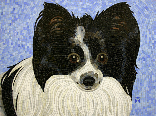
Check out the stunning Papillion below from Donna Van Hooser of Sun Dog Mosaics. You can see more of her lovely works over at Flickr, or on her main site at Sun Dog Mosaics.
I have blogged on Donna before. I love her mosaics because of the movement or andamento in her work. A lot of pet portrait artists like to say that they focus on the eyes because they are the "window to the soul", well yea ... duh. I have seen this so many times in artist bios that it is starting to sound like a trite sound bite in my brain. With that said I do have to acknowledge Donna's ability to create realistic and soulful eyes in mosaic, because it is no easy task. Mosaic materials are less fluid than paint, they are chunky and I find it hard to achieve the same level of detail with glass or tile that one can achieve with painting or drawing tools. Donna's mosaic pups have lovely eyes with all elements present, the iris, pupil, highlight, and even a little of the corner-whites when needed. She seems to have no basic formula for this and each dog's eyes turn out very unique. The work she did of her parent's dog Floyd even has a bit of a droop and some pink showing under the eyes.
Donna has a bold graphic style and her dogs are often created on top of simple bold color grounds. In the work above you will notice that the movement of the blue tiles in the background serves to pull you back into the subject ... this piece is all about Brandi. Donna is obviously 100% focused on her subjects and not just trying to impress us with her masterful mosaic techniques ... but of course, impress she does.
..........................
I know I said I was going to focus on local Dallas mosaics this month, but last week was crazy and I did not get a chance to get out and shoot the works I wanted to shoot.
I want to get over to the museum and shoot the work below by Miguel Covarrubias. Maybe soon I will get out of the studio with the camera so I can do some local mosaic reporting for you guys.
"Brandi" © Donna Van Hooser |
Donna has a bold graphic style and her dogs are often created on top of simple bold color grounds. In the work above you will notice that the movement of the blue tiles in the background serves to pull you back into the subject ... this piece is all about Brandi. Donna is obviously 100% focused on her subjects and not just trying to impress us with her masterful mosaic techniques ... but of course, impress she does.
..........................
I know I said I was going to focus on local Dallas mosaics this month, but last week was crazy and I did not get a chance to get out and shoot the works I wanted to shoot.
I want to get over to the museum and shoot the work below by Miguel Covarrubias. Maybe soon I will get out of the studio with the camera so I can do some local mosaic reporting for you guys.
Saturday, September 25, 2010
Cattelan's Finger
Yet again, Maurizio Cattelan achieved his admitted goal: he is on the covers of magazines.
The finger, called L.O.V.E.*, has been erected in front of the Milan stock exchange for the duration of the Fashion Week happening in the city.
Everyone is happy: Cattelan gets his attention, the public is proud of such a daring representative, the city gets its Fashion Week (kind of) publicized, and the brokers... well, the brokers have a good laugh and continue their business as usual.
That is not to say the work is not good. It is poignant. The finger that is sticking is the only one remaining on the hand. The others seem to have been severed. So is this hand telling the bankers to go fuck themselves, or is that the only thing it can say? Or maybe it's that when you have next to nothing, the middle finger is the one to resist longest.
Oh, but of course, it's made of marble and put on a pedestal.
But that, really, is not the work at work here. The work is to have been able to put it in front of the Stock Exchange. To have shown them the finger and have them accept it. This is what makes a real contemporary trickster - not the sculpture, but the context.
"We want to be confirmed as the capital of contemporary art", the city's administrators officially stated, "and we have to not only mediate but also accept what we do not like".
Which is a hilarious comment, and only confirms Cattelan's intelligence. One wonders how he did it. Maybe what he said was, let's cut the crap, it is a criticism, but it will attract more tourists than you can ever imagine, and will not hurt you in any way whatsoever, because no one is going to take their money out of the stocks after seeing my work. On the contrary, the tourists will leave their money in Milan.
But the controversy remains. “It is unacceptable that the City sticks its finger up to the Stock Exchange" – said the councillor for Town Planning Carlo Masseroli in a fervent discussion.
Masseroli says: "the administration cannot be culturally subordinate to a self-styled artist like Cattelan who wants to use Milan to earn money”.
Oh, that's right, Cattelan made money off this! I wonder who payed him.
So the question is, who is Cattelan showing the finger to?
I'm not sure, but the pictures suggest that the finger is in front of the stock exchange. And is not pointing towards it, but from it.
Which could end this text. But will not. Because even if Cattelan laughs in our face, even if he plays a trick on all of us, he still plays out the crucial role of catalyzer - he materializes the tensions that are already there. He makes us go "Hey! Wait a minute!" He sticks the finger where it hurts.
*The title was originally supposed to be "Omnia munda mundis" ("To the pure ones everything is pure").
Friday, September 24, 2010
Star Wars Papercraft: Ewok Paper Toy
This painterly 3D Ewok paper toy is the work of Australian illustrator Ashlee Duggan. Ewoks first appeared in the Star Wars movie, Return of the Jedi. Duggan aptly describes Ewoks as: "a fictional species of teddy-bear-like hunter-gathers that inhabit the forest moon of Endor. They appear as stocky, sapient bipeds which stand about one meter tall." The single piece template for the Ewok paper toy may be downloaded here.
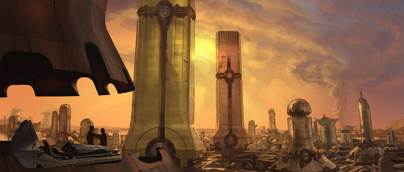
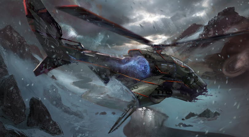
Concept ships by Phil Saunders
Phil Saunders' random stuff.
Keywords: concept mechanical concept ships spaceship environmental concepts from by phil saunders filmmaker writer concept designer california usa
Thursday, September 23, 2010
Big Tommy From 06
Looking at snapshots of our boy Big Tommy. He is very under the weather this week. I apologize in advance if I am slow to answer e-mails for the next few days. Yesterday was hectic as we went from our vet to a diagnostic clinic across town. They are unsure at this point what is causing fluid to build up in his stomach and chest. He was a strong happy playful dog last weekend and now he is pretty darn sick. Please keep your fingers crossed for our big headed boy. He is 10 and the Alpha of our little pack. He sings songs when you pet him just right and sing his name to him. I hope he is singing again soon.
Wednesday, September 22, 2010
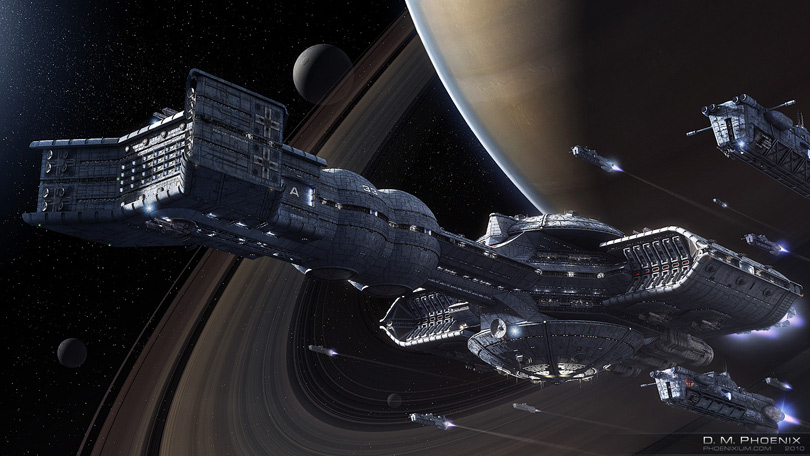
Concept ships by D. M. Phoenix
D. M. Phoenix has recently completed a model from the less known 1994 animated series Exosquad, depicting the Exo-Carrier Resolute. The scale is insane!
Click on the first two pics for high res images.
Keywords: digital concept spaceship art by d m phoenix depicting galactic space scene from animated show exosquad the exocarrier resolute maya 3DS software 3d three dimensional modeling rendering lighting compositing image render max phoenixium.com
Click on the first two pics for high res images.
Keywords: digital concept spaceship art by d m phoenix depicting galactic space scene from animated show exosquad the exocarrier resolute maya 3DS software 3d three dimensional modeling rendering lighting compositing image render max phoenixium.com
Tuesday, September 21, 2010
Alice in Wonderland Chess Papercraft
Sometimes 2D papercraft can be just as much fun as 3D papercraft. Such is the case with this Alice in Wonderland chess set. The two sided flat paper chess pieces in this set are based on the illustrations by Sir John Tenniel found in the original Alice in Wonderland book. The game's PDF template designed by Jordan Peacock includes a printable chess board and may be downloaded here.
Old-Time Avantgarde
Oh, and on a different note, here's a little bit of pre-mash-up mashing up, for your listening amusement, the one and only John Oswald:
It is a fascinating feeling, to realize that today's contemporary is tomorrow's retro, that no matter what, everything we wear, listen to, appreciate or create today will be looked at in just a few years with a paternizing, if not condescendent, smile. Timeless art? Pl-lease. The very feeling of them not being timeless, of being dated, is part of the pleasure of appreciating them. Age can work for the work, but it is still at work.
Monday, September 20, 2010
Mosaic Monday / Dallas Mosaic Artists
Dallas mosaic artists are making things happen! I usually scour the web to find cool mosaic work from all over the country to talk about on Mondays or I sometimes will show off some of my own projects. Today and the rest of the month I want to cover local Dallas mosaics and local mosaic projects.
.......................
Check out my short video below about a large public garden project my classmates are involved in for the Texas State Fair. I did not take part in the project, but I am so excited for everyone involved. They did an amazing job and I hope to create a longer video soon that will show the flowers in the garden. This video shows some in progress shots along with an interview with project organizer Katrina Doran.
.....................
Shannon Leigh Saunders recently had her mosaic work showcased by Cebolla Fine Flowers, the showing runs through Sept. 25th. I checked out this high end retail opening last week and was very impressed with both the quality of Shannon's work and also how beautiful her pieces looked in this large upscale retail environment. Shannon's work varied in subject matter, she was showing floral pieces, abstracts and even a portrait. What did not vary at all was her attention to detail and craftsmanship. Her work is just exquisite. I am afraid my small photos of the show postcard does not do her work justice.
The piece below was one of my favorites that Shannon was showing. I found this nice image over at flickr via member: allitscrackeduptobe.
© Shannon Leigh Saunders
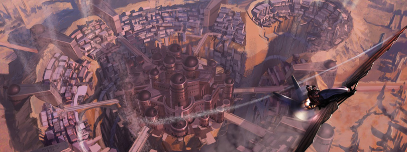
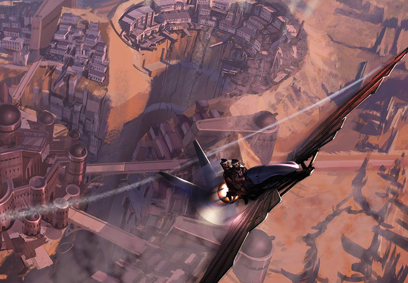
Concept spaceships by Jordan Lamarre-Wan
Jordan's blogspot.
Keywords: concept ships spaceship art flying vehicles illustration designs by jordan lamarre-wan concept artist for disney interactive at junction point studios austin texas usa
Subscribe to:
Posts (Atom)