Sunday, July 30, 2006

"Me, You and Everyone You Know": Filming art, Arting film


Seeing the film Me, You, and Everyone You Know, I kept getting the impression that it's a series of performances and installations, rather than an actual "life-like" story. They all had a punch, they were beautifuly written, conceived... and that was strange. Something unusually pure about it. Of course, it isn't about the film being "unrealistic". It is about it being a specific type of creation. And I'm afraid I'm having some difficulty describing just what that is.
But take some specific qualities of the film: the characters are sketched rather than painted. Sketched quite well, but nonetheless - they are hinted at and not "described". There is little or no small talk, nothing that can allow us to go deeper, beyond the surface of an action. I believe this is because at the heart of the work lies the need for composition, understood as the composition of a painting or performance rather than the composition of a character. The actions, events, situations, always seem to point to, or refer to, or use the language of, contemporary art.
Example: the two boys, both beautifuly discreet and calm characters, make ASCII drawings. And at a certain point, one of them shows the other a drawing he invented: a map of the neighborhood with "me and you and everyone we know" on it, in the form of dots. It might sound as a perfectly normal thing for boys to do. Well, it's not. And the level of asbtraction is quite high. Which doesn't mean it would be impossible for a twelve-year-old to come up with something of the sort. But it has the fresh scent of good contemporary art much more than of the spontaneous creation of a young adolescent.
It makes the entire experience of watching the film an unusual one. Of course one can enjoy it - it's a great picture - but once you feel what I'm trying to tell you, you simply can't stop thinking of someone writing it. Creating it. Composing it, like some installation.
Guess what. The director and star of the film - Miranda July - is actually a pretty renowned visual/performance/etc artist. This is her first feature film, and until now she has been doing installations and performances, many of which quite similar to the ones her character makes in the film. She is also the co-author of a brilliant web project that has been blogged about quite a lot, Learning To Love You More.
Doesn't this bring a lot of issues to the table?
If visual art can fit so well in a feature film, why not keep with the latter format? Isn't it more important, given the total lack of interest of the wider public towards contemporary art and the amazing success of the film (Golden Camera in Cannes, etc...)?
How close can a film, as in, regular saturday night film and not andy warhol film, be to a visual art work? Can't we judge it as such?
How does our judgement change once we accept something as a film or an installation /video art? Of course it does, and tremendously so. But isn't there something to be discovered by each of the disciplines - in the way we see the other work? For instance, for me a film is much easier to accept as such, to follow, to believe in, while video art creates great spaces for asking questions, for changing my approach, from a dynamic to a contemplative state. Oftentimes, though, the video art could use a little of the pragmatic follow me approach of a film, and vice versa, a film could use a little games with distance, so we can breathe.
Another issue: does the more accessible film equipment (Me, You... was shot on video, though it's still damn expensive video) mean that there is space for artists to go into/play with the more mainstream stream? Or is still going to be an offense to even think of mixing the two?
These questions are sometimes schematic, because I feel a need for schemes, for perspectives, points of view.
It's nice to know Matthew Barney is not the only visual artist making feature films. Although we shouldn't forget there are film directors who also make visual art (Lars von Trier, Peter Greenaway...).

ps.: Miranda July also wrote a blog, openly admitting it was part of the indie film industry strategy to promote the film. Nice nonetheless.

Thursday, July 27, 2006

With respect


It is with much respect and a sad heart that I am starting on 3 memorials this week. One of our old clients that we were fortunate to capture while she was still around has passed away unexpectedly. Heidi is a terrific Saint Bernard and her humans are active rescue volunteers and terrific dedicated animal lovers. I know they will miss their special girl. I will also be working on Grizzly, a big bear of a Chow and Keyne a very handsome Rotti. My heart goes out to their families. It is never easy to loose our fur-kids and sometimes non-pet humans just do not understand how deep this sort of grief can be. When you get right down to it love is love, and grief is grief regardless of the species. We all have to process it in our own way. I am just very honored that I am often asked to help create a piece of art that may help keep the happy memories alive.

Toy Piano - why is Margaret Leng Tan so fascinating?

The European Mezzo TV channel tells you everything about "culture" you need to know:
1. It is a ridiculously small milieu. Just look at their site. It is not much more developed than your average friendly grocer's home page.
2. It is snobbish. Ubearably snobbish. It does not intend to introduce art to new audiences, it does not intend to render the experience of art more... well, more anything than it already is. You need to get it, to get it. Just look at their site. The few introductions to future programs are ridiculously small, superficial and badly translated ("she inflames the audience"....).
3. It has no money. Just look at the site.
4. It seems not to care. It makes no effort to be user-friendly (the TV program on the site is in Excel, for the love of God!).
5. From time to time, it brings you the most delicious moments you could ever have hoped for.


Margaret Leng Tan's recital was such an enlightening moment. Leng Tan plays the piano. She comes out of the vein of John Cage. And moves forward. How can you move forward after Cage? Are we not stuck, as after any serious avant-garde artist? It might almost seem a permanent paradox: the true revolutionaries leave little space for their students. But if you look carefuly enough, there is plenty of room for others. And so, Leng Tan, after playing around with several of Cage's games (she is a Julliard graduate, so that meant mainly prepared pianos and such), tried the toy piano.
Today, she is considered the magician of the toy piano. Moving consequently into the exploration of the "toy sound", she established herself as a real master.
But Lang Tan is not my main interest here. What I found curious about what I saw was that the sound of the toy piano is so fascinating. Is it because it's a toy? Because it's so "simple", "naive"? Because it wanders around the frequencies, often destroying the "natural harmony" completely?And if so, what is it about this that attracts us? Maybe, and this is just a hypothesis, it's because this childlike simplicity is a relief. We can step down from the pedestal and actually enjoy it, without necessarily appreciating it as the scholarly art amateurs we are does. The playfulness is nearly destructive, it almost breaks the whole illusion of art, but then, not quite. It maintains the charm, the power, and yes, the beauty, while allowing us to move away. Only what sort of movement is it? Is it really the creation of distance? I would say it is rather assuming a distance, taking it as a starting point, which allows to be as close as we wish, making up our own rules, our private relation to the piece, uncontaminated by the judgement of style, technique, interpretation. That does not mean all of these elements do not play a role - they do. But we are happy to stop judging it, to put ourselves into the oblivion of spectatorship.
This became clear when Lang Tan played a very well known piece, Mozart's Turkish March, and I started listening to the interpretation, the technical aspects, the mistakes, and it wasn't as appealing. What I really needed was something simpler, easier maybe, but more immediate, more bare, less dressed up in the fancy clothes of "culture".
This brings me to another point, which could be developed: aren't the minimalist works - that have been appearing in the last couple of decades in various art fields - this type of search for a bare art? An art that, beyond the discussion of "hi" and "low", starts with an "a-b" that allows us to enter easier, to travel further, and to feel more at ease, just as if this were a simple toy, that by some chance (which, as Cage knew well, has little to do with chance, although it can spur from coincidence), by some chance becomes this: good.

Listen to Margaret Leng Tan here and here. I must admit, though, that these aren't the works that impressed me most.

Tuesday, July 25, 2006

Free Holiday Cards and Christmas Ornaments


Art Paw is giving away free holiday cards and Christmas ornaments to all existing clients this week. You can choose from a set of 6 note cards or a fun ceramic tree ornament ( with your pet's artwork). One gift per household. I decided what is a Christmas in July promo without presents to my loyal and long time clients. All you have to do to receive your gift is give Rebecca (me) a call toll free this week at 888-225-4278. I will need the name of the person that ordered your custom art and your pet's name. Your holiday goodies will be designed from your old artwork and we will mail your gift to you within 4- 6 weeks. Please give me a call and collect your Christmas present. I want to hear from all of you guys and find out how many new pets you have and what is going on with your 4 legged pack. Merry Christmas!

Monday, July 24, 2006

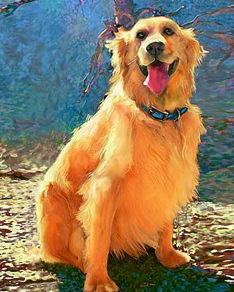
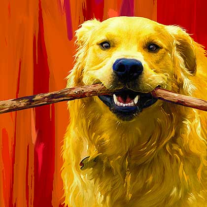
Painterly Golden Retrievers

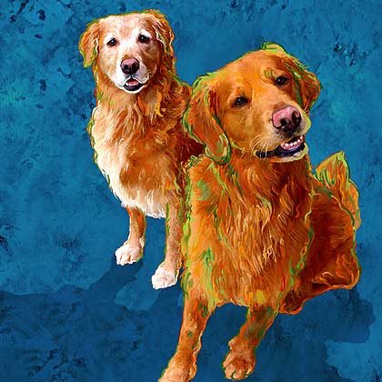
All of the Golden Retriever artwork below was created using my painterly style which incorporates hand drawn lines and paint smudges that are applied via an electronic stylus. This style of working and smudging pixels around lends itself quite well to long haired pups like Goldens.
Auggie and Brutus were a fun and dynamic duo that I played with earlier this spring.


Bailsworth (below)is a very handsome pup that Dan worked on last year. Dan doesn't get to play very often however when he does step in and work on one of our portrait projects the results are always terrific.


Bear was a joy to play with because his humans are professional wildlife photographers and his original photo was very nice.


Beau and Belle really pop against this blue ground.

Saturday, July 22, 2006

Shadow Highlight Tool

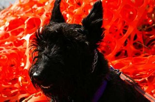
Ok today I am going to share my all time favorite new tool in Photoshop CS2, well it is new to me anyway. I stumbled across this late last year and I now use this tool on almost every photo that comes across my desk. It is especially handy when dealing with black dogs. My clients have a very tough time photographing their black coated pups without ending up with a solid black dot. As the owner of 3 black Scotties I know all too well how tough it is to create the perfect lighting situation for dark dogs. With a little photoshop knowledge you can find the best in your every day digital snapshots and squeeze out a little magic in the pixels you end up with.

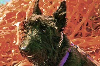
The shadow highlight tool is very similar to adjusting levels, however it gives you much finer control. I am posting two shots of my boy Ajax. We shot this at the lake in the middle of a bright sunny afternoon. I saw some of that orange safety netting all balled up on the ground and thought it would be a fun backdrop for our boy. The resulting photo was ok, but the facial details on my boy were hiding. By using the shadow highlight filter in Photoshop I was able to find his sweet eyes.
Ajax As Shot:

Ajax with Shadow Highlight Filter:

Click Here to see a quick time tutorial on this fabulous tool. Just click on the pumpkin screenshot when you get to the tutorial page to launch the lesson.

Bill T. Jones - The honest demagogue

I have just finished watching an interview with Bill T. Jones. I have seen him perform both live and on video. His story is touching and controversial. He is an authority.
But he is also a demagogue. There is a way of presenting oneself which has something incredibly irritating. Some sort of self-confidence and a way of declaring one's own experiences as universal truth.
You can only say this does not imply a similar attitude on stage if you've never seen Bill T. Jones on stage. The man constantly talks to the audience, his dancing is show-and-tell, it is lectures, sermons accompanied by dance, or joined by it, explained by it. And the tone of his voice has something distant, impersonal, that disturbed me. Now, I've also heard it during the interview. His powerful voice becomes too powerful, and sentences like "Dance is the first art." leave no space ofr anything else. No other areas, interests, points of view. And he is not saying this is what he thinks. Even when descirbing his most personal experiences, he says "The only way one can go through losing someone one has loved is by becoming what one has loved in that person". He doesn't say "I". He speaks for the rest of us. Demagogue? Prophet?
It is strange to discover that what I have been considering as an art of intimacy has the flavor of prophetic discourse. Can this be honest?

Thursday, July 20, 2006

Hooves & Feathers


Earlier this summer before we got so snowed under in custom orders the girls spent some time playing around with wild life images. Now we have some fine feathered friends in the gift shop and some other fun critters. I even spent a little time playing around with insects. I wanted to do a lot more creepy crawlers, maybe soon I will get caught up with my commissions and return to my bug art. Years ago when I designed greeting cards for a living I had a line of insect cards. They did not do all that well at the retail level, but the few people that did like them really loved them.

Wednesday, July 19, 2006

Dateline Kennel


Another day, another portrait. Busy working on art this week so watch the homepage for updates. No time for blogging. Here is a quick link to a fun site:
http://www.lileks.com/institute/dogs/future.html

Jump tomorrow!


--------------------------------------------------------------
>>>> WORLD JUMP DAY REMINDER >>>> http://www.worldjumpday.org/
--------------------------------------------------------------

--------------------------------------------------------------
20 JULY 2006
Only days to the historical WORLD JUMP DAY!
You have asked to be notified one day prior to the event.
--------------------------------------------------------------
Send your images and videos of your jump and get the chance
to win a special WORLD JUMP DAY T-shirt!

For information about uploading, emailing or sending your
images/videos a special page will be available on the WORLD
JUMP DAY website shortly after the jump has occurred.

Please be sure to begin jumping at the calculated time of
11.39.13 GMT on 20 JULY 2006. The duration of the jump
should be no less than 2 Minutes. Timing is very critical
in this experiment. We thank you for your help.

Have a good Jump!
Your WORLD JUMP DAY Team
www.worldjumpday.org

PS: Just remember that this time is calculated for Lisbon. Check the web page for your local jumping time!

Tuesday, July 18, 2006

My Portuguese flag

Portraits and more Portraits

Lot's of new orders came in last week, and we have quite a few things ready to be stretched and shipped out. Anyone with any questions about their order status should give us a call toll free: 888-225-4278. In an effort to maintain better communication with all custom clients we will start sending out weekly project reports on Fridays.

We are setting up a new production schedule and we will be printing twice a week, and stretching only on Fridays. I am trying to find my groove so to speak so things will run smoothly when it really gets crazy here in the fall.

I just printed Bosco today and he looks great!

Monday, July 17, 2006

The poet's responsibility: the Peter Handke Affair

This is far from the first time Peter Handke is being controversial. And it's not the first time he describes the "Serb question" in a scandalizing way.
But after he spoke during Slobodan Milosevic's funeral, all hell broke lose. All cultural hell.
Shocking? Certainly. The question is: why?
Among the many fascinating opinions, one exchange I particularly appreciated.
Botho Strauss:
Those who fail to see guilt and error as the stigmata (or even as stimulants in some cases) of great minds, shouldn't busy themselves with true poets and thinkers.

And Guenter Grass, answering:
Heine – like Goethe too, by the way – remained a fan of Napoleon until his death. The horror and the terror that Napoleon spread, how he used up his armies on the way to Russia – all of that was of no consequence for his admirers. Heine runs equally afoul of today's criteria whereby Handke is condemned for his absurd, one-sided support for Serbia... Handke has always tended to adopt the most nonsensical arguments and counter-positions. But what I dislike about the current discussion is the double standard, as if you could grant writers the right to err as a special kind of favour. The writer Botho Strauß said something along these lines (text in German here)... I have a hard time with granting writers a kind of bonus for geniuses which excuses their partisanship for the worst and most dangerous nonsense.

After this whole affair, Handke gave several interviews. Some of them (copy here) witty and slightly aggressive, others invoking Yugoslavian history to explain, to justify. But how well does he know history? I certainly am no specialist in this matter, but whenever someone explains history too well, even it is to correct what someone else said, I have my doubts, and look for a second opinion.
Probably the most fascinating thing about this affair, is that a poet still has that much power. Yes, you will say, but acting as a politician. No. Acting as someone for whom the polis matters. Zoon politicon - the social animal.

The Brown Dress Performance


365 days. one brown dress. a one-woman show against fashion.
Have an idea. Make it simpler. Make it one idea. Then work on it. Mould it, so it lives, not like a number, but like a word. Study it until it makes sense. (I love the expression to make sense). Try it. And again. Live it. Assume this is it, and it isn't any better, but it isn't any worse. And since you assume it, it can only get better. Which, if you check the site I found it at, as well as the author's, Alex Martin's, journal, did happen.

Sunday, July 16, 2006

Puggie Night Lights


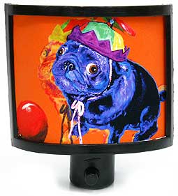
If you are a Chinese pug owner there is no need to bark in the dark any longer. We just created a fun new page of Pug night lights that will light up your life. There are 8 fun styles and they are created in-house.

I know, I know, the rest of you guys are wondering how you can get a little light for your Laso, some glow for your Grey hound or a bright bulb for your Bichon. With well over 200 dog breeds to try and cover it may take us awhile to get to your breed. Order a custom portrait before August of 06 and I'll toss in a free night light with your own artwork if you use promo code #0706lite.

David Gallaugher's grass-lined wheel


FOR
Excellent. Funny. Smart.
It's a brilliantly simple idea. It makes us think - and smile. It is all about ecology. And nature in the city. And taking a real break from all of this. And let's all live together like one happy family.
And above all - don't take it all too seriously. Because it's conceptual - i.e., it is about the concept more than it is about what comes out of its realization. Because it's unpretensious - i.e., it doesn't intend to change the world (at least not the whole world at once). Because it's pretty - i.e., it is a relief from all this...hmmm... down to earth thinking. Oh, and because they got to hear a lot of hamster jokes, apparently.

AGAINST
How do you know where you're going? How long is the grass going to last? So this is the version of nature that architecture students have for us? Don't ask what nature can do for you, but what you can do for nature.

BOTTOM LINE
I like it.
"Even in the Public Gardens [in Halifax, NS], you're not allowed to walk on the grass."
(which is a much better statement than another reported one: that they want to "draw attention to what he considers a North American obsession with manicured lawns.")

ALTERNATIVE
Teresa Murak, Procession (1974)

thank you Jan for the link!
UPDATE: The photo of the Grass Wheel is by Andre Forget, a Halifax-based photographer. I'm terribly sorry for not putting the credit before. It is often difficult to execute on the internet (to get to the original source), but it's mainly laziness, and not incapacity or bad will, that is to blame.

Saturday, July 15, 2006

Art Tutorials

You know the web is so abundant with art tutorials these days. Many of these learning exercises have quick time movies, flash demos and audio. Until I can find the time to sit down and start writing my own tutorials I think I will start sharing my web-finds here on Saturdays. So if you are an artist yourself, please visit us again next Saturday and feel free to comment and leave us any cool links to your favorite on-line learning tutorials.

Here are a few recent finds:
Drawspace.com ( have to sign up for free account)

Pop Art Tutorials:
Melissaclifton.com

Warhol Tutorial

Warhol Tutorial #2

And click here for some fun flash on basic art principles.

Friday, July 14, 2006

Hot Dog Days

We gave the Scotts a haircut this week, and they seemed really happy about it. Yesterday it reached 102 here in Dallas, and we are supposed to see the same today. I love opening up the Art Paw home page this month during our Christmas in July sale and seeing that blue snowflake graphic. It cools me off and reminds me that fall will be here before we know it.

Scottie fans should check out 3-dog howl's Scottie Days of Summer artwork below, it will cool you off!

You might also wade into Cafe Press to take a peek at my friend Sheila's lovely photography that is available on notecards ...summer is a great time to send some cards & letters.

Thursday, July 13, 2006

Cool Shades


I just finished working on a great little guy named Bosco. This fellow could be our poster-boy for the coolest of summer dogs. He is sporting a Hawaiian shirt and sun glasses. Click here to see his proof. I am very happy with Mr. Bosco.

Over the years a few clients have sent us photos of their pups in shades. As a digital artist my fun challenge with these pics is often finding some hint of eyeballs beneath the plastic lenses and then burning (darkening) the pupils so that the dog's sparkle and character comes through. Spectacled pups always make me smile.

More Cool Shaded Dogs:


Wednesday, July 12, 2006

The "Staff" is growing!

Lots of fun stuff happening around here these days. To begin with we have some new faces this summer. We just hired a very talented photographer named Diane, and her bio and photos will be added to the site soon. One of my best friends has agreed to take over shipping and canvas stretching and she also gave my production room a face lift (see pics in last post). Her name is also Rebecca and she is a very talented artist and jewelry designer. We have been getting to see a lot more of young Teryn, a talented teenager that works with us on Saturdays. The summer has been busy and I am trying to staff up for the crazy Christmas rush that will start in just a few short months. Allison is taking over more and more web related duties and I think she just may be my right arm this holiday season.

And Then They Leave:
We had to say goodbye to Matt earlier this year. He decided to move back home to New Mexico. I gave him a glowing referral however and he landed a great design job with some sort of herbal products company. Art Paw is really just a tiny little studio and home based business so when we loose people it is like loosing family. I am always happy though when "my talented kids" ( ha, everyone under 44 is a kid) move on to pursue their own dreams. My little purple haired Lola has stopped returning home during her college breaks and we miss her too. I have come to realize that Art Paw will always have a constant flow of canines and young artists.

Tuesday, July 11, 2006

Art Paw Studio News


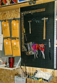
Last week Dan was off work and he started to get his new painting studio set up. He also gave me windows in my doors on my production building. We have two of those wooden storage type sheds that you can purchase from Home Depot. Both are wired with electricity and air conditioning. They are air tight and they are perfect artist studios. When I first started my business 8 years ago I would run out and pay retail on card board boxes every time I needed to ship a portrait. During my 3rd year in business when the orders were increasing and steady it became obvious that I had to start buying boxes wholesale. It was at that time that I knew a had to have more space and quick. The storage shed was the perfect solution for shipping. We have since extended it's functions to include canvas stretching. This summer my best friend has organized my space for me with new shelving, wire baskets, and a place for every tool.
I painted the trim green and added a few flower pots to dress it up. Some time this month I plan to design my own vinyl window shades for the new door windows. What was originally an ugly brown box in the backyard is turning out to be a very efficient and good looking work space.
Dan Working on my door windows

Interior Shots


Monday, July 10, 2006

New Chihuahua Art

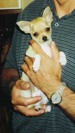
I am currently working on a cute little Chihuahua named Tabasco. This tiny pup is from Sweden and I am finalizing his artwork today with a few tweaks and minor adjustments. Later this week I have a few more painterly works to start on. If you are checking the site for your proof ... stay tuned. I hope to be caught up with all orders by the end of this week, ( crossing fingers ).

Chihuahuas are such cool little dogs. When I was in high school I dated this boy that had a pet Chihuahua that belonged to his Mom. The little guy was sort of nippy and snappy (the dog not the boy). I had never known any other Chihuahuas so I got a bad impression of the breed as a young girl. Later on in the late-eighties while I was managing a doggy biscuit bakery I was fortunate to meet some really cool and very well adjusted Chihuahuas, a few that I totally fell in love with. I learned that they are really very big dogs in tiny packages. I also learned at that time that you can not judge a breed by one dog's behavior. Yea, Chihuahaus are very cool, and probably often misunderstood.

I'm sure Tabasco is probably an angel when he needs to be and a feisty chili pepper when the occasion calls for it. I'm really liking this new piece, and it was fun incorporating the human "paw" in this work. As the owner pointed out the hand does give a real sense of scale for this little pup.

Sunday, July 9, 2006

Installation for the soccer maniacs

Police in Berlin said on Wednesday they had arrested two men on suspicion of placing cement-filled soccer balls around the city and inviting people to kick them. At least two people injured themselves by kicking the balls, which were chained to lampposts and trees alongside the spray-painted message: "Can you kick it?"
I agree with ann that the message seems unnecessary, but the work does have a pleasant, sadistic thing about it. Especially if you're living in a country like Portugal.

(via, originally from)

How to concentrate on blogging?

Number 4 on the list of things to do in order to concentrate on writing is "Stop with the blog already". That puts the blog in a rather bad position, doesn't it?

Saturday, July 8, 2006

Art Blogs

I enjoy reading other artist blogs much more than writing in my own, and it seems that more and more artists are blogging these days. I just found out that one of my all time favorites has started a blog. For some non-doggy rambles check out Jeff Soto. His blog is brand new, but he is an established artist with a huge following. We have a few of his silkscreens on our walls at home. Another fantastic general art blog that is on the subject of drawing is called Drawn.

For animal related art stuff check out these fun pet art blogs:
Terry Pond ( The wiener dog artist)
Leanne Wildermuth
Big Cat Heads
Carrie Hawks
Kathy Weller
Michelle's blog

It is a lot of fun to peek into the lives of other artists and see what they are working on. Some artist blogs can be very personal and some can be sort of general, but I find them all interesting. Ok,so now that I have avoided any real writing myself today, it is back to work for me.

Friday, July 7, 2006

Romeo Castellucci and subjective criticism


It is not rare for me to come out of a show/performance/stage production and not know whether I liked it or not.
This was certainly the case with Romeo Castellucci's 4th episode of the Tragedia Endogonidia series - BR.#04 Bruxelles/Brussel, during the Alkantara Festival. And if I waited so long before writing anything, it was precisely because of that.
The state of I don't know is something to cherish. Whereas in everyday life it may be quite problematic, there is no reason for it not to persist in aesthetic judgement.
There is more. Contrary to many aesthetic theories, I firmly believe aesthetic judgement can change - and usually does! - after the aesthetic experience. We reevaluate what we saw, heard, felt, after thinking about it, but also, after receiving new information. That is why the conversations people have after shows are not, in my mind, just the need to share one's impressions. They are rather attempts at establishing some sort of relation between me, my view of things, and the way others see and feel them. And, since we are no monads, communication makes a difference. I've had shows which I didn't really appreciate but started to have liked after having discussions about them. This is probably quite natural in non-temporal arts, where we can come back to a piece and renegociate our relationship with it. But in time-based art it seems awkward, to say the least: how am I to have liked something I already didn't like when it took place? The "taking place" is what's misleading here. Things take place, but our judgement of them needn't stop when they do. Does this mean we are easily influenced? We can't make up our mind by ourselves? Yes. Isn't that great?
The problem is when we see something controversial, like Castellucci's production.

The theater, reportedly says Castellucci, is a space to show amazing events.
But what is "amazing"? Castelucci's amazing might actually come from a maze rather than from amazement. It is a dry, calculated construction, a sort of a post-Wilsonian theater of imagery. But where Robert Wilson opts for a sort of a postmodern surrealism, the Castellucci I've seen prefers semantic games with the "timeless themes": birth, death, violence, etc., directly going for the heavy-duty stuff. At the same time, his aesthetics is quite close to what we've seen in the Cremaster Cycle. The strong white light that's gloomy, the fantasy/mythological characters, the extreme slowness (they aren't only taking their time, but ours as well...), and what's most striking, the extreme ritualization of everyday activities. Actually, this passing onto the stage seems to be quite natural, as Cremaster had the performative and theatrical qualities that only maybe needed to be nourished with some sort of theater dynamics to make it a stage piece. Here, tragedy is what provides this dynamics. It raises the energy level, while keeping the aesthetics of unbearable purity unbearably pure. Castellucci's discovery here seems of some importance: you don't need the story to have the tragedy. Or do you? Although fighting away any clear narratives, BR#04 somehow goes back into them all the time: when a guard takes off his uniform, and lies nearly naked on the floor, to be beaten up by other guards, we get a very succint, but also very straight-forward story. More - it is actually a story with a moral! This is a crucial point that distinguishes Castelucci from Wilson or Barney. The latter two stay as far from moral, social or political issues as they can, while the Italian director goes directly into them. How does he survive? How does one survive combining a visual arts/ abstract world with dwelving into social matter? Cláudia Dias had one solution I particularly liked: being delicate and extremely personal while maintaining a rigid formal structure. Castelucci's structure is even more rigid and dry (almost lifeless!), but he chooses the exact opposite strategy to Dias: he becomes completely impersonal. The characters have absolutely nothing personal about them. The stories aren't stories, but flashes, hints of stories, sketches of narratives with a few grasping details. Thus, the "narratives" we see are at once complete - a guard undresses to become an anonymous person, who is thenupon abused by other guards - and inexistant - there is no reason for the abuse, no outcome, no difference between the people who beat and the one who is beaten, there is no beginning and no end, as the act of violence remains fairly similar throughout the scene. It is suspended, and we are allowed to link it to our entire imagination, memory... or not.
And this is where the roads diverge. Do we accept this game of suspended scenes and create the stories ourselves, or do we demand something more than just live paintings? Do we see the crawling old man dressed in a bikini as a beautiful, engimatic and sad image, or do we see it as a naive metaphor? Is gratuitous violence meaningful because it shows the lack of sense, or is it simply gratuitous and therefore senseless? Are the strange characters that appear somewhere in the middle fascinating, or just cheap decoration? Is the baby that is left crying alone on the stage a great act of provocation, using the tradition of live art, or is it an irritating act of going back to something that has already been done but with stupid cruelty and a pathetic atmosphere?
I really cannot answer these questions. When leaving the theater, I asked a few friends about their opinions. An young actress said it was disturbing and moving. A performer said it was the worst thing he had ever seen. A choreographer said it was absolutely beautiful. An older actor who used to work with Grotowski said it was simply a stupid show pour épater les bourgeois.

I continue to cherish my I don't know. Castellucci's is a great theater to have watched. Then again, I believe it was Mark Twain who defined a classic as a book people praise and don't read. At times, I wonder how important is the very experience of being there, live, when a work is so disciplined it sometimes seems to move from the ritual to the image of the ritual. Isn't the image enough, then? Is this why Castellucci's web page has no images?
more on Castelucci

Wednesday, July 5, 2006

Boston Terriers


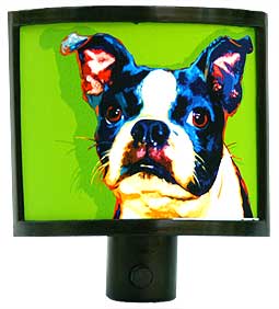
This month I am focusing on Boston Terriers and we have updated that section of our site to offer some new limited edition Boston Terrier prints, boston nightlights and more. I am scouting around the web to find other cool artists to include in our Boston Terrier links page that is still under construction. Today I bumped into a really cool young artist from New York that has some amazing fresh work. Her name is Alexis Trice ... check her out. Her work is very quirky and very hip.

Tuesday, July 4, 2006

Happy 4rth of July!


Happy 4rth of July. The Scottie above is our boy Atticus. That art image is from a few years ago and it always makes me smile. The hat was photo-shopped in however if we had an uncle Sam hat like that Atticus would have been happy to wear it ...he loved clothes.

I just did a quick search at CafePress for more Patriotic Dogs and found some Scotties by one of my favorite artists (Maggie Ross)...check out the cool gifts with the Scotts below on them.


She also has a great Airedale:

Cafe Press returned over 46,000 results for "Patriotic Dog". Zowie, that is a lot of red white and blue canines.

Have a fun and safe fourth of July. Don't forget to bring inside any skiddish dogs and young puppies that may be frightened by the noise of local fireworks displays.

Two gifts

Oneand two.
(found here)

Saturday, July 1, 2006