Thursday, July 31, 2008

Flight: Part One


When I dive from the cliff, nobody catches me . . .

I can barely conceal the smile on my face as I glide--

The joy of being able to launch myself at once into a separate sphere, gives me a supreme satisfaction, an indescribable feeling.

Levitation is a consummate thrill. Floating is even wilder and more insane to imagine. And flight is beyond comprehension.

While I’m flying over giant clusters of people just as if they were pixels on a vast screen, I realize that my secret ability to fly has come to me in the time of an emergency.

Flying is not a part of my daily routine, you see.

I realize that something was threatening me on the ground, and that’s why I suddenly took flight. An impression of the primal scene still haunts me, vague pictures floating restlessly in the back of my mind, distant as memories.

The crowds on the ground are trying to keep up with me. They’re running after me as if they too might bolt into the air. They don’t look like pixels anymore. More like gazelles, running in loose herds; the undulant rhythm of their hind-legs beats like a drum on the African plain.

The beasts of the savanna are chasing me with delight.

For the rest of the dream, I soar over the majestic sweeping continent. Thorny acacias and palm trees spread throughout the vast swathes of grassland and marshes. I look down at the elephants which appear pensive and sad. They are monuments of sadness. Grey lugubrious figures with heavy-thick skin, brooding eternally over the land.

Then: long-necked giraffes carrying messages to the tall trees, whispering all sorts of secrets to the leafy vegetation; they chew in serene self-possession. White rhinos are transfigured into kingly creatures who command respect from the tribes.

The striking zebras graze indolently on the pastures. From my birds-eye, their vivid stripes evoke a mesmerizing contrast to the dry, parched lands.

Flying seems to be the simplest thing in the world.

"Rainbow"


1 EPS : 1,4 MB

http://rapidshare.com/files/121895388/Rainbow_Vector.rar

"Office tools"


3 EPS : 4,4 MB

http://rapidshare.com/files/123301141/Notes_And_Paper_Clips.rar

"Comic hands"


259 EPS : 2,6 MB

http://rapidshare.com/files/123500896/259_Hands_Vector.rar

"Mixed"


10 AI, EPS, CDR : 2,6 MB

http://rapidshare.com/files/124287232/12.rar

Freefall

Vector illustration by expansiondesign

"Barack Obama"


1 AI : 1,3 MB

http://rapidshare.com/files/130820028/Obama.ai

"Robotika"


1 AI : 1,4 MB

http://rapidshare.com/files/131525808/robotika.zip

"90 orange icons"


1 AI&EPS File : 26 MB

http://www.filefactory.com/file/e1ab20/
http://www.filefactory.com/file/bbad30/
http://www.filefactory.com/file/1e318a/

And the winners are...

Our print contest winners are Alex and Creative Flutter.
To claim your prize just go on over to my Etsy Shop and start looking around. Place any print ( $24.99 or less) in your shopping cart and then choose to "pay by check" ... ( then just DO not send the check!). You will not be charged anything at all and I will e-mail once I see your order. If you prefer you can also e-mail me and then write out your item choice, and your shipping address.

You have until August first to claim your prize.

"Beijing 2008 Logotypes"


15 AI : 9,6 MB
http://rapidshare.com/files/130822657/BeijingLogotypes.rar

Wednesday, July 30, 2008

Free Art Print Contest

Today I am giving away 2 free prints from my Etsy Shop!

I am offering 2 free reproduction prints on canvas from my Etsy Shop to 2 lucky winners. You can win a reproduction print of your choice ( no not your own pet, sorry ) valued at $24.99 or less. To win just be the first or the last person to comment on this post.
How To Enter This Contest:
#1
Post a kind comment on this post by midnight tonight ( 7/30).
#2 Check Back on 7/31.
Was your comment the first on this post or the last? If so ... then you WIN! You have to post a comment to have a chance (no e-mails please). Multiple posts by the same person are not allowed if you are trying to be last.
#3
Tomorrow I will post the winners and tell them how to redeem.

Click on any image below to visit my Etsy Shop. Shoppers are welcome!

Tuesday, July 29, 2008

Vector Icons Pack #2

A free vector icon pack from gwhite83. You'll get a better view if you open the PDF file with Adobe Illustrator and scale the icons up. Many of them are detailed illustrations, that can be refined and styled to what you need. Download

Website Layout Design with Adobe Illustrator and Photoshop

It was just about time for the first web design tutorial in this blog. Vector illustration skills are handy not only for print , but also for web design. A warmup exercise from ComputerArts Magazine.

"Craig Grannell shows you how to use Adobe’s two CS3 graphic design powerhouses to work up the layout for a website
Most web designers work with Photoshop or Fireworks when creating websites, and Illustrator is often overlooked. However, Adobe’s vector package is perfect for crafting the initial components of web layouts." Full tutorial and source files via Computer Arts Magazine

Fly Me to the Moon


drawings by Vasco Morao.

Cool Dog Name ... Gizmo

"Gizmo"
(See all 6 proofs)

I love the name Gizmo for a dog. We have done maybe 2 or 3 Gizmos over the last 10 years ... not a very common name. This cute pup's artwork will be stretched today along with BeeBee & Moxie. We have seen a lot of interesting dog names here at Art Paw this past month.

According to an article by Mary Hanna "In the world of dog-naming, human names continue to dominate, according to a company that sells engraved dog tags. The top five male names are Max, Jake, Buddy, Bear and Bailey. For females, dog owners prefer Maggie, Bear (the gender-neutral name of the dog world), Molly, Shadow and Lady".


Monday, July 28, 2008

Gustav Klimt Site


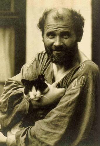
I will get back to dog art soon this week, and I have another give-away in the works for mid-week. Today however I really want to share a great site I discovered late last night on Gustav Klimt. It is a really stunning site that uses Flash. I usually hate Flash-heavy sites, but this one is so yummy and well done. Go check out iklimt.com, you will not be sorry.

In googling Klimt and his cat I also found a rather charming little book over at Amazon for kids called Klimt and His Cat.


Saturday, July 26, 2008

Sasquatch, Squid, Shoes and Skulls!

You have to check out Kraken Mosaics.


I bumped into Eve on Flickr several months ago when I discovered some crazy lady covering an entire section of wall with a giant squid mosaic. At that time I too was nipping glass in pursuit of squid themed mosaics. It has been over a month since I have worked on any mosaics and I am missing it. So today I post on someone that seems to be going at full-time. She has been showing a lot, and is even being represented in Daas Gallery.
Her subject matter includes aliens, squid, skulls and more.
Go check out the Kraken Mosaic Etsy shop and support this talented artist.

Friday, July 25, 2008

Dream Away. Andrea Galvani

Andrea Galvani, La Morte di Un'Immagine #9 (2006)

Have you ever witnessed something so beautiful it makes you angry? Something that makes you angry because it blows your entire scale, because it makes your delicate struggles for harmony ridiculous, petty, insignificant? This beauty that should elevate you, that should lift you up and carry you through the night, the beauty that is the inspiration and the core, is its exact opposite: smashing, unbearable, hard and cruel. It is a sunset that is just too magical, stars that shine too bright, or an event that seemed like the best of all performances. But what I mean is not perfection, it is beauty. It is not unnerving because it doesn't allow you to access it, like the perfection of the stone. It is unnerving because it takes away your ability to judge it, or what's worse, it's a type of beauty that takes away your ability to include it into your appreciation of beauty. It makes it silly to think of art, to create, to go to galleries and museums, to scan art blogs and dwelve into poetry. It leaves you lonely, ridiculously hanging on to an outdated scale or desperately trying to adapt it to something that corresponds more to what Kant calls the sublime - although the problem is, it is not sublime, it is exactly what beauty could have been, had you not already developed a different scale altogether.
I'm lucky: I forget. The taste fades quite quickly from my mouth, the text evaporates from my head, and so does the view of the sea after the storm. It all starts again for me, and what is left is like a bookmark, a sign that says "this was good" and maybe, maybe manages to reproduce some sort of a sensation of a sensation I had when it happened.
And then, sometimes, if one focuses on this memory, the memory starts growing a new head, one that is nothing like the previous one. One that does not compete in these subjective beauty contests, one that is at once much more raw and more constructed, that uses your imagination but somehow fits it together with whatever surrounds you, adapting the memory into an idea, transforming it into this weird creature that still has the body of a horse, but instead of the head has grown a thick, black cloud. Of balloons.
Delicious.
Thank you Andrea Galvani.

(via)

Businesswoman & Businessman EPS Silhouettes

Here we have two free vector packs with illustrations of businesswomen and businessmen in different poses from parka. You can easily change the color of their outfits by simply selecting and changing the fill colors.

You can use them for design brainstorming, designing a business card logo or for designing a corporate website interface.

The artwork is saved in EPS file format, you can use any vector compatible editor to modify or customize it.

Licensed under a Creative Commons Attribution-Share Alike 3.0 License.

Download *EPS File

Download *EPS File

New Artist Video ... great find!

Check out this terrific video I just found from Manon Doyle. She did a fine job with this ... hard to believe it is her first video. I have been following this lovely and talented gal's blog for some time now and until I saw this video I had been mispronouncing her name in my head. Just one more great reason to put yourself out there in front of the camera. Manon did a great job of discussing her current project and also shares with us the easy to use camera she is working with on her video.

Are you using video yet to promote your art or business? After you watch this scroll down for some video resource links. Next Friday I will try to post an interview I am going to do with a local artist pal of mine on her handmade Jewelry studio.


Video Resource Links:

How To Create a Video Cast from Shelly Hall

Web Video Marketing:
Trends, Techniques, and Copywriting Tips


Another great post from Copyblogger about Video

Copyright Free Music links:

http://creativecommons.org/audio

http://www.jamendo.com/en/

http://www.podsafeaudio.com/

Chinese Ink Brushes for Adobe Illustrator

A set of 13 vector ink brushes by xentric For Illustrator CS2 and above. Download

Thursday, July 24, 2008

The Font Conference


collegehumor.com present the FONTS and their characters in their own Font Conference.
Starring: Times New Roman , Arial Narrow, Arial Black, French Script, Rage Italic, Baskerville Old Face, Bookman Old Style, Wide Latin, Old English, Jokerman, Futura, Ransom, Courier New, Century Gothic, Wingdings (the one that got kicked out by Times New Roman), Comic Sans, Broadway.

New Dog Art

I guess I had better post some new doggy art. I did work one day last week while on vacation. I started on 2 portraits, Betty & Beebee. Yesterday I finalized these sweet girls.

"Betty The Boston Terrier" ( above)
See all 6 proofs


About The Art: Strike a pose Betty! The original photo for this little Boston was just perfect ... the folded paws made this little girl look so dainty. I slightly rotated her head a tad and I removed the grey invisible fence collar.


"BeeBee The Yorkie" ( above)
See all six proofs

About The Art: Bee Bee's original photo was a bit low in resolution. I created a variety of looks for this little Yorkie. The first sample here of BeeBee is my boldest offering. I have a strong sense that BeeBee's human is going to be opting for a more tame version.

Wednesday, July 23, 2008

Dark Thorn

My youngest son, Alex, is very much into trading card packs, such as "Yu-Gi-Oh". This inspired us to come up with some of our own creature creations, such as "Dark Thorn"...


Look for a coloured version coming up soon!

Hogwarts for Artists

Yes Virginia there really is a Hogwarts for artists and it is called Penland.

When I was studying jewelry & metalworking back in the 80's at college I dreamed of taking courses at Penland. Penland is an amazing school located in the Mountains of North Carolina. While on vacation last week we toured the campus and I realized that all the mythology about this place was true. It really is a magical place to create. I never got around to leaving my kitties for the summer back when I was 20 to head off to Penland, but it is never too late. I think next summer may just be the summer that I take a workshop.
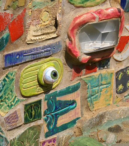
portion of mosaic wall ( above)
A dorm (above)
Metals studio (above)
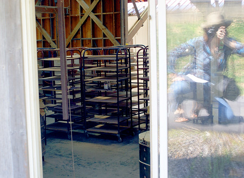
"From the outside looking in"
Pottery studio
The school is a combination of stone covered cottage style studio buildings along side more modern facilities. There are trees everywhere and windows are flung wide open to take advantage of the cool mountain air and ample sunshine. The courses include workshops in paper, metals, fibers, ceramics, photography, painting & drawing.

Tuesday, July 22, 2008

Approaching the Cliff


The blank page is the only cliff I dare to stand over, fathoming the abyss with the thrilling calm of an explorer.

When did this fascination begin?

At ten years old I recall carrying little notebooks throughout the house. I would situate myself in the living room and brood over the pages, making scribbles and poetry.

My father once yelled at me for having too many journals. And that was even before I had more than two or three.

Today my bookshelves are lined with journals. There is also a place on the bottom shelf for journals that are unfinished or not marked in at all.

My mother was an avid diarist. But hers was a sketch diary which was filled with quotations from the books she read and some passages of her own.

She complained about my father in her diary.

Perhaps beginnings don’t really matter. We look back in vain, as through a kaleidoscope, attempting to piece together the mica and glass fragments of life. Each of us has a history which dissolves into colored images when we refer to it.

The past seems less like a cohesive narrative and more like a scattered photo album where the pictures are always changing places.

Strangely I’ve made it my life’s passion to weave the images of my past into books.

Life has the arc of a novel without holding the meaning inside. That’s our job, to give the novel of our lives structure and meaning, to organize the photo album and make labels, to develop the characters and the plot.

But where do urges come from? I mean the drive we have to attain our goals, to satisfy our desires. How does this drive relate to personal history?

My life has a definite goal; and there is a drive in me to fulfill that goal.

To tell you my goal would be to give away the secret. The secret I don’t even know. The secret I’m keeping from myself.

It seems God has concealed my goal; and I don’t even know if I believe in God.

If I could name this enigmatic goal, then perhaps I would be able to put down my pen, leave the computer alone, and stop checking email.

But I don’t know what the object of my existence is and that’s why I keep searching.

I accomplish trivial pursuits along the way. Occasionally I am gratified by my pursuits, literary or otherwise, but whatever I accomplish it never eclipses the desire within me to keep chasing down this larger, more luminous goal.

The goal I have no name for. The goal I cannot even describe.

The blank page holds infinite possibility. Now it occurs to me I can either fill the blank page of life with the words and descriptions of others: I can ventriloquize;

or I can attempt my own language. And describe the world as I see it. And describe myself as I feel things.

I don't follow any religion. I am out of college and have decided against graduate school. The place where I work does not require me to perform mind-numbing tasks.

I guess I've realized that I don’t have to be an echo anymore. I can be myself and speak in whatever words come to me.

If I don’t describe myself, then others will, right?

The Book of Innocence is a literal journey. I have many ideas, but ideas are mere and in life, things just happen, eluding our plans.

I stand over a great cliff, and look far ahead; where I can see nothing but the blank space of air--

the air I breathe which exilarates me and makes me want to jump.

90 Artistic Brushes for Adobe Illustrator

Over 90 artistic brushes for Adobe Illustrator from nextexile. They are all in different shapes and you can use them for personal and commercial use...

For a detailed preview click on the image below. To use them you will have to expand the .zip archive and load the "NextExile Artistic Brushes Pack 1" file with Adobe Illustrator (File>Open). After that, open the brushes palette (Window>Brushes). Download

36 Vector Fashion Model Illustrations

A collection vector fashion model illustrations from Dezignus / Fireman10.The pack contains 32 silhouette shapes of girl models in different poses and outfits...

Free for pesonal and commercial use. The artwork is saved in EPS file format, you can use any vector compatible program to modify the file. Download

Vector Fashion Models

A collection vector fashion model illustrations from Dezignus/Fireman10.The pack contains 32 silhouette shapes of girl models in different poses and outfits...

Free for pesonal and commercial use. The artwork is saved in EPS file format, you can use any vector compatible program to modify the file. Download

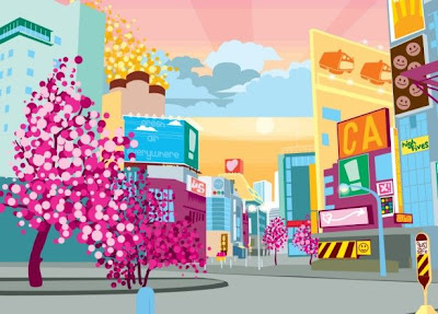
Cityscapes drawing tutorial for Adobe Illustrator

Another inspirational digital illustration tutorial from ComputerArtMagazine
"Illustrating city scenes can be simple, but creating an idyllic place is often tricky. Ben the Illustrator, aka Ben O’Brien, uses Illustrator to create subtle effects and creative techniques that will bring a cityscape to life
You’ve ambled around London’s backstreets, sauntered through beautiful European capitals and stood awestruck at majestic American skylines. You’ve snapped your photos, but how do you take the atmosphere, architecture and soul of a city and put it into an illustration?" Full tutorial and files

Bruno's Puggie Art At Home

"Shelley & Bruno at Home"
24 x24 pet portrait on canvas

Thanks so much to Shelley for sending us this great shot at home with Bruno. You got me blogging again ... yay! Love Love Love, that yellow wall. The colors all work great together. I would have hung the piece about 4 inches lower, but that is just me. You usually want art in the living room to be close to eye level while sitting. Of course that can create trouble when really tall people sit on the couch and lean back to the wall, bumping the artwork. Over the couch is a tough spot, in fact I have a piece over my sofa right now that is really too high. It does not help that I live with someone that is over 6ft tall ... his eye level is much higher than mine.

I am still settling in from our trip, playing with video and photos. I am back at work today and working hard to get caught up. I will be posting new art and trip pics soon.

Monday, July 21, 2008

Marek Cecuła. The sense of matter.

I must admit I had no idea Polish design (well, design-related sculpture would be the more correct term I suppose) can be anything like this.
While I'm at it, I must also admit that the moment of becoming a little less ignorant, this moment of moving from a state of nothingness to the sudden illumination by something of this caliber is something delightful.


Last Supper (2003)

Porcelain Carpet (2002)


from the Hygiene series (1995)


from the Hygiene series (1995)


from the Eroticism series (2005)


from the Scatology series (1993)


It does not necessarily make sense. It does not necessarily say something, as in, a thing, as in, a message. It prefers to wink at us, like someone sitting in a waiting room winks at us, right after we finally managed to get our eyes of a gorgeous neighbor. Is that the "I know how you feel" wink? Or is it showing you he knows something both of you know he shouldn't and yet both of you know he certainly does? Is this something you share? A common interest? A common feeling of guilt? A feeling of risk, maybe? This winking, the one I feel when seeing Cecuła's works (not touching them, unfortunately, although that seems a perverse desire), is one of recognition, but also one of daring sensitivity, if not always sensuality. Touching is key? No, come to think of it, the not-touching, here, is what drives the senses right to the matter.
More on Marek Cecuła at his site.

(via)

Sunday, July 20, 2008

The big Fuss: Who Killed Barack Obama?


Once again, Peter Fuss (remember his "For the Laugh of God"?) manages to poke the finger in the right spot.
His most recent work, exhibited at the Out Of Sth exhibition in Wrocław (Poland) (which also has blu's animation on display) plays on our sense of reality.
What I like most about this work is something I didn't notice at first. The first reading, to me, was simple: knowing the fate of the liberal Americans who came to positions of power, it is difficult not to think of the risk Obama is facing. This also might be seen as a cool and lucid way of looking at politics. Can any ideal manage to survive? Isn't Obama, the Obama we know as fighting for "change", somewhat dead, already? Who killed him?
But what I really like about this work is not this seemingly political message. It is the way it portraits us and our own patterns of looking at reality.

The problem is not that Obama may get killed. The problem is our thinking of it as a fact. It is not Fuss's work that is cynical. We are.
Seeing the work on a billboard makes it even more obvious: we take it for granted that things are the way they are, and even if they aren't, too bad for the facts. The billboard is there, so Obama is dead. Who killed him? Guess who.


update/ps: A couple of months ago an Israeli designer created a shirt with a similar text. I think the differences between the two projects prove my point. Having/seeing this on a T-shirt and seeing it on a billboard are two completely different experiences. (Not to mention the completely different level of design). And that's what sets apart a good artpiece from a, well, another one. (Also notice the context - one is set in NY, the other- in Wrocław). Suffice it to say that already a few days after the opening of the exhibition two French tourists entered the gallery (you can see the entrance to the right on the second picture) saying they haven't had the chance to follow the news and they were quite terrified. Now, just to add another level of artsy-fartsy commenting, the person attending them answered they weren't to worry because it was "just an art installation". Ouch, now that's not what I would call effective art guidance. Or what she being ironic?

Vector Silhouettes

A free vector stock from teach-me-freedom. The set is a mix of 35 different silhouette people postures. To use, open the file with Adobe Illustrator. Download